This article was published in Scientific American’s former blog network and reflects the views of the author, not necessarily those of Scientific American
As we prepare to round the corner into December, it begins to feel like the season of many things: holiday cheer (and holiday stress), festive sweaters, end-of-year reflections. But more than anything, it is undeniably the season of eating.
We all have our personal associations around annual traditions and food, some more singular than others. A friend of mine, for example, insists that Christmas is simply not Christmas without green Jell-O salad. On the other hand, these types of food associations can be quite widespread, for reasons often based in biology. For instance, each fruit and vegetable has its own natural growing season. Moreover, studies have shown that people tend to consume more calories as the weather cools, perhaps due to a chipmunk-like stockpiling instinct dictated by our evolutionary history. Then, of course, there are the more socially and culturally based gastronomical phenomena—the pumpkin spice latte, for example, or the peculiar and shadowy entity known as the acai berry, which owes its recent fame to being designated somewhat dubiously as a “superfood.”
As with any human experience as universal as eating, it’s one thing to discuss a food trend anecdotally, and quite another to try to measure it. Given the ubiquity of the Google search bar as a vehicle for humans to advertise their most prevalent thoughts, questions, and (ahem) appetites, what better resource to reveal seasonal food trends? And what better way to present that information than as a thoughtfully designed interactive data visualization?
On supporting science journalism
If you're enjoying this article, consider supporting our award-winning journalism by subscribing. By purchasing a subscription you are helping to ensure the future of impactful stories about the discoveries and ideas shaping our world today.
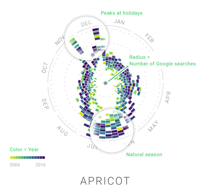
Enter Google News Lab and Moritz Stefaner of Truth & Beauty Operations. Their new project entitled The Rhythm of Food examines a plethora of edible items, from apple pie to Chinese water chestnuts, revealing each food’s seasonal ebb and flow, as well as its popularity over time, from 2004 to 2016. Most of the data is from the U.S., but in some cases, where the food in question varies wildly in seasonality by location—apples, for example, or kale—the focus shifts to other parts of the world.

Credit: Moritz Stefaner Truth & Beauty
Click the image to launch the interactive
So, grab a snack and explore this delightful visualization. And for more on food, check out some of the interactive graphics from Scientific American’s September 2013 Food Issue. Jan Willem Tulp’s The Flavor Connection explores food pairings like you’ve never seen before, and Where (in the World!) Your Fruits and Vegetables Come from, created by the Office for Creative Research, reveals the diverse origins of imported produce.