
This article was published in Scientific American’s former blog network and reflects the views of the author, not necessarily those of Scientific American
Editor’s Note: The following is a guest post from Stefania Guerra, Giovanni Magni, Giorgia Lupi and Gabriele Rossi from Accurat.
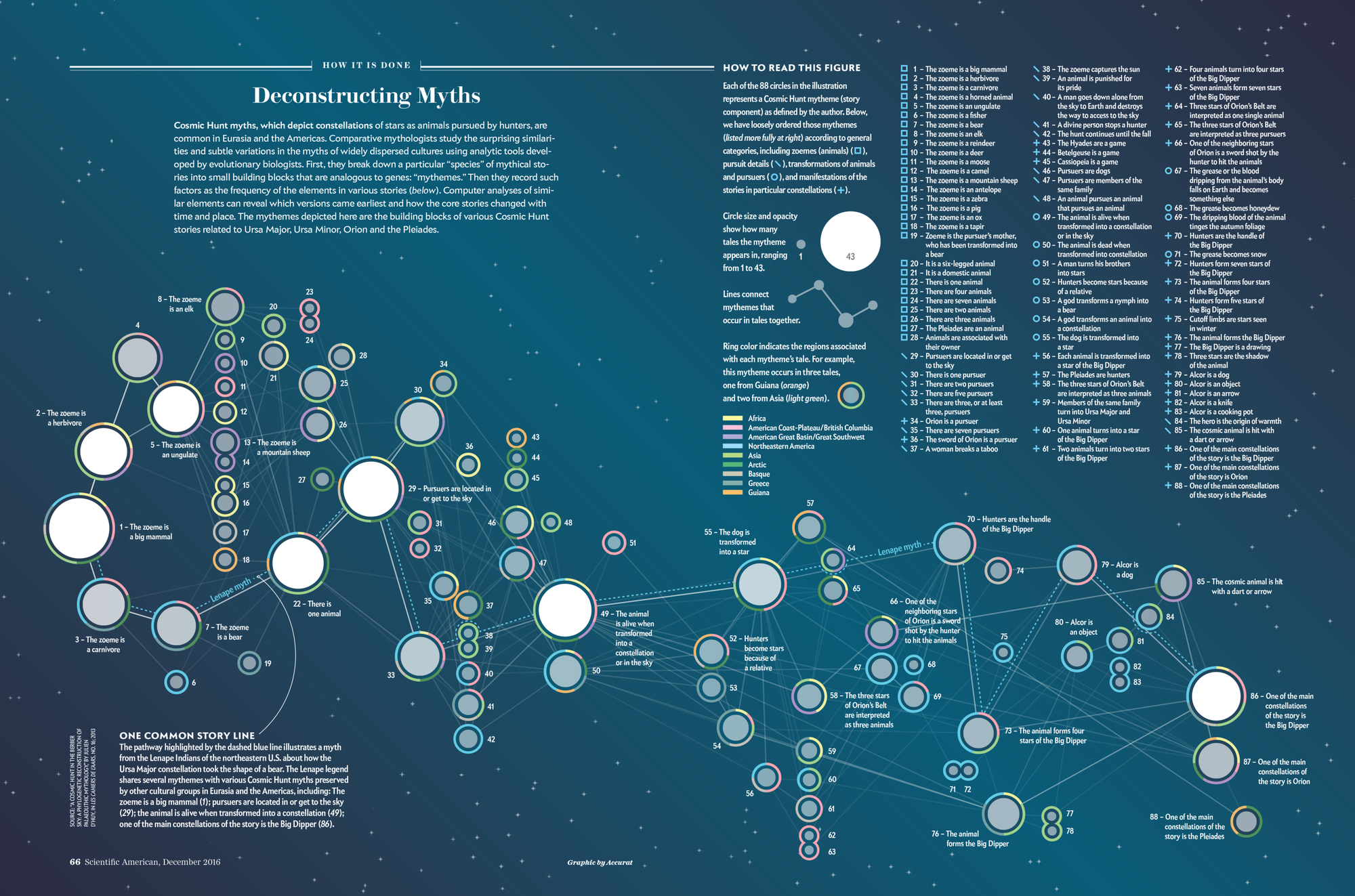
For the December 2016 print issue, Scientific American asked Accurat Studio to develop a data visualization centered on the research paper “A Cosmic Hunt in the Berber sky: a Phylogenetic Reconstruction of a Palaeolithic Mythology” by Julien d’Huy. D’Huy’s work explores how myths change in the retelling down through the generations, and analyzes how those incremental changes can shed light on the history of human migration going as far back as the Paleolithic. (See his Scientific American article “Scientists Trace Society’s Myths to Primordial Origins”).
The original research paper focuses on the cosmic hunt myth in particular; stories about constellations such as the Big Dipper, Orion, and Pleaides. To examine how myths vary across culture and time, the author maps the stories’ minimal narrative units — called mythemes —as if they were genes in a DNA sequence and uses them to reconstruct the genealogy and migrations of the different populations that share stories about constellations.
On supporting science journalism
If you're enjoying this article, consider supporting our award-winning journalism by subscribing. By purchasing a subscription you are helping to ensure the future of impactful stories about the discoveries and ideas shaping our world today.
Our goal was to show hierarchies and dependencies between all the interconnected versions of the cosmic hunt myth, visualizing d’Huy’s results. In this post we will break down the process that led us from the first raw dataset to the final version of the visualization.
Data and Research
D’Huy worked on a myth familiar to most of the palaeolithic human settlements around the world, the cosmic hunt, breaking down the story into mythemes — as he describes them: “an irreducible and unchanging element of the myth that can be similar or different between two versions.”
The dataset we worked with is therefore a matrix of myths and mythemes with boolean values (0 and 1) used to mark the occurrences within the different versions of the story.
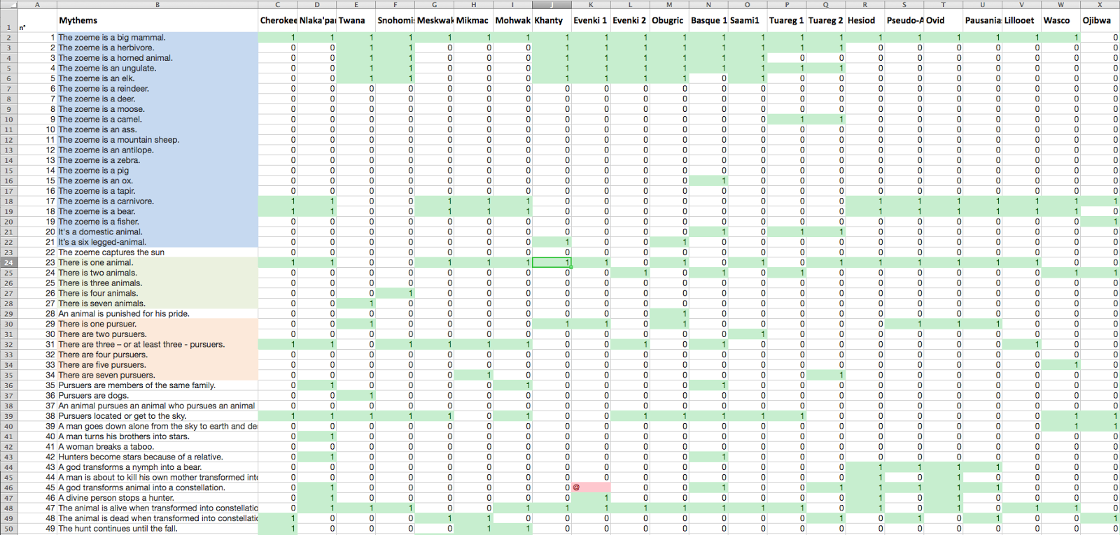
Screenshot from the original dataset in Microsoft Excel. Credit: Accurat
Our first step was to use conditional formatting in Microsoft Excel to highlight like values, in an effort to identify visible patterns. In parallel to this manual exploration of the dataset, we dedicated a week to diving into the topic and to studying the subject in more depth, by reading other work by d’Huy and by collecting and indexing related visual references. Our first visual research focused on collecting meaningful examples of genealogical trees (below), a particular type of representation the authors used extensively in the paper to map the results of their research.
Preliminary visual research: images related to the word “phylogenetic”. A Workspace. Credit: Accurat
This research helped us understand why some visual approaches are more effective than others in different contexts, and prompted us to think through which boundaries we could push in order to create something unique and innovative, but at the same time clear and easy to decode and read. Even when the deadline is short, we believe it’s important to dedicate time to this type of research because, if done properly, it ends up saving precious time in later phases by avoiding early conceptual mistakes.
Also, the original study contained several illustrations, like the one below, that guided our process and helped us understand how the researchers approached the dataset and presented the results to an audience of their peers.
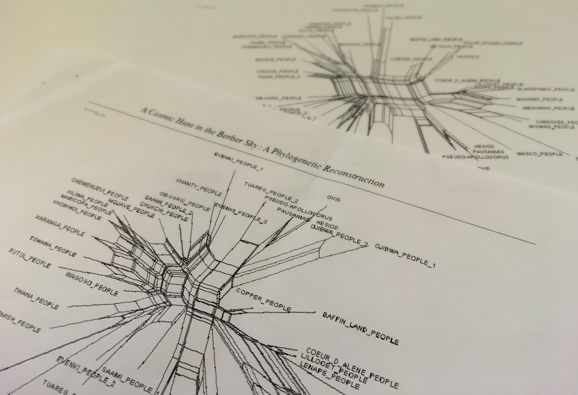
Splitgraphs from the original publication by Julien d’Huy. Credit: Jen Christiansen
Design and Visual Exploration
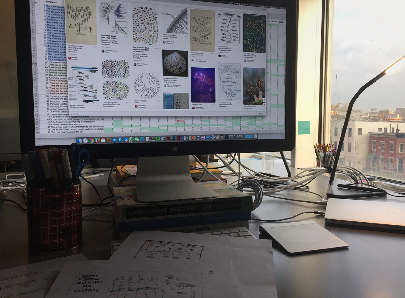
After cleaning and organizing the dataset and indexing all of our inspirations and references, we started making some visual explorations of our own: These first drafts are for us both a way to “see” how the dataset can be organized from different points of view but also serve as a first visual basis to imagine how to create the final visualization. Many of these explorations, even if not used in the final spread, became useful later while tweaking the visual model.
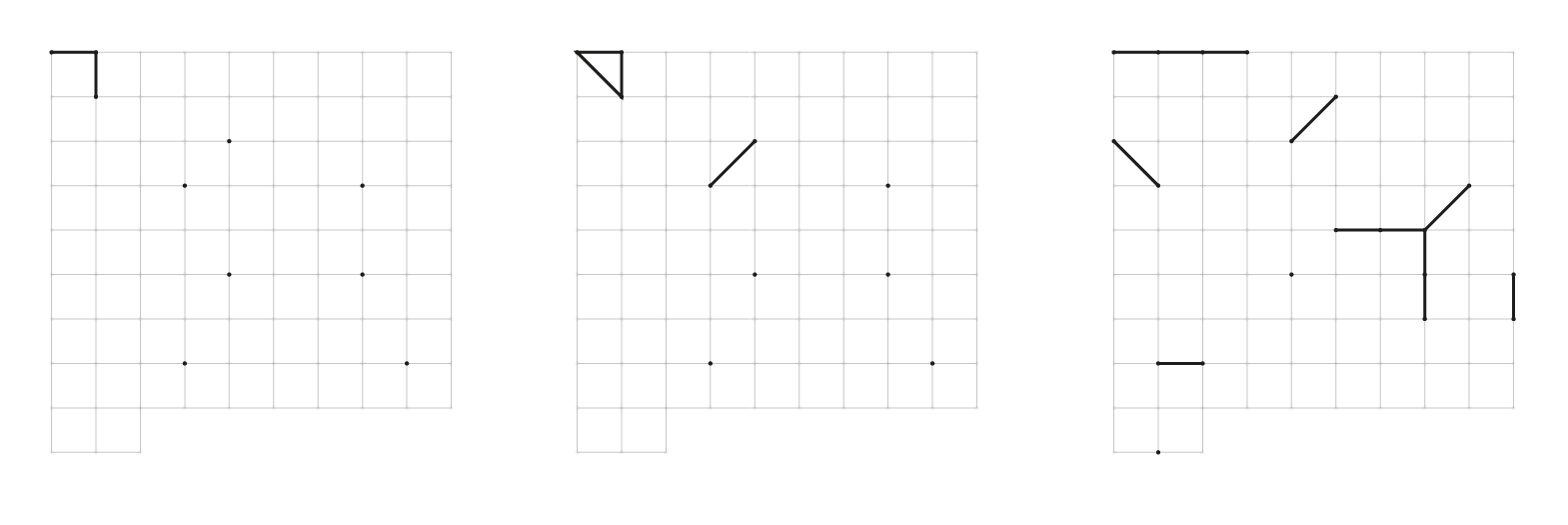
Sketch: Representation of multiple versions of the myth through a matrix of symbols that indicate differences between mythemes numbered in progressive order. Credit: Accurat
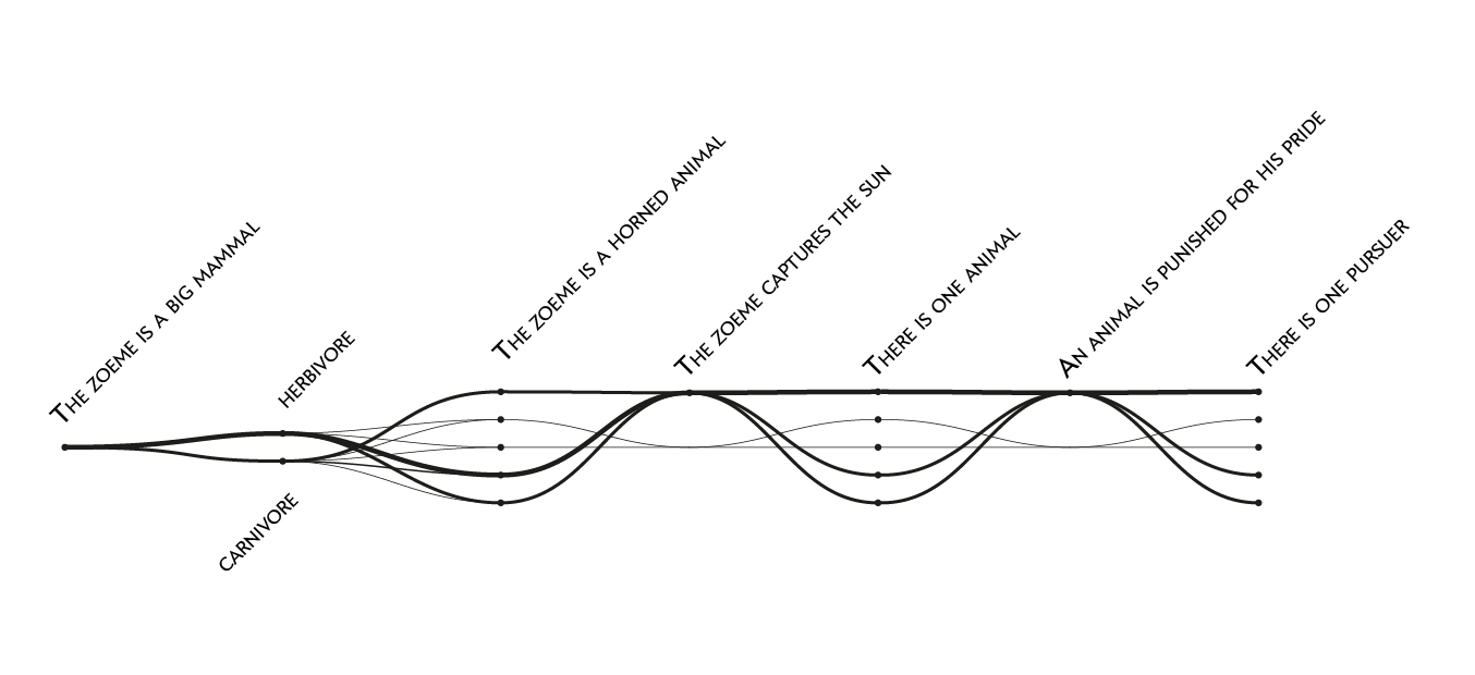
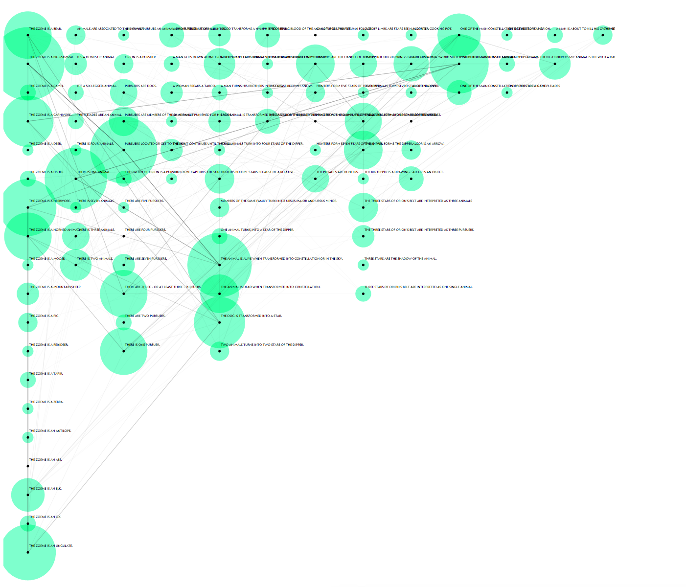
Sketch: One of the first attempts to visualize mythemes as part of a narrative flow. Initially discarded, this approach became useful in a later phase. Credit: Accurat
The first round in this process is always characterized by micro-experiments that tackle possible approaches for the visualization in very quick ways. Then, we move on by iterating on the most promising ideas, and develop more refined examples that begin to consider edge cases in the dataset and all other additional constraints, such as page layout, font sizes and colors.
Since the data structure is built on a single boolean information — the presence or absence of mythemes within each version of the story — the goal of the first iterations was to provide readability at a high level across the two main variables: population/culture (version of the story) and mythemes.
In one of these drafts we visualized all the occurrences of mythemes on a half-circle: the main goal was to show patterns and similarities among story versions, using color and position along the rays to create clusters and highlight similarities.
Sketch: A radial visualization that could be split in two facing pages. Each ray is a mytheme, and colors represent different versions of the myth. Credit: Accurat
This idea was eventually discarded — radial visualizations are not the easiest way to make comparisons — but finally looking at all 93 mythemes in the same page gave us an important first look at the whole picture.
To change point of view, instead of focusing on the mythemes we then started to look at all the individual versions of the story, imagining ways to create a symbol for each of them that would allow the reader to make direct comparisons. We tried arranging the 93 possible mythemes on a square grid and connecting the ones that were present in each version of the story, creating a unique glyph for each population. This draft was one the most important explorations and a big step towards the final design of the visualization
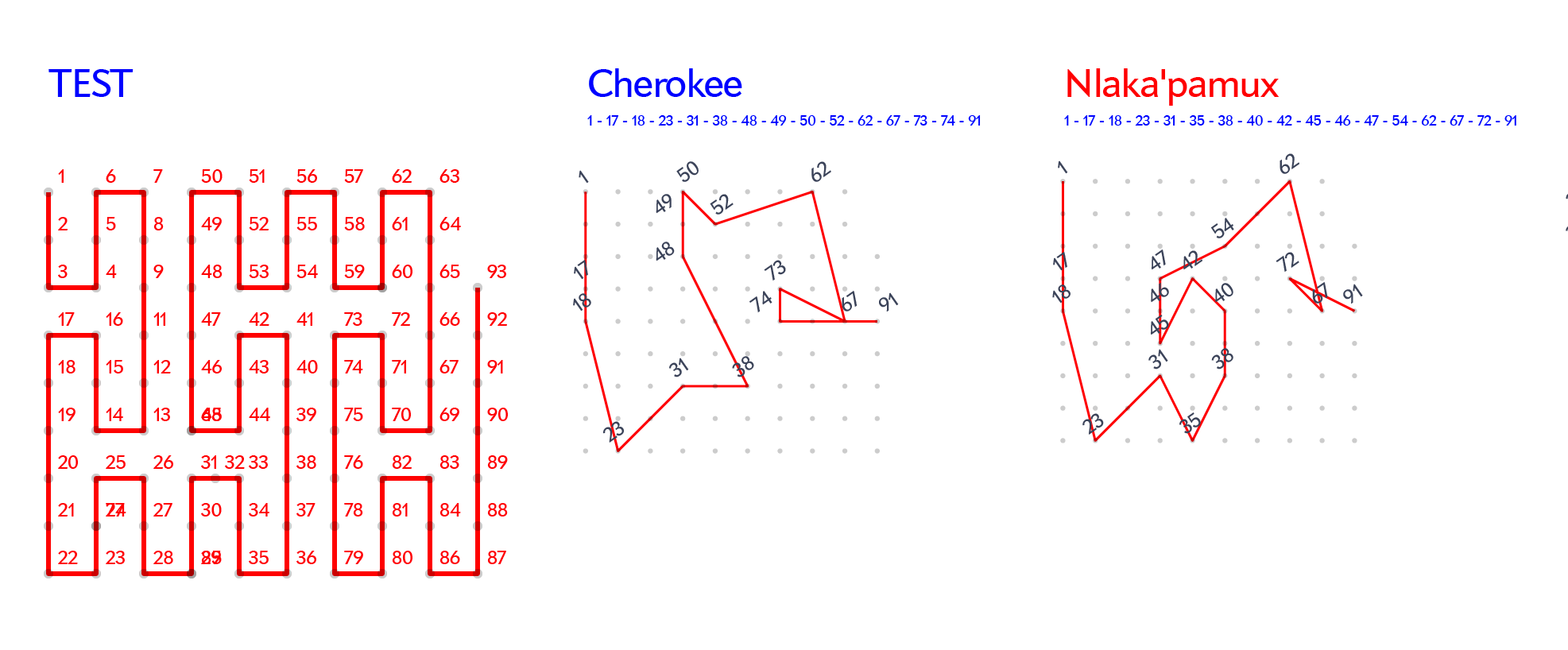
Sketch: visual representation of stories through space-filling curves. Credit: Accurat
Sketch with grid layout. Credit: Accurat
This step allowed us to consider that even if mythemes are thought of as independent units —for example, for the mythemes “The animal is a mammal” and “There are three pursuers,” there isn’t a defined order or interdependence—we imagined they could be ordered in a way that created consequentiality, which brings back the feeling of reading a story by following key passages. We thought it could be interesting to use this method to show that many consecutive mythemes were shared by different versions of the myth.
Even though we had the constraint of a printed magazine for the final piece, due to the nature and peculiarity of the dataset, we decided to create a small interactive prototype to test this assumption and easily check if it was worth pursuing. Doing this helped us arrange the matrix of mythemes by different criteria, testing different layout algorithms and presentation order.

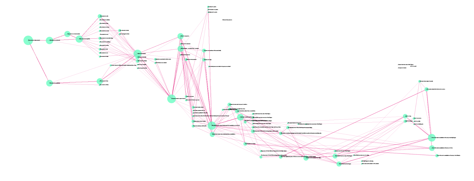
Interactive prototype of the story matrix: Mythemes in this example are ordered exactly as explained in source research paper by d’Huy. Credit: Accurat
We used the interactive prototype to explore all the different versions of the myth, one by one or by highlighting the most common paths and behaviors. This gave us the ability to see the dataset from a completely different point of view, something linear and more tangible.
Quickly putting together interactive examples, even when working on static images as a final output, helps us by making the dataset more easily explorable. In this case, it allowed us to immediately see multiple alternatives for ordering of the mythemes. Using this simple interactive rendition, we were able to categorize mythemes by typology and to test possible layouts. But, most importantly, it revealed how many different stories followed a common path through some key passages, a characteristic of the dataset we decided to highlight in the final piece.
Sketch: Example of alternative ordering, mythemes split into lines depending on their categorization. Credit: Accurat
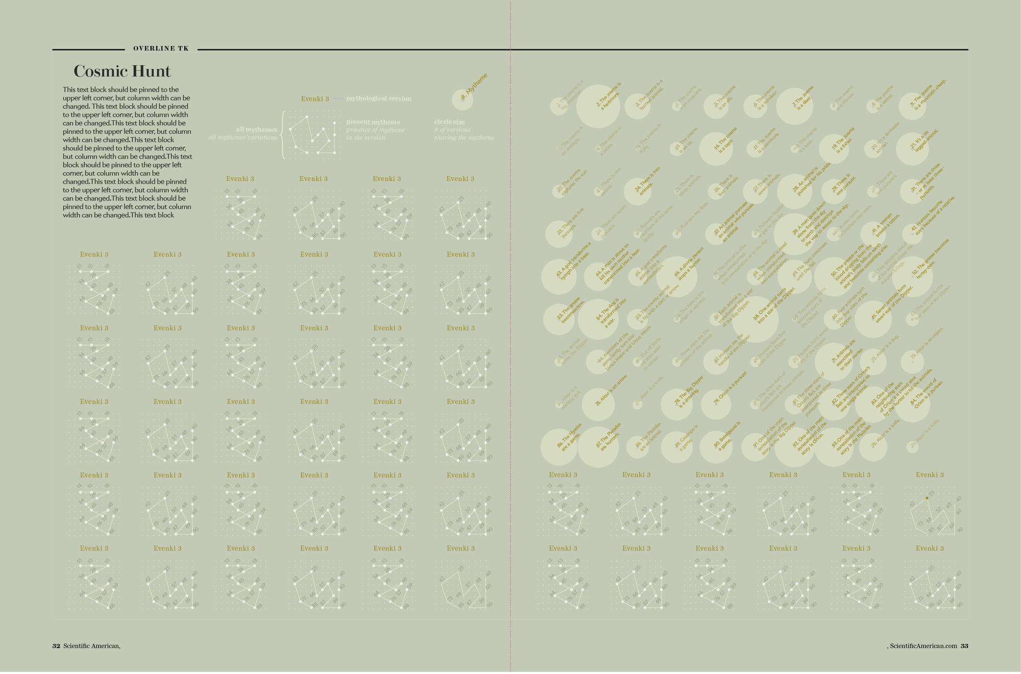
Considering the constraints in proportion and medium imposed by the printed magazine, this story needed a more aesthetically pleasing layout. The grid looked too rigid and didn’t use the space evenly. Our next step was to literally unfold it.
Sketch: the “unfolded” grid of my themes. Credit: Accurat
This is actually the very first “wireframe” of the visualization we ended up choosing for the final graphic. From the square matrix we moved to a much more linear structure, allowing the reader to follow the different stories from left to right by shifting from one mytheme to the next one without having to go back and forth on a grid. At this point, we were confident in the chosen visual model and we were finally able to start focusing also on stylistic aspects, to make the image more effective and appealing and to make it consistent with the magazine’s style.
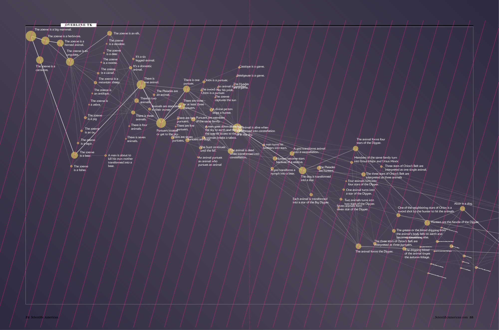
Sketch: First diagonal page layout. Credit: Accurat
Sketch: Intermediate step of refinements. Credit: Accurat
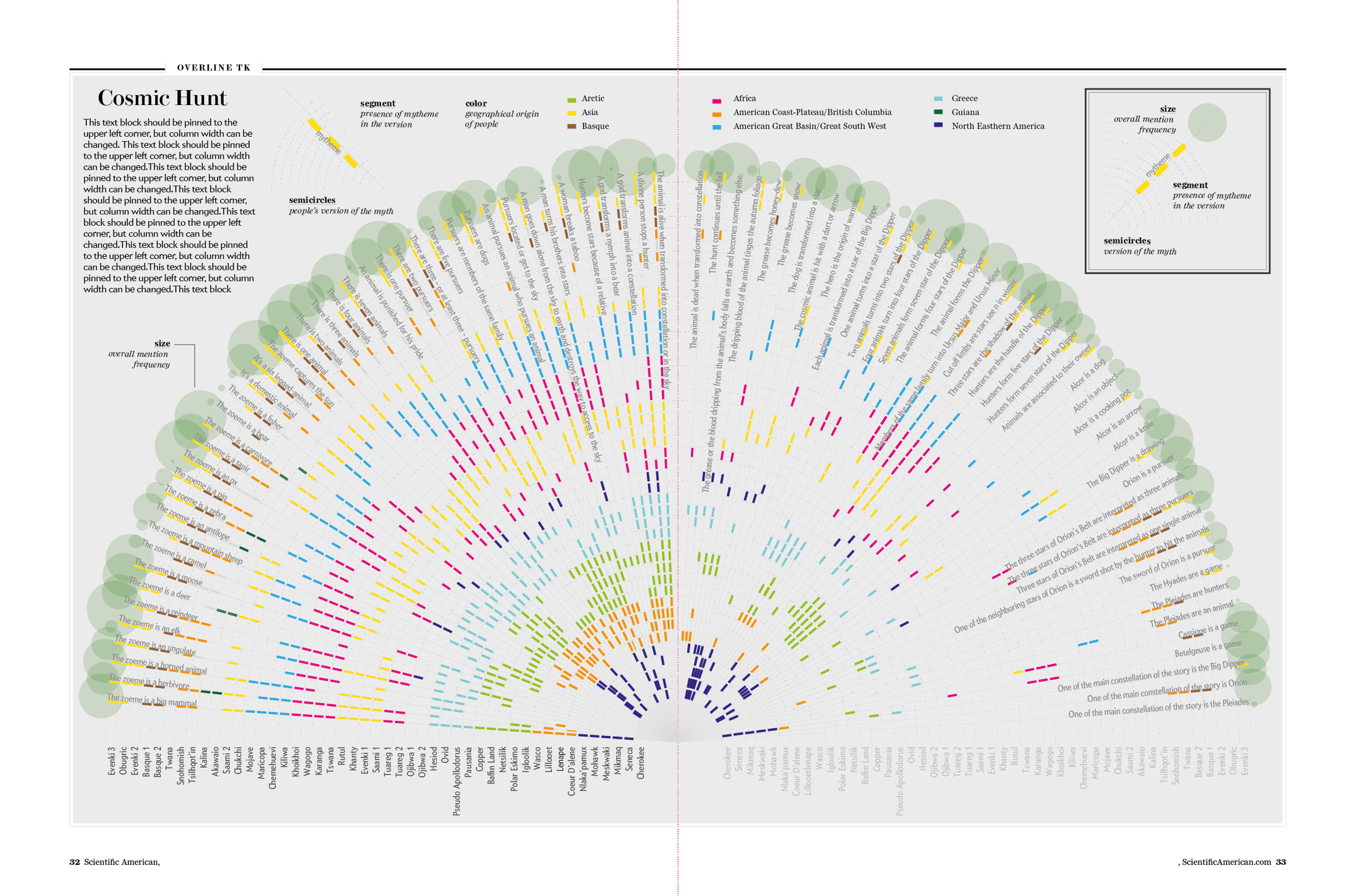
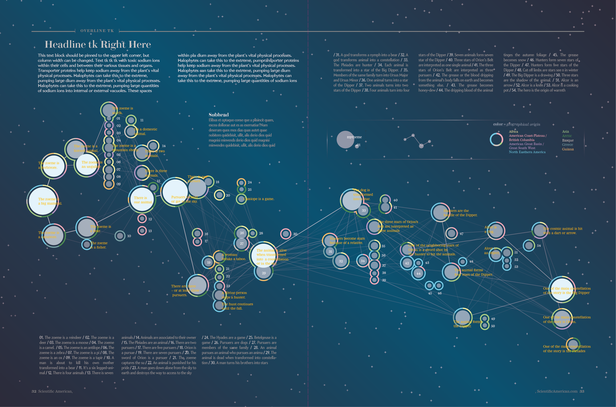
During this process of visual refinement we also decided to number each mytheme and to provide a key on the right-hand page but, most notably, to use colors on the outer ring of each mytheme to encode information on the geographic region of the populations whose myth included it.
The last step was then to run print tests to resolve issues related readability, size and color contrast, and the image was finally ready for print.
Final. Credit: Accurat
The visualization as it appears in the December 2016 issue. Credit: Accurat; Photo Credit: Jen Christiansen