This article was published in Scientific American’s former blog network and reflects the views of the author, not necessarily those of Scientific American
Two years ago, the Keeling Curve was affirmed as a National Historic Chemical Landmark. I wrote the post below in honor of that event. What has the curve revealed since then? Atmospheric carbon dioxide levels are still climbing, and still breaking records.

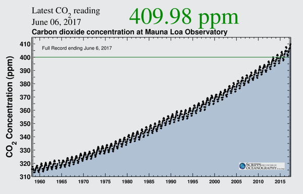
Keeling Curve from June 6, 2015 through June 6, 2017. Credit: Scripps Institution of Oceanography, UC San Diego
On supporting science journalism
If you're enjoying this article, consider supporting our award-winning journalism by subscribing. By purchasing a subscription you are helping to ensure the future of impactful stories about the discoveries and ideas shaping our world today.
A Climate Change Data Visualization Gains National Landmark Status (first published on on June 11, 2015)
The Keeling Curve is a benchmark data visualization in climatology. Often overlooked by chart collectors in favor of its younger, arguably more memorably-named climate viz cousin the "hockey stick graph," which tracks temperature over time, the importance of Charles David Keeling's plot of atmospheric carbon dioxide should not be forgotten. To that end, on June 12, 2015 at the Scripps Institution of Oceanography, it will be re-affirmed by the American Chemical Society as a National Historic Chemical Landmark. (Another dedication event took place in April at the data collection site, NOAA's Mauna Loa Observatory).

Keeling Curve as of June 4, 2015. Credit: Scripps Institution of Oceanography, UC San Diego
As stated on the dedication site, "Keeling’s legacy includes a measurement program that endures to this day, providing an authoritative record of atmospheric CO2 concentrations that is a cornerstone of modern climate science. The Keeling Curve, the iconic graph that presents these data, is a powerful symbol of the human impact on the environment and the role of fossil fuels in global climate change."
Keeling—a geochemist affiliated with Scripps Institution of Oceanography from 1956 until his death in 2005—was a true pioneer. In an effort to establish a baseline of knowledge about atmospheric carbon dioxide concentration—with the long term goal of helping to determine the overall impact of greenhouse gas emissions—Keeling began measuring CO2 levels using infrared gas analyzers in March 1958 at sites in Hawaii, Antarctica, and California. His initial findings, published in 1960, revealed a seasonal pattern, with low levels of atmospheric CO2 in October rising to high levels of CO2 in May. This mirrors northern hemisphere vegetation cycles. More robust levels of photosynthesis—and CO2 capture by plants—in the summer, followed by lower levels of photosynthesis—and atmospheric CO2 accumulation—in the winter. Continued data collection at the U.S. Weather Observatory in Mauna Loa, Hawaii confirmed a longer-term trend that caught Keeling's attention early on. CO2 levels (then and now) continue an uphill climb, resulting in a seasonal oscillating pattern superimposed on a steadily rising curve. Indeed, in May of 2013, levels reached 400 parts-per-million for the first time in at least 800,000 years. And we seem to be marching steadily towards 450 ppm, a threshold that some suggest will kick us 2 degrees Celsius above pre-industrial levels, thanks to the greenhouse effect.
That temperature trajectory has been tracked by the aforementioned—and arguably more well-known—hockey stick graph, which shows change in the average surface temperature of the Northern Hemisphere over time, based on paleoclimate indicators and recent thermometer readings. Its popularity may be simply because people can relate more easily to temperature than to carbon dioxide levels. But subsequent debates on the validity of the paleo-reconstructed values surely stoked interest. First published in 1999 by Michael Mann, Raymond Bradley, and Malcolm Hughes, it entered the public consciousness when prominently displayed in the 2001 United Nations Intergovernmental Panel on Climate Change report. (For pdf downloads of the full original report, click here). It has become an iconic graphic for climatologists, skeptics, and the public at large. A 2005 variation on the original is shown below, including global surface temperature projections, as published in "Vital Climate Graphics" by the United Nations Environment Programme and GRSI-Arednal.

A 2005 variation on the hockey stick graph. "Temperature trends and projections," by Philippe Rekacewicz, UNEP/GRID-Arendal, from Vital Climate Change Graphics Update, 2005.
Thanks to the American Chemical Society for honoring the Keeling Curve, and reminding me that scientific visualizations of great import are often humble line charts that that gracefully reveal the real star—persistent and careful data collection.