This article was published in Scientific American’s former blog network and reflects the views of the author, not necessarily those of Scientific American
On supporting science journalism
If you're enjoying this article, consider supporting our award-winning journalism by subscribing. By purchasing a subscription you are helping to ensure the future of impactful stories about the discoveries and ideas shaping our world today.
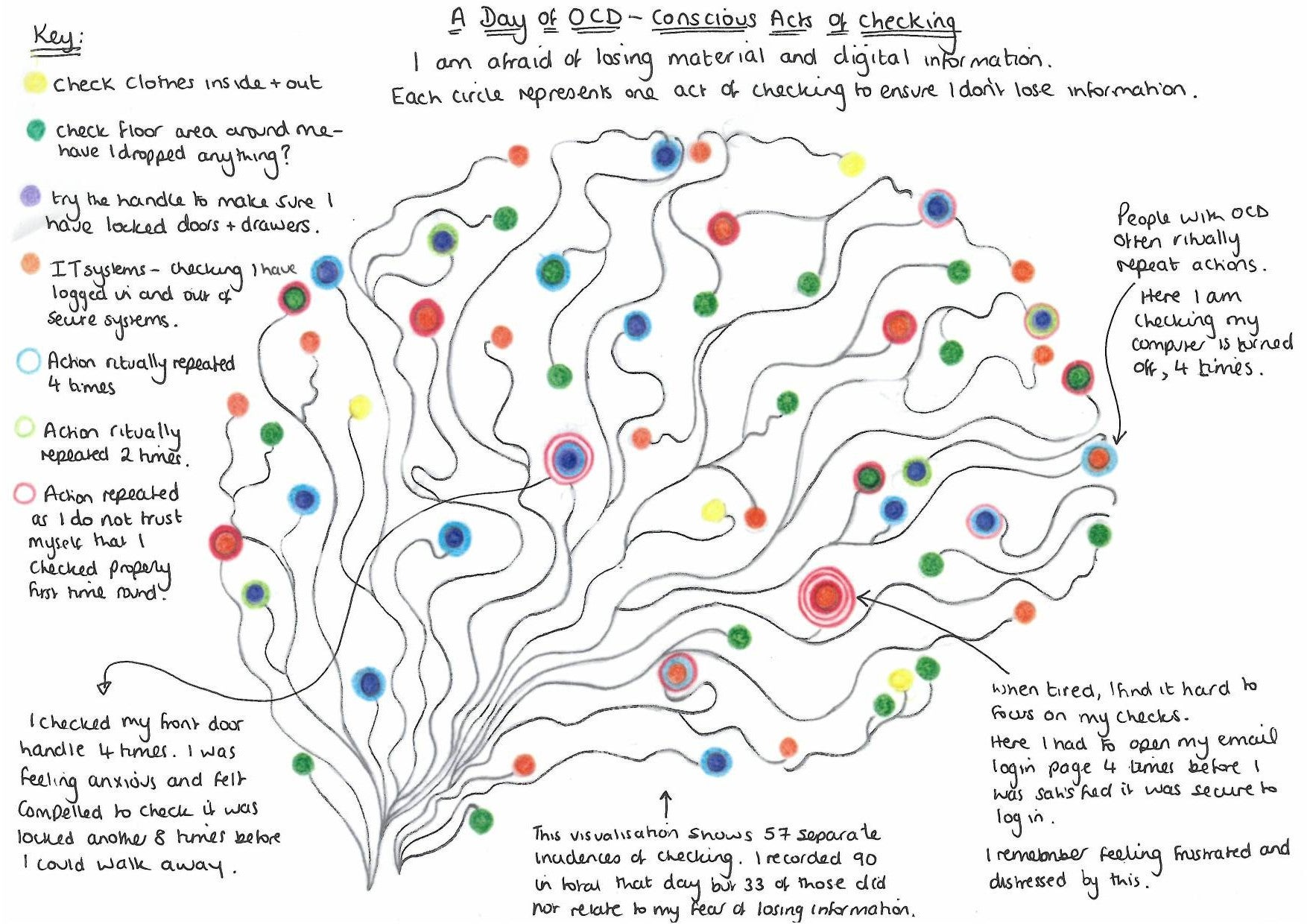
This week, as Mental Health Awareness Month draws to a close, I’m compelled to share an example of how data visualization can be many things we don’t necessarily expect it to be—personal, moving, equal parts imaginative and meticulous. Jill Simpson, a sociology research fellow at the University of York, recently published an article on visualizing mental illness, accompanied by a hand-drawn diagram documenting a day in her own life as a person with anxiety and Obsessive Compulsive Disorder (commonly known as OCD).
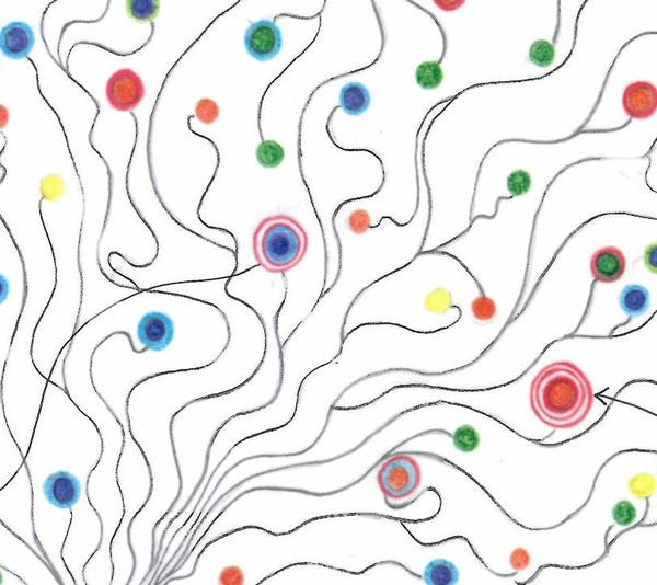
Credit: Jill Simpson
Apparently drawing inspiration from Giorgia Lupi’s and Stefanie Posavec’s Dear Data project, Simpson drives home some crucial messages. First, conditions like OCD are real and tangible health issues that don’t deserve be minimized as they often are in our culture. Second, everyone’s experience with mental illness is unique—this seems self-evident, but the specific and intimate nature of Simpson’s drawing reveals something essential that a list of symptoms simply cannot encompass. And finally, data visualization can be a powerful tool for communication and understanding, not only among people, but also within oneself.