This article was published in Scientific American’s former blog network and reflects the views of the author, not necessarily those of Scientific American
Photographers and image creators (including severalpeople in this blog network) have been complaining about the flagrant contravention of image usage rights on blogs for ages. After being educated on this by Glendon Mellow and others over the years, I’ve tried to only use creative commons-licensed images, and to provide proper attribution. This requires a bit of extra overhead on my part, but it's not really that onerous. Giving credit is obviously the right thing to do, and when people are using their art to make a living, I think it's important to respect their wishes about how that art is used.
Except...
I like to write about published papers, and I like to include actual data in my posts. I’m not sure how many of you actually pay attention to the graphs and things that I include, but I think it’s important to show the actual data behind the words I’m typing. The trouble is that scientific publishingisbroken. I’ve been ranting about this for years, and though many strides have been made towards open access, preprints and the like, there’s still a lot of data (mostly paid for by you, dear taxpayer) locked behind paywalls.
On supporting science journalism
If you're enjoying this article, consider supporting our award-winning journalism by subscribing. By purchasing a subscription you are helping to ensure the future of impactful stories about the discoveries and ideas shaping our world today.
In the past, I’ve reached out to journals for permission to use isolated figures and either never heard back from them or didn’t hear back for weeks. So I’ve used screengrabs of figures in posts and have never had a complaint, but for various reasons I think I need to shape up a bit and have a better justification. So I’ve got a couple of options.
The first is to only post images from open access journals. I should probably err towards this option - I am strongly in favor of open access (even radical open access) anyway, so I should probably do more to promote open access studies.
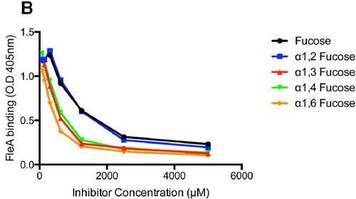
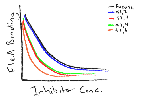
But sometimes there are studies that are just too good to pass up. The second option is to re-create graphs from these studies, and just make sure it’s clear that it’s not the real data. Example:

Figure 1B from a recent PLoS Pathogens paper. All articles published at PLoS are licenced under a pretty generous CC-BY license
Vs

Here's my attempt at re-creating the above data. Hopefully no one would confuse this for the real thing.
Apparently, there's also an argument that using data in this way is fair use. And also, the folks here at SciAm can help me get permission. But, drawing graphs by hand is kinda fun... I'll probably assert fair use if I get lazy or if there's a particularly complicated (but eddifying!) graph in a paper. If you have other ideas (or disagree with anything here), let me know in the comments section what you think.