This article was published in Scientific American’s former blog network and reflects the views of the author, not necessarily those of Scientific American
The impending repeal of the Affordable Care Act is not the only threat to health care these days. Another crisis, one you may not have heard of, concerns a radioactive isotope called technetium 99. This obscure atom is used in a medical imaging technique called single-photon emission computed tomography, or SPECT, used to diagnose millions of patients every year. As the few nuclear reactors that produce technetium 99 prepare to shut down due to age and risk of breakdowns, doctors are increasingly worried about shortages. In the February issue of Scientific American, journalist Mark Peplow discusses the details of this challenge and how scientists are attempting to address it.
This being a somewhat obscure (and let’s face it—potentially boring) topic, it stands to benefit from graphical explanations in addition to verbal ones. As graphics editor for Peplow’s article, I felt it was most important to visualize what is at stake from an average reader’s perspective: how many patients rely on technetium 99, and what sorts of conditions do they have? The graphic below breaks down the numbers.
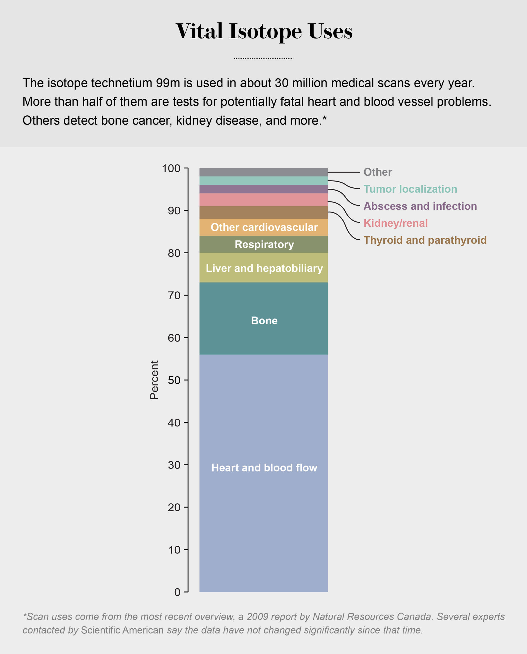
Credit: Amanda Montañez
Source: Natural Resources Canada. Presented to the House of Commons Standing Committee on Natural Resources, June 2, 2009
On supporting science journalism
If you're enjoying this article, consider supporting our award-winning journalism by subscribing. By purchasing a subscription you are helping to ensure the future of impactful stories about the discoveries and ideas shaping our world today.
But there are other visualization opportunities here as well. For example, where does the existing technetium 99 come from? How is it currently produced, and what new technologies might be deployed going forward? The graphic below, from a 2013 story in Nature, uses clean, friendly visuals to answer these questions in an accessible way.

Credit: Nature News
Source: NEA/OECD
I encourage you to read both stories for an in-depth look at the medical isotope crisis. But if you’re looking for a quick primer, these information graphics offer a decent summary of the topic—with minimal reading required.