This article was published in Scientific American’s former blog network and reflects the views of the author, not necessarily those of Scientific American
Last week, the above chart (from The New York Daily Tribune, September 29, 1849) was featured in Scott Klein's article "Infographics in the Time of Cholera" on ProPublica. Fans of historic data visualizations are no doubt familiar with John Snow's cholera map, published in 1854. But Klein's post offers up a broader view, discussing the line chart above, and giving us a sense of how newsrooms grappled with data displays in the mid-1800's. He writes:
"Although graphical displays of data were not unheard of in scholarly and engineering books, they were exceedingly rare in U.S. newspapers of that time...
The Tribune graphic is a snapshot in miniature of a standard yet to come, revealing a growing sense of awareness of the potential for well-designed information displays to help people understand and solve problems. And it has important lessons to teach us more than 166 years later."
Klein's post gives a sense of New York during the epidemic, as well as the challenges facing publications at the time when it came to printing charts, both technological and those related to audience graphicacy. And it got me thinking….how did Scientific American cover the topic at the time?
On supporting science journalism
If you're enjoying this article, consider supporting our award-winning journalism by subscribing. By purchasing a subscription you are helping to ensure the future of impactful stories about the discoveries and ideas shaping our world today.
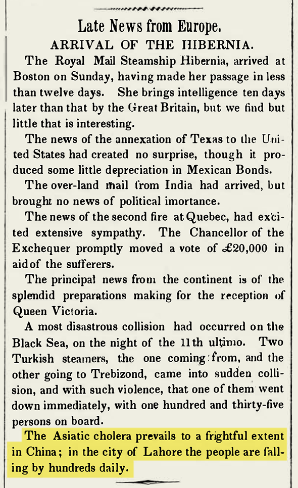
Founded in 1845 as a 4-page weekly devoted primarily to inventions, Scientific American also covered international news in brief. Indeed, cholera was mentioned in the very first issue (August 28, 1845).
But engravings in the early years of the publication skewed heavily towards patent illustrations. So perhaps I shouldn't have been surprised that the first graphic associated with an article on cholera in Scientific American was that of an invention. I hereby present—somewhat sheepishly, and with the caveat that in-depth medical coverage in the magazine didn't take hold until around 1921—a proposed cure in the form of a “galvanic belt,” published in the January 13, 1849 issue:

Every few weeks, cholera reappears in Scientific American, with reports of deaths overseas as well as emerging, and quite varied, ideas on what the cause may be.
The data tables of New York cases introduced in the June 23, 1849 issue are closer in spirit to the New York Tribune coverage that Klein details in his post, although the source is unclear in the first installment.
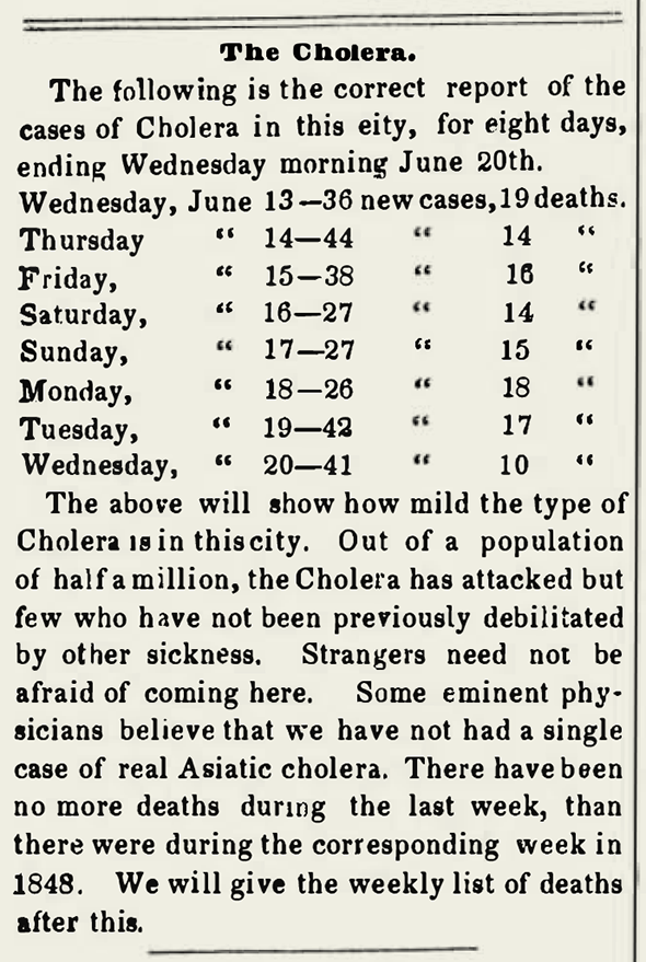
June 23, 1849
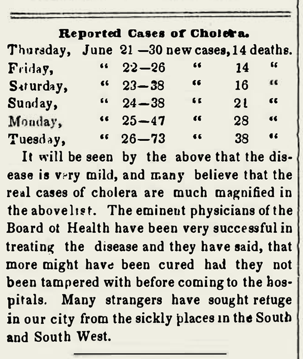
June 30, 1849
The editors began questioning the data in the next installment:
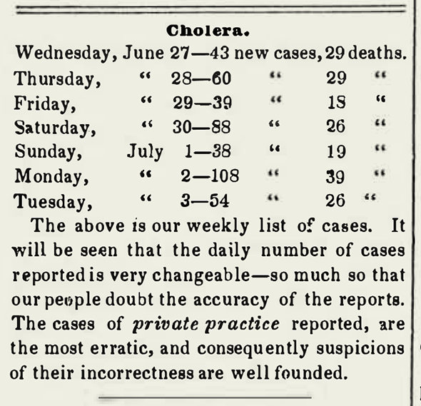
July 7, 1849

July 14, 1849
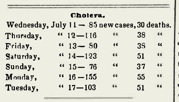
July 21, 1849
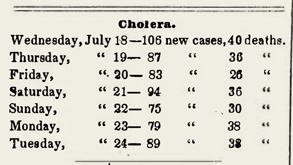
July 28, 1849
After a series of brief articles throughout the year outlining a variety of possible cholera causes and containment ideas, things came to a bit of a head in the July 28 issue, in which the editors printed this introduction (below), followed by seven short text-only pieces in tandem, with cholera prevention measures and cures from a variety sources, ranging from suggested doses of hydro-sulphuric acid, to surrounding oneself with peeled onions, and surmised connections with thunder storms.
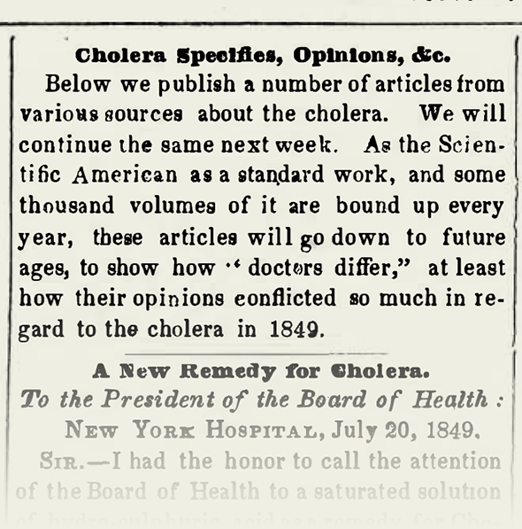
July 28, 1849
On August fourth, Scientific American stopped printing New York cholera case data tables, "for no dependence whatever can be placed in them."
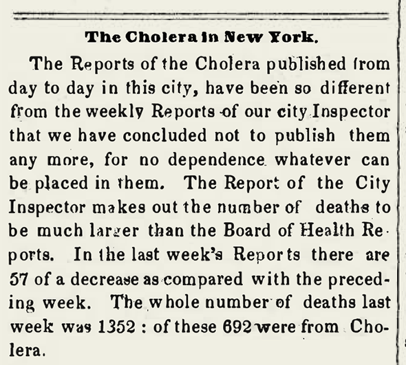
August 4, 1849
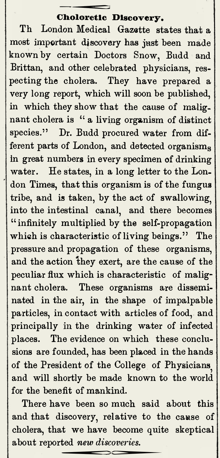
At long last, to those of us looking back with modern knowledge of cholera in mind, a glimmer of our current understanding emerges in the October 27, 1849 issue, along with a reference to Dr. Snow. Ironically, by now the editors have become skeptics, leading to this exasperated ending,
"There have been so much said about this and that discovery, relative to the cause of cholera, that we have become quite skeptical about reported new discoveries."
