This article was published in Scientific American’s former blog network and reflects the views of the author, not necessarily those of Scientific American
At what point in her career can a young or aspiring scientist expect to achieve success in her field? This week, the journal Science released a paper that attempts to answer this question. Using data from Google Scholar, Web of Science, and Physical Review journals, researchers compiled profiles of thousands of scientists across seven disciplines, tracing their careers over time and measuring the impact of each paper they published.
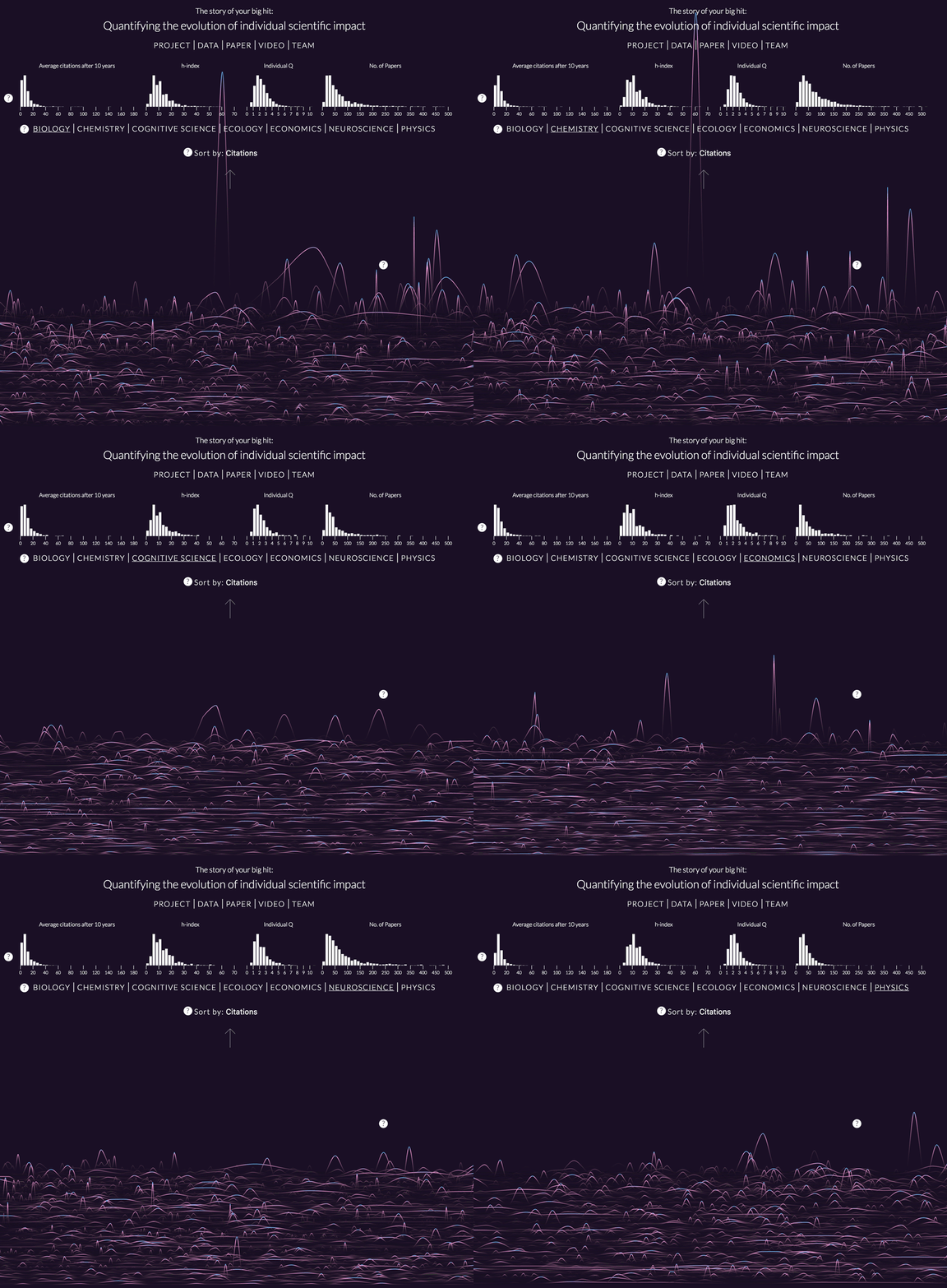
Interestingly, what they found is that there is no predictable pattern of success over one’s career. In fact, it seems completely random—a scientist’s most impactful publication might just as likely come at the beginning of his career, as toward the end or somewhere in the middle. And this rule holds true for all seven fields included in the study: biology, chemistry, cognitive science, ecology, economics, neuroscience, and physics.
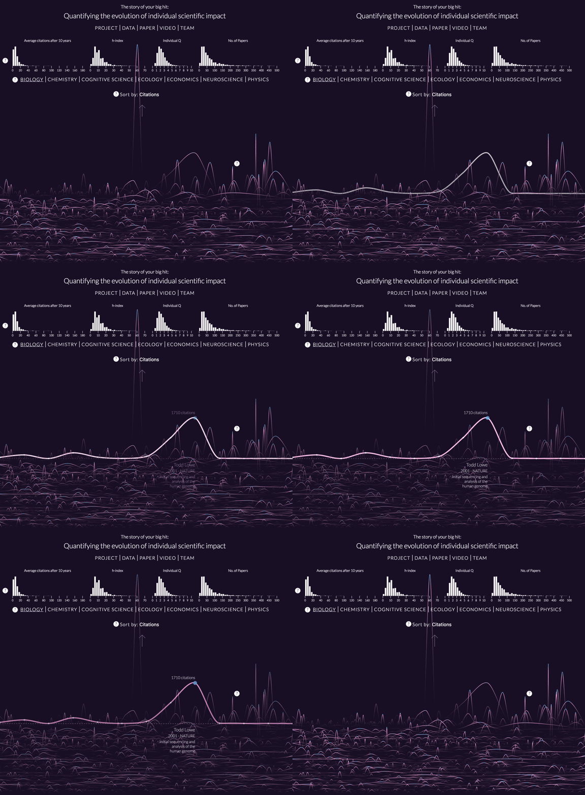
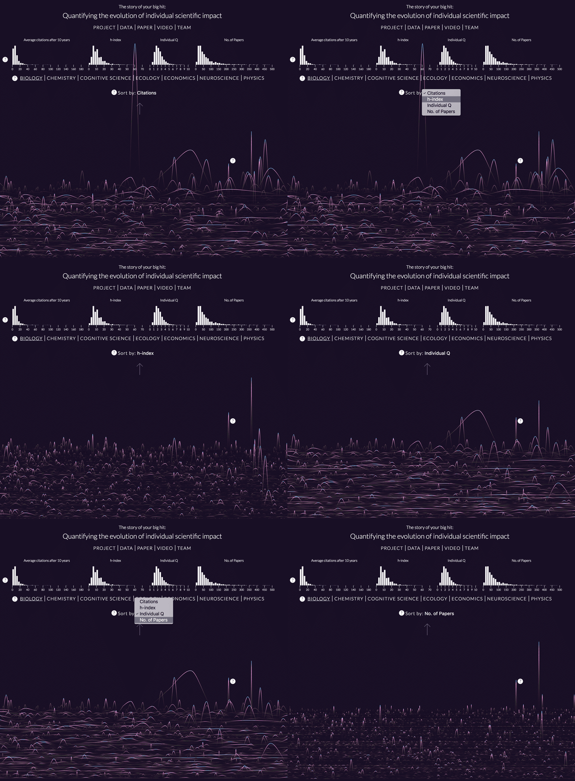
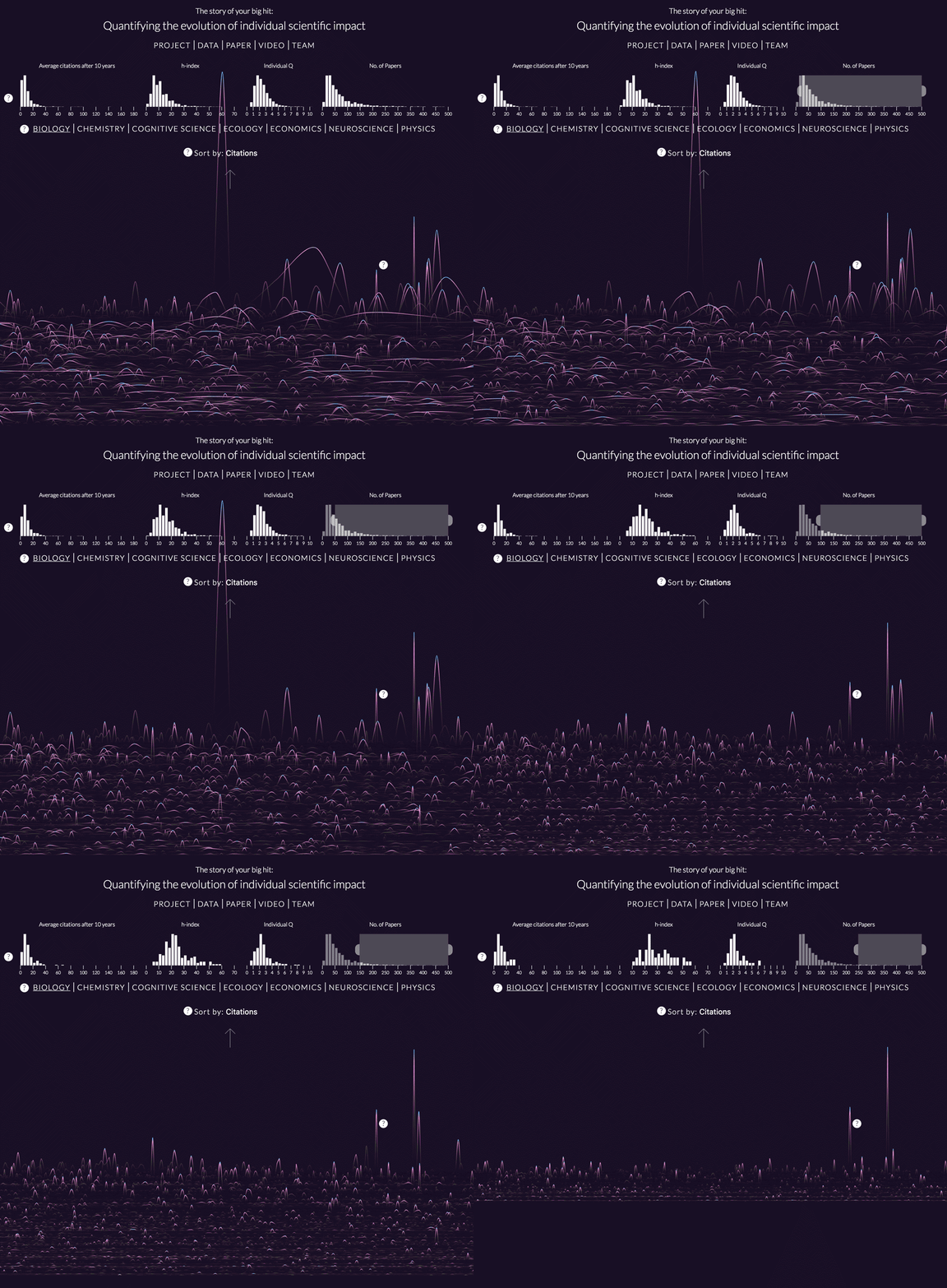
Perhaps this seems like an underwhelming result. However, when presented visually, it actually becomes rather intriguing. Kim Albrecht, a data researcher and designer at the Center for Complex Network Research, has assembled the enormous quantity data from the study into a beautiful and information-rich work of interactive data visualization.
On supporting science journalism
If you're enjoying this article, consider supporting our award-winning journalism by subscribing. By purchasing a subscription you are helping to ensure the future of impactful stories about the discoveries and ideas shaping our world today.
The series of GIFs below demonstrate how the visualization works, but you can also explore the tool on your own here. And in case you missed it, check out Albrecht’s Cosmic Web visualization, which I wrote about earlier this year.

Credit: Kim Albrecht
Credit: Kim Albrecht
Credit: Kim Albrecht
Credit: Kim Albrecht
Credit: Kim Albrecht