This article was published in Scientific American’s former blog network and reflects the views of the author, not necessarily those of Scientific American
Editor’s Note: The following is a guest post from freelance data designer Jan Willem Tulp.
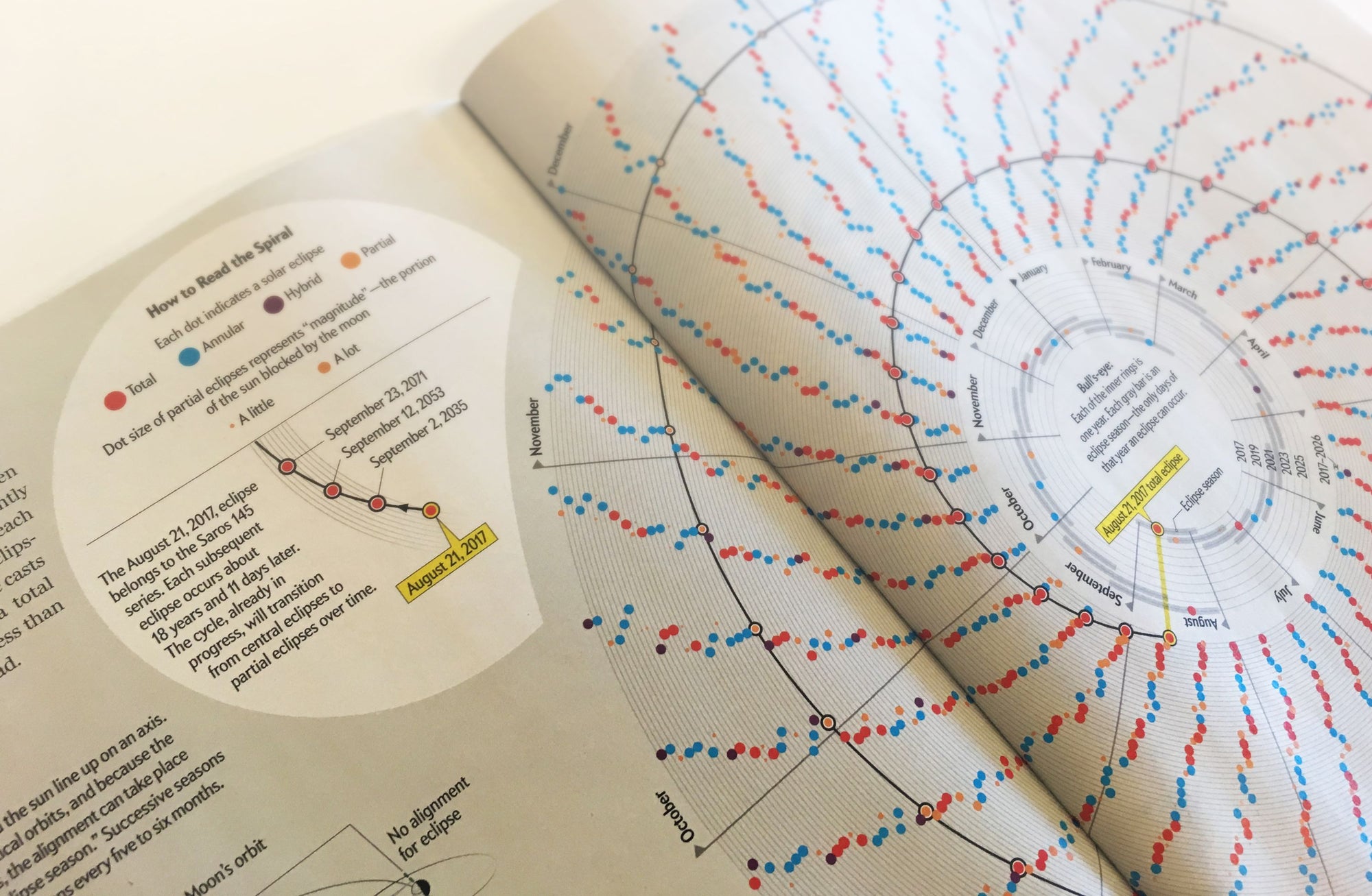
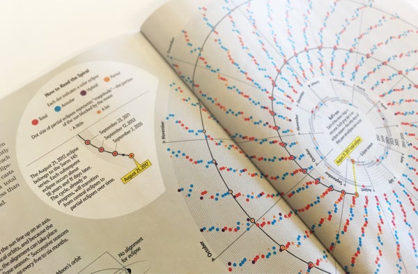
Eclipse season chart by Jan Willem Tulp in the pages of Scientific American. Credit: Jen Christiansen (photograph)
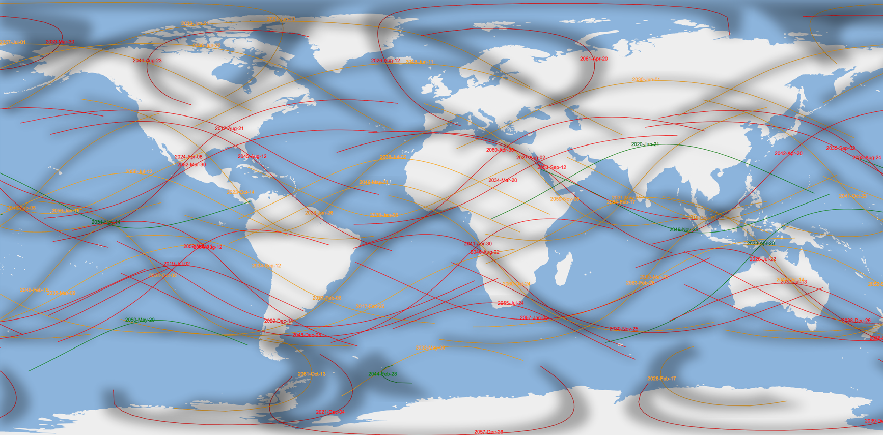
On August 21, 2017, a total eclipse of the sun will be visible from within a narrow corridor that traverses the United States. Scientific American graphics editor Jen Christiansen asked me to create a set of visualizations to commemorate this event: for the August 2017 print magazine as two 2-page spreads and on their Web site as an interactive graphic. The main goal was to give users and readers a better understanding of this upcoming eclipse by placing it in geographic and temporal context.
On supporting science journalism
If you're enjoying this article, consider supporting our award-winning journalism by subscribing. By purchasing a subscription you are helping to ensure the future of impactful stories about the discoveries and ideas shaping our world today.
Starting with the data
In my process I always like to create initial (digital) sketches and prototypes with actual data. This allows me to get a sense of the characteristics—like quality and size—of the data, just to get an idea of the potential for a visualization. And although sketching without data may work to some extent, in my experience you make too many assumptions if you don’t work with the actual numbers, resulting in design ideas that may not work. A big part of the process consists of evolving the initial sketches and prototypes to a working concept by continually making improvements and trying out alternatives.
For this project I used information from the Web site eclipsewise.com, created by Fred Espenak, who has calculated a large number of eclipse predictions. His Web site includes a data set called Five-Millennium Canon of Solar Eclipses: –1999 to +3000, which contains metadata about eclipses, including the type of eclipse, the date and time of an eclipse as well as the path that an eclipse travels.

SKETCH: Our initial idea was to visualize all 5,000 eclipses at once. But after trying it out visually, it became clear that this was not a viable option, and some filtering would be required. In this example I devised a filter that would show only eclipse paths that intersect with a small geographic region. The map here is represented by a grid of latitude and longitude lines (continents would come later). Eclipses are color-coded by type. Credit: Jan Willem Tulp
Building the map
A basic map of eclipse paths is actually quite straightforward. There are, however, quite a few variables to play with, such as which map projection to use and which filters to apply to make sure the map isn’t too crowded with paths, yet still communicates a rich amount of information. Early explorations with the data (as described above) helped to inform the time interval I would end up using for the final version, 2017 to 2046.
As the case for many projects, getting the colors right involved a lot of trial and error. One of the things I always keep in the back of my mind—to help inform design decisions—is: “What does the data represent?” or “What does the data mean?” For instance, with regards to color, a few things I kept in mind while working on this project: eclipses happen during daylight; they are shadows cast on Earth’s surface; and an annular eclipse is one where you still see a ring of the sun around the moon. Although some of these ideas did not end up in the final result, they were part of my prototype trials and helped to shape my ideas.
SKETCH: Eclipse map where the area between the upper and lower bounds of the path are shown as shadows. The color of the central paths of the eclipse is based on the type of eclipse. Credit: Jan Willem Tulp
Representing eclipse seasons
I think one of the more interesting views on the data relates to eclipse seasons and cycles. The final spiral graphic in the magazine on this topic did not start as a graphic of seasons, however, but rather a graphic about two other periodic cycles of solar eclipses.
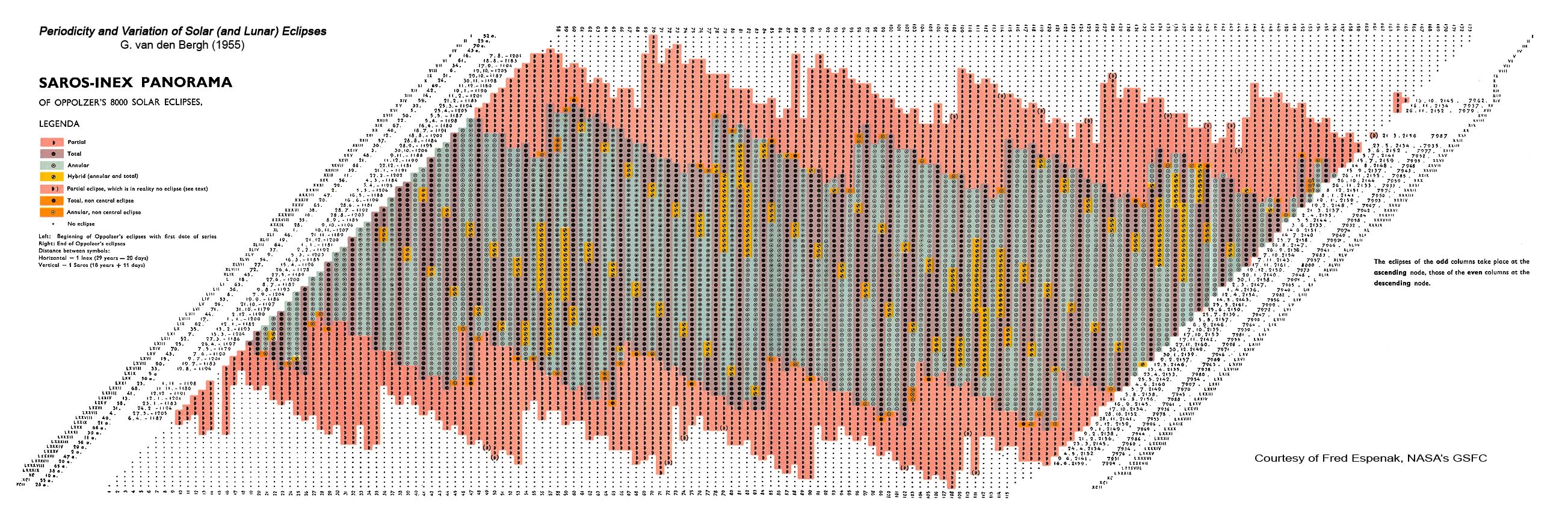
A number of different eclipse cycles have been investigated, and the most useful are the Saros and the Inex. These are two eclipse repetition cycles for which certain orbital parameters are repeated. On the eclipsewise.com Web site there is a large graphic (attributed to “Periodocity and Variation of Solar (and Lunar) Eclipses,” by G. van den Bergh, 1955) that shows the relation between the Saros and Inex cycles. As Espenak wrote, “One step down in the panorama is a change of one Saros period (6,585.32 days) later while one step to the right is a change of one Inex period (10,571.95 days) later.”
My initial idea was to re-create this graphic and make several enhancements—for instance, to use small icons for the type of eclipse instead of just color-coding them, to show more directly what each eclipse looks like.

SKETCH: A re-creation of part of the Saros / Inex panorama graphic with small icons used to depict the type of eclipse (partial eclipses are denoted with a smaller dot inside a larger circle), and eclipses for the next 25 years highlighted. Eclipses that share a column are members of the same Saros series: Eclipses that share a row are members of the same Inex series. Credit: Jan Willem Tulp
However, even though you can see there is some repetition going on, it turned out that understanding the graphic, how you should read it and what exactly you should get out of it was still quite hard. One reason is that because of the different intervals of the periodicity of the Saros and Inex cycles, the way time is organized in this graphic is quite hard to understand.
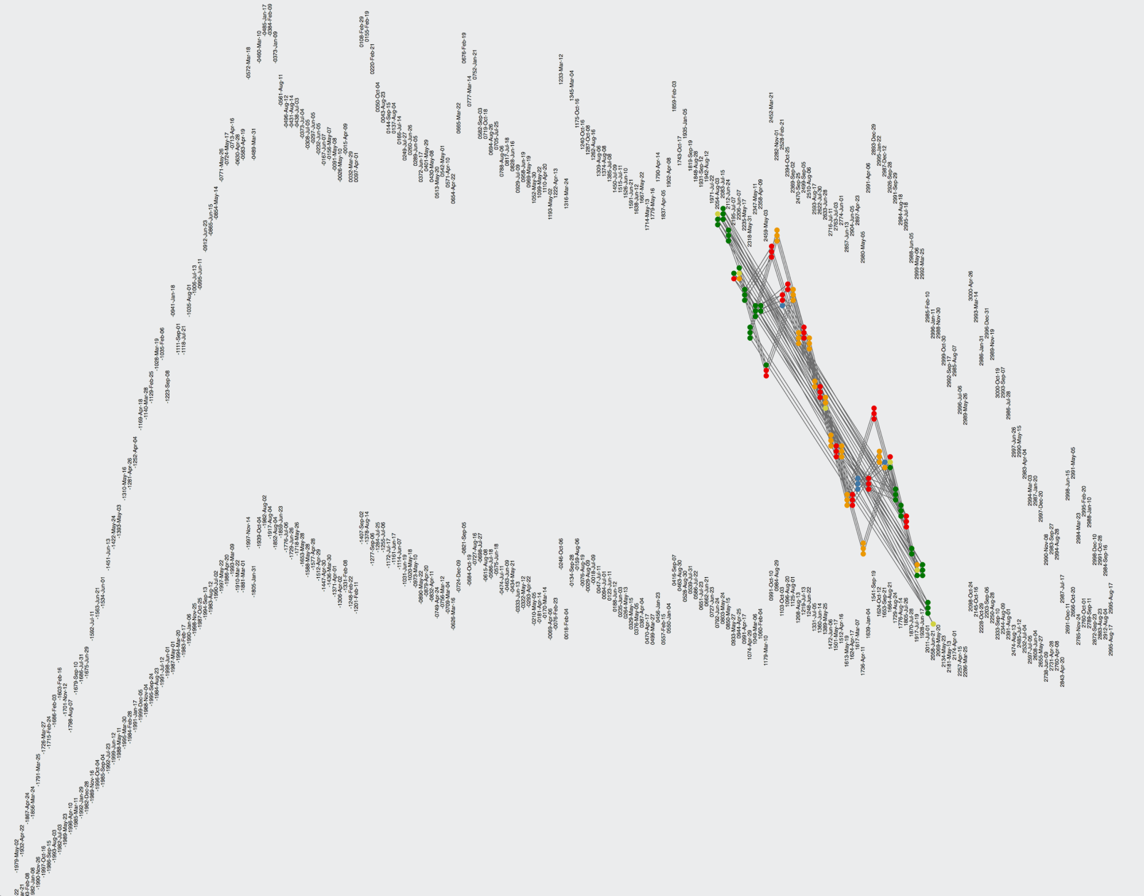
SKETCH: The next 25 years of eclipses connected chronologically with a line. It’s clear that because of nonsequential positioning of the eclipses, the time component is hard to understand in this graphic. Credit: Jan Willem Tulp
Conversations with Christiansen, Mark Fischetti (text editor) and Michael Zeiler (an expert consultant and technical reviewer for the full print article) resulted in a shift in focus. We decided to create a different type of graphic based on eclipse seasons, in which the time component was easier to understand.
Eclipse seasons are the only times during a year eclipses can occur, due to the inclination of the moon's orbit (see graphic from the full article below). Each season lasts approximately 34 days and repeats just short of six months, thus there are always two full eclipse seasons each year.
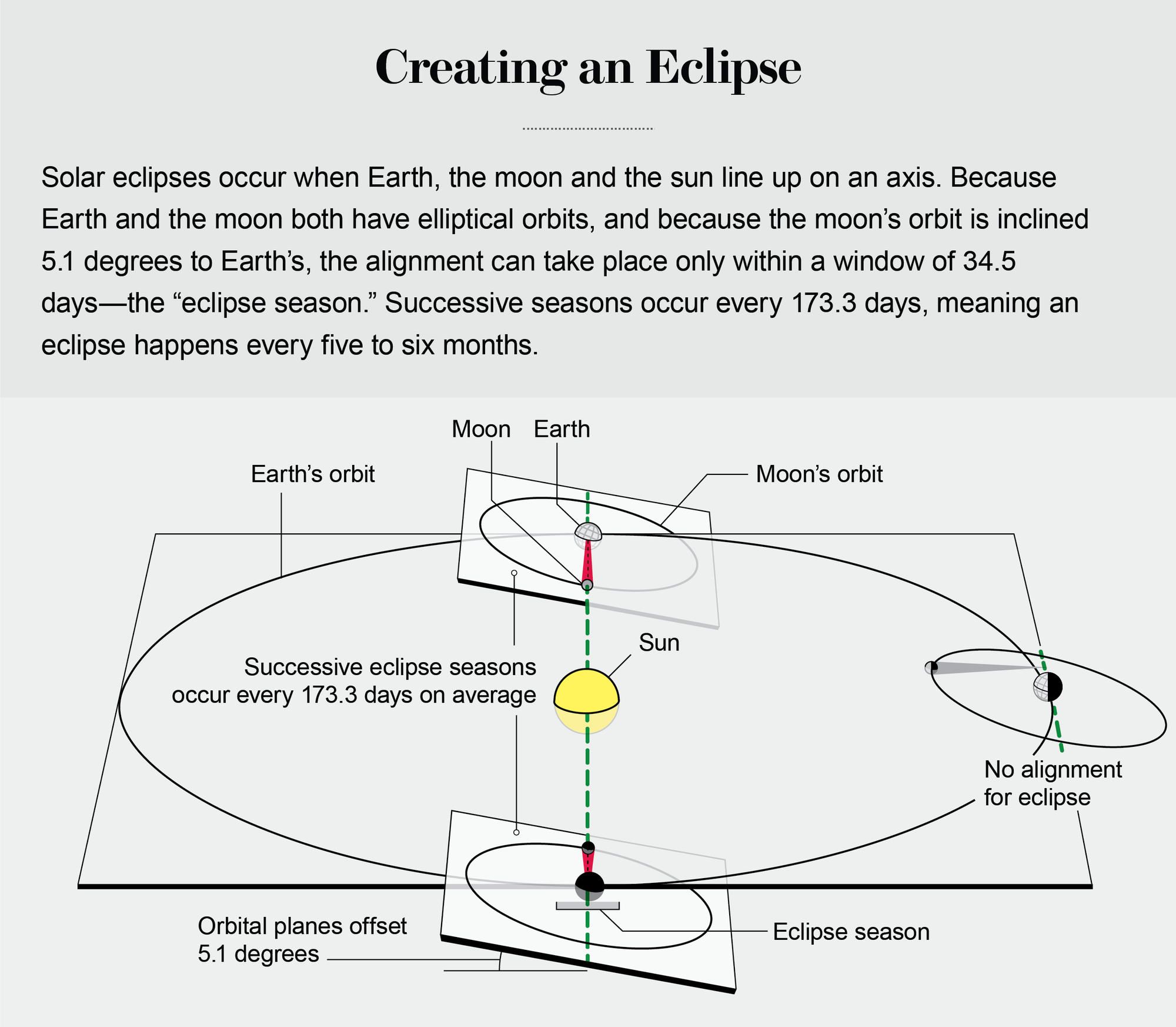
Credit: Jen Christiansen
Existing charts that convey this concept tend to rely on classic calendar grids, with each column representing a month and each row representing a year. But one of the characteristics the calendar year is that it repeats itself. After December 31 you start with January 1 again, which lends itself perfectly for a radial layout. And by doing so, and plotting the timing of each eclipse on this radial time scale, the pattern of eclipse seasons are revealed in the form of radiating bands (as shown below).
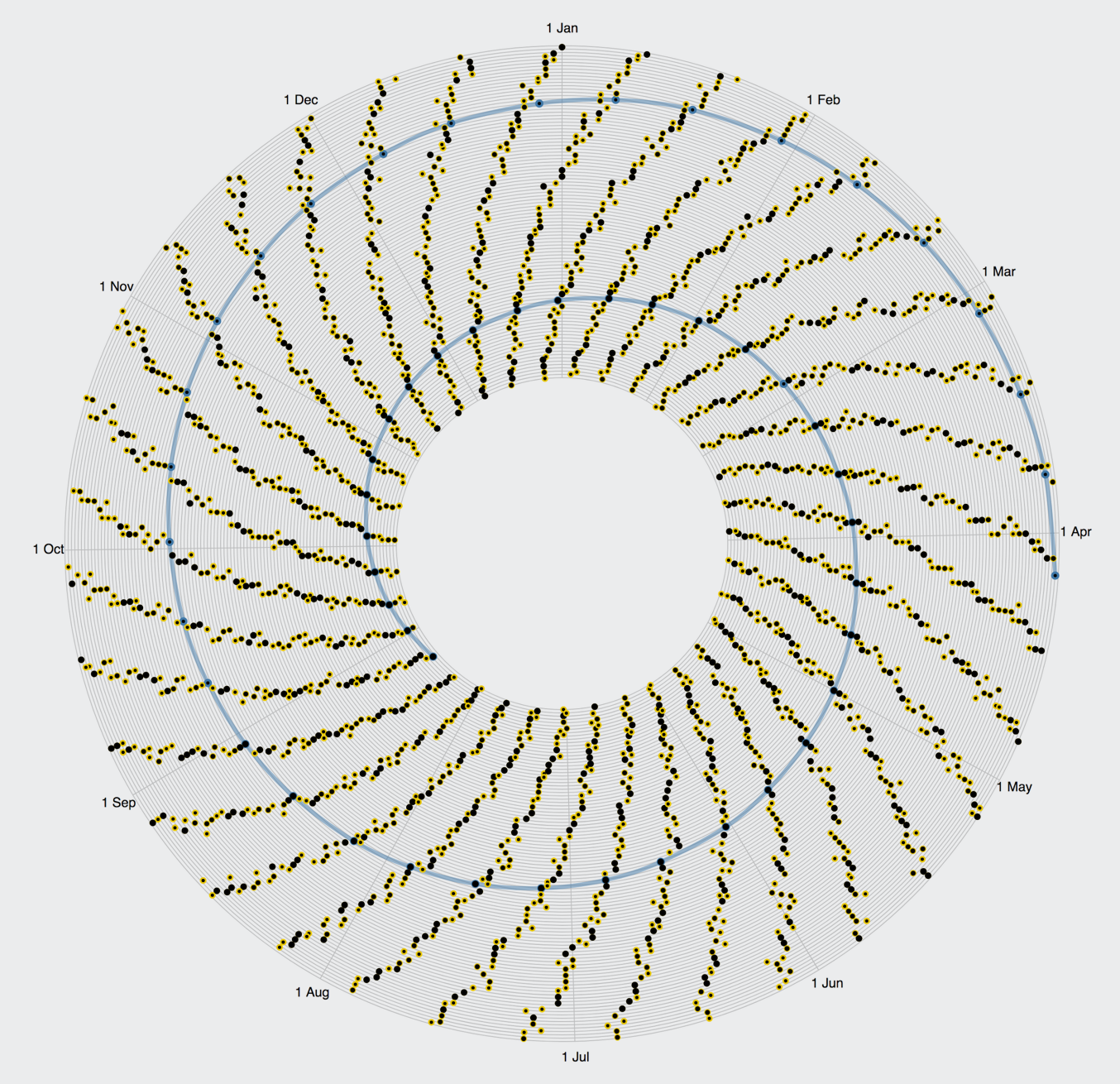
SKETCH: Occurrences of eclipses over time, laid out on a radial timescale, and in this version still using small icons to represent how each eclipse type might appear (yellow halo for annular eclipses, smaller black dots within larger yellow circles for partial eclipses) . The blue line connects eclipses that belong to the Saros 145 index, starting with the August 21, 2017 eclipse in the innermost ring. Credit: Jan Willem Tulp
In order to fit all eclipses out until the year 3000 into the space of in a print page, some compression was necessary. Each band represents a decade in the sketch above. For the final graphic we expanded out the inner circle (2017 through 2026), allowing the next 10 years of eclipses in the center to be more legible, and allowing for a clearer visual explanation of the time frame in which an eclipse may occur with small gray bars. The final version retains the Saros 145 series spiral, starting with the August 21 eclipse near the center. Yellow halos were removed because there was some concern they wouldn’t be large enough to print well. Eclipse type in the final was denoted by color, and the size of the partial eclipse dots remained scaled to represent eclipse magnitude.
Developing an interactive globe
For the interactive visualization it was again a question of how to narrow down the number of eclipses so that it wouldn’t be too overwhelming or unreadable. Also, if you can personalize a visualization, or provide options that are relevant for a user, it will increase the engagement of the visualization.
In this particular case it allowed us to put the August 21 eclipse in broader context, providing readers that won’t be able to experience the total eclipse this year in the U.S. with a sense of where and when they might be able to view one in the future. The interactive version allows you to select a country that has one or more central eclipses traversing the selected country in the next 150 years.

Central eclipses (color-coded by type) that will pass over Antarctica during the next 150 years. Credit: Jan Willem Tulp
As Fischetti wrote in the SA August issue article, “Grab a friend and go.”