This article was published in Scientific American’s former blog network and reflects the views of the author, not necessarily those of Scientific American
Although data visualization is often viewed as a fairly straightforward, dispassionate way of presenting facts, anyone who has studied the field knows that data-driven graphics can be hard to decipher, and are often far from impartial. Sometimes, the depiction of data, while not necessarily dishonest, can be used to emphasize the validity of whatever argument its creator wishes to make. Alternatively, a graphic may use visual trickery to mislead its audience, or may be—quite simply—badly done. In some contexts, an unclear or biased representation of data is unfortunate; in others, it can be devastating.
When visualizing data in health care, for example, the ramifications of the usual problems—inaccuracy and/or lack of clarity—become heightened. Due to the risk of malpractice, a visualization intended for use by health care professionals must be so clear and precise as to render misinterpretation virtually impossible. This may come at the cost of visual interest or novelty, but we can accept this tradeoff because what matters is that the viewer understands the data, not that she or he derives any entertainment or emotional response from it. And since health care professionals are likely to be well versed in interpreting data, ensuring comprehension is a relatively attainable goal.
When it comes to visualizing data for patients, the equation becomes a bit more complex. Often, the first question is what to visualize, or just as likely, what not to visualize. For example, if we show a patient a graph indicating the likelihood of a negative outcome associated with a certain treatment, is that sufficient as an educational tool? Should it be paired with a visualization of other risks associated with lack of treatment? What about alternative treatment options, which may not be as heavily studied? Should less conclusive data be abandoned altogether? Beyond the content of the visualization lies the question of how to portray the data. In order to ensure maximum impact, visualizations must be both understandable—even to those with relatively low numeracy—and visually compelling enough to make patients want to look at them. At each turn, the essential considerations depend heavily upon the intended audience, and are further complicated by the fact that patients are almost never a homogeneous group.
On supporting science journalism
If you're enjoying this article, consider supporting our award-winning journalism by subscribing. By purchasing a subscription you are helping to ensure the future of impactful stories about the discoveries and ideas shaping our world today.
I have faced these problems first-hand in my own work as a medical illustrator. My ongoing research project at the University of Toronto is centered on developing an educational resource for use in midwifery. This doesn’t officially fit into the category of “patient education” since women that work with midwives are called clients, not patients. The idea of pregnancy as a normal physiological condition, rather than an illness, is essential to the philosophy of midwifery care, so this linguistic distinction is important. Nonetheless, the issues involved in visualizing data for patients are eminently relevant to my work.
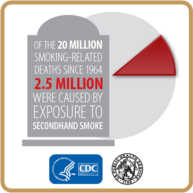
In health care, some data visualizations are meant to conjure a certain response from viewers. Picture, for example, a poster showing the risks of smoking. Perhaps the color red will be used in abundance to indicate danger, while skull or gravestone icons may warn viewers of potential deadly effects. These visual cues are engaging, but they also deliberately invoke alarm, as the ultimate goal is to compel viewers to stop smoking.

Data graphic on the dangers of secondhand smoke. (Credit: Centers for Disease Control and Prevention)
In the case of maternity care—and especially among midwives, who are meant to be less authoritarian than physicians—risk-related information must be approached very differently. As part of my research, I talked with a few midwives about how they discuss risk with their clients. It’s common to quote statistics verbally, and less common to show them visually. The objective is not to convince women to choose a specific course of action, but rather to inform them. Statistics can be difficult to navigate, however, especially when compounded by multiple options and associated risk factors. Unfortunately (to paraphrase one midwife), once you plant the mental seed of risk—especially if the risk is something serious, like permanent illness or death—most women immediately picture their babies suffering that outcome. The actual likelihood of the outcome might be miniscule, but the expectant mothers’ distress is no less severe, because even a 0.2 percent chance means, “this could happen.” If a woman has to make a decision about her care based on statistics like these, the anxiety that results from such thinking can be deleterious.
This phenomenon can be applied to many different areas of health care. For patients who need to weigh the risks and benefits of various treatment options, data can be an important tool, but it’s often complex, and sometimes scary. On one hand, it’s imperative that viewers receive a complete and transparent picture of the data. There is no dancing around the risks—they exist, and that must be made clear. On the other hand, there is a need to ease, or at least not worsen, the viewer’s emotional response to that information. In essence, the visualization must be comprehensive and unbiased, yet viewer-friendly and engaging.
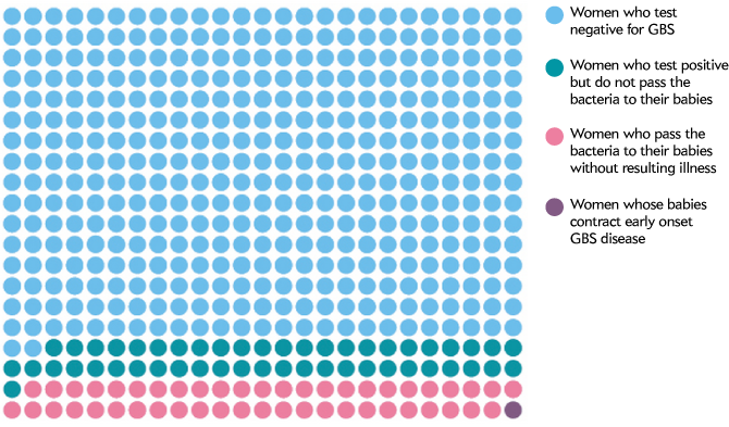
What, then, is the solution? I certainly don’t have all the answers, but a few things are clear. For one thing, data visualization is vastly underused in patient education. For the same reason that scientists plot their quantitative results rather than just viewing them on a table, it seems self-evident that visualizing data is better than simply listing numbers and percentages. And in the case of particularly anxiety-inducing risks, it can be helpful to visualize a value like 0.2 percent as a simple way to establish just how small it is relative to the odds of a positive outcome. Also, studies have shown that some data visualization styles are better than others when it comes to communicating risk to patients with low numeracy. Icon arrays are particularly effective, and are apparently less likely to increase patient anxiety than other graphical techniques.

Icon array showing various outcomes associated with Group B Strep (GBS) among pregnant women, by Amanda Montañez.
While data visualization is becoming more widely used in patient care, there is still work to be done. For example, I find that impartiality is sometimes neglected in favor of attention-grabbing visual elements. Also, formal considerations such as color interactions and composition must be given ample attention, lest distracting graphical features get in the way of comprehension. Data visualizers must also find ways to communicate less clear-cut information, such as ranges of data, and variations based on risk factors.
On the whole, data visualization for patient education is an area that merits more investment than it currently receives. Considering the plentiful talent and technology associated with data visualization more generally, it seems that the challenges involved in patient education, while undeniably complex, would not be insurmountable, if only given the proper attention.