This article was published in Scientific American’s former blog network and reflects the views of the author, not necessarily those of Scientific American
In the wake of the presidential election a few weeks ago, Dan Rather published a blog post for Scientific American asserting that, “Now more than ever, we must stand up for science.” Indeed, public understanding of and trust in science has often felt dangerously tenuous in recent years. With the anti-vaccine movement fueling measles outbreaks, schoolteachers in several states lecturing young students on creationism, and climate-denying politicians petulantly lobbing snowballs on the Senate floor, science has felt under attack for some time. But the election of Donald Trump represents a larger threat to science than we have ever seen, and it comes at a moment when we desperately need scientific research and evidence-based policies to prevail. Considering the very real and immediate dangers posed by issues such as climate change and antibiotic resistance, our very survival as a society depends on it.
So, as Rather points out, our role as science journalists becomes more important than ever. We will continue to communicate key scientific developments to the public and to call out policies that are harmful and/or at odds with scientific evidence. But beyond that, we must find ways to further engage and grow our audience. For those who are already interested and science literate, we need to inspire them to engage with science at higher levels—whether that means pursuing a degree in a STEM field, calling on the government to fund important research, or teaching their children to embrace scientific thinking and curiosity from a young age. For those who are less comfortable with scientific language and principles, we must pique their interest and draw them in with compelling and accessible content. And—most dauntingly—for those whose beliefs are decidedly anti-science, we need somehow to convince them of the core tenets that we, in our highly educated and evidence-oriented bubbles, take for granted.
As a graphics editor, I found one passage from Rather’s blog post particularly relevant. In pursuit of the above goals, he writes, “We need more cross-pollination and engagement. We need experimentation on form, tone, content, and distribution. We cannot allow science content to be relegated to echo chambers or elite distribution outlets. We need to try to find a way to take the message to where the people are, through digital promotion, distribution and social media engagement.” While he does not explicitly say “we need more and better information graphics,” I intuitively inferred that message, and nodded emphatically.
On supporting science journalism
If you're enjoying this article, consider supporting our award-winning journalism by subscribing. By purchasing a subscription you are helping to ensure the future of impactful stories about the discoveries and ideas shaping our world today.
Why information graphics? Well, aside from the fact that I make a living creating them, I believe graphics have the potential to be the most easily consumable and shareable type of media, especially for science content. I am more educated and science literate than the average member of the public, but I am not ashamed to say that, when I read a paper, article, or book about science, I look for the pictures first.
The beauty of a good information graphic is that it can tell a whole story in a single unit of visual content. As much as I’ve come to roll my eyes at the overused headline format, “[Such and Such Concept] Explained in One Graphic,” this convention does capture the strength of the graphic as a medium. (The headline certainly becomes less compelling when revised to read, “[Such and Such Concept] Explained in Several Paragraphs.”) Because while information graphics often do require their audience to do some reading, the text tends to be broken up into manageable chunks and arranged for easy consumption together with visual elements.
There is also something about an information graphic that inspires trust in its content; seeing a concept visualized gives it a certain amount of objective weight. Surely this idea can be used to ignoble ends, as seen in certain deliberately deceptive data visualizations. But more often than not, I believe it is harder to lie with a graphic than it is with words alone—if only because it requires much more effort to visualize something for which there exists no factual reference.
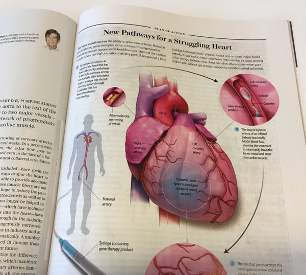
It’s also harder to cut corners when communicating something visually. I can explain a scientific process in words without thoroughly grasping it, but to draw it takes a higher level of understanding. I am reminded of this principle just about every time I embark on a new project at work. For example, I recently commissioned a medical illustration explaining how patients receive gene therapy treatment to promote development of new blood vessels in the heart. After reading a verbal description, I thought I understood the procedure quite well. However, the process of developing the graphic forced me to identity and fill in the gaps in my knowledge, such as the precise location where the catheter is inserted (“in the leg” doesn’t tell the whole story), and exactly where in the coronary artery the gene therapy product is released. And that necessary precision makes the graphic not only informative, but also trustworthy, as I conferred with an expert to answer any questions that arose throughout the process.

Graphic from the article "Heart Therapy" in the January 2017 issue of Scientific American
Credit: Mesa Schumacher
So, understanding the potential of information graphics to successfully inform and even persuade their audience, how do we use them to reach more people? There are plenty of avenues to explore, and many of my colleagues in the field have been pursuing them for some time.
Nigel Holmes may be the best example of a graphic artist who can take a complex or opaque concept, and make it not just understandable, but fun and inviting. In a 2015 episode of the PolicyViz Podcast, Holmes describes how using familiar, physical things as references can help people grasp difficult concepts. He cites an experiment he conducted in an attempt to convey the true scale of the number seven billion (the world’s population). He figured out how to quantify precisely the number of grains of Morton salt in a unit of weight, and acquired seven billion grains’ worth. Having established the volume of this quantity of salt, he estimated that it would fill about seven medium-sized bathtubs. While he could have selected any two of an infinite array of objects to convey the same value, salt and bathtubs work because they are both universally familiar and tangible. The average person can easily conjure a mental picture of both the unit—a crystal of table salt—and the volume—seven bathtubs.
In a recent talk, Holmes outlined another method he employs, which he calls “the Greek chorus.” He creates approachable characters to lead viewers through his graphics; these characters might ask questions, make commentary, or interact with the other visual elements. By inserting a friendly, human element into the picture, the Greek chorus becomes the viewer’s ambassador to the information. In the July 2015 issue of Scientific American, an illustration by Holmes explains the mathematical concept of group theory using rotating cubes as a visual reference. While cubes seem simple enough, and the graphic uses standard conventions such as arrows and axis lines to show their rotations, what I believe makes the visualization truly accessible are the three tiny figures he has inserted into the scene. As they spin, push, and lift the cubes, these apparently minor characters manage to bring the physical objects and their motion to life.

Graphic from the article "The Whole Universe Catalog" in the July 2015 issue of Scientific American
Credit: Nigel Holmes
Another way to draw in otherwise recalcitrant readers is to use humor. Data journalist Mona Chalabi embraces this approach, but importantly, she also aims to challenge the idea that data is necessarily precise and accurate. By using hand-drawn visualizations that are both whimsical and imperfect, she makes the information accessible while acknowledging her own fallibility as the messenger. By infusing each visualization with her own humanity, she appeals to the viewer in a way that a crisp, digitally generated image simply cannot do.

Credit: Mona Chalabi
On the flip side, there can be advantages to exploiting the artistic tools we have at our disposal in science visualization. As my colleague Jen Christiansen asserted in a 2012 blog post, visualizing an abstract concept in a friendly and engaging way does not always mean making the visual elements overly simple or playful. Instead, artists can fill their visualizations with enticing texture and detail—even when that means taking some artistic license—in order to draw the viewer in. To take a dense and intangible subject like quantum physics, and infuse it with a rich and striking physicality, might seem somewhat counterintuitive. But when done well and responsibly, such embellishments can dull the cold obscurity of complex science, perhaps just enough to open a reader up to investigating it.

Graphic from the article "The Inflation Debate" in the April 2011 issue of Scientific American
Credit: Malcom Godwin (illustrations); Jen Christiansen (graphic, top left)
So let’s explore a variety of methods to make science graphics more approachable. But as Dan Rather rightly emphasizes, we must also find ways to distribute our content so that it reaches new audiences. It must be as accessible and sharable as possible. This means prioritizing digital content—that is, content made specifically for screens rather than pages. And crucially, it must be optimized for phone screens, as mobile devices have now replaced computers as the most popular means of downloading and consuming digital content.
Moreover, we should experiment with and exploit the digital format to present visual information in refreshingly accessible and compelling ways. Let’s study the innovative visualizations that inspire us, like Nigel Holmes’s award-winning animated graphic about the Higgs boson, or Bloomberg’s widely celebrated interactive data visualization, “What’s Really Warming the World?” The growing prevalence of virtual reality will surely open new avenues of visual communication, and we should investigate the full potential of VR as an educational tool with a uniquely visceral power. Of course, different stories lend themselves to different formats, and static graphics can often do the job best. But we ought to be open-minded and diligent as we look for ways deliver the important visual stories that science has to tell.
Above all, we who have the forum to create and distribute science content should approach each project with the full reality of Trump’s presidency and the danger of anti-science rhetoric in mind. Information graphics will play one of many roles in this fight, but I believe it’s an important one, and I humbly welcome the challenge.