This article was published in Scientific American’s former blog network and reflects the views of the author, not necessarily those of Scientific American
Editor’s Note: The following is a guest post from Robert Simmon, a data visualization engineer at Planet Labs, and previously the lead visualizer at NASA’s Earth Observatory.
At heart, design is the discipline of clear visual communication. Just as writers must follow the rules of grammar to be understood, creators of scientific graphics need to follow the principles of good design to communicate effectively. Subtle differences in layout, typography, and color can be the difference between an opaque, difficult to understand graphic and an elegant figure.
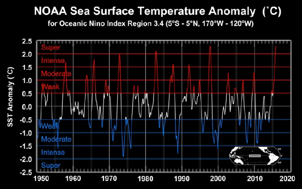
Creating scientific graphics can be difficult: most scientists and engineers lack training in design, deadlines are tight, compromises must be reached between team members and management, and the available tools may be limited. Fortunately, many design guidelines are simple and easy to execute, which I’ll show by re-designing the following graph, originally presented by NASA at the 2015 American Geophysical Union fall meeting.
On supporting science journalism
If you're enjoying this article, consider supporting our award-winning journalism by subscribing. By purchasing a subscription you are helping to ensure the future of impactful stories about the discoveries and ideas shaping our world today.

Despite being relatively simple (one variable changing over time), this figure appears cluttered, and the data itself is difficult to read. In my opinion, it can be improved by creating layout with a visual hierarchy with subtle changes in typography, color, and arrangement.
A visual hierarchy brings the most important elements of a graphic into the foreground, and pushes less important elements into the background. A strong layout will also guide the eye, so that a viewer will see information necessary to understand a graphic. This is exactly like a front page: the most important headlines are emphasized strongly, followed by less important stories, body text, and bylines. Readers get the overall point quickly, and are able to absorb supporting details with further study.

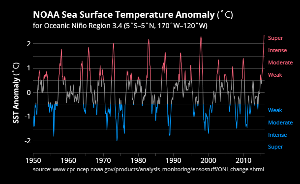
Graphic by Robert Simmon (based on NOAA data)
In my redesigned graphic the two most important elements (data and title) stand out. The graph containing the data uses a thick line weight and high-contrast colors, which brings it into the foreground. The horizontal gridlines are thinner and darker, fading into the background. I removed the frame around the graph entirely—it flattens the graphic lessening the difference between foreground and background.
Color differentiates El Niño, La Niña, and neutral conditions in the Equatorial Pacific. Neutral conditions (sea surface temperature anomalies between -0.5 and 0.5 degrees Celsius) are medium gray and El Niño conditions are a bright, desaturated red. La Niña conditions have a blue hue, with the exact same saturation and brightness as El Niño. (I created matching colors with the HCL Wizard color palette tool.) The matching colors emphasize the two states of the Southern Oscillation equally. In the original the colored line for El Niño and La Niña conditions was darker than the pure white used for neutral, so it faded into the background.
The title is larger that any other text, bold, high-contrast (white on black), and pushed to the upper-left corner of the frame: where most western viewers will start reading. Supporting text (tick labels, annotations, citations) are smaller, lighter in weight, and positioned along the edges of the frame. This positioning emphasizes the title while retaining supporting information. I also removed the half-degree tick labels, making the numbers easier to read.
All of the changes were relatively minor—I kept the same overall structure, format, labels, color scheme, and size—but the overall effect is a cleaner figure that is (to me, at least) much easier to interpret.
For more tips on developing scientific visualizations, see Simmon’s Subtleties of Color series on NASA’s Earth Observatory website.