This article was published in Scientific American’s former blog network and reflects the views of the author, not necessarily those of Scientific American
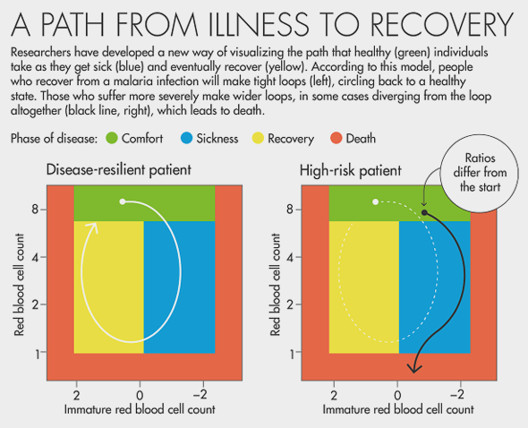
The chart below caught my eye in a recent Quanta Magazine article. Rendered by Lucy Reading-Ikkanda for “A New Way to Predict Infection's Toll” by Emily Singer, it provides a clear and intuitive look at how disease-resilient and high-risk individuals can differ in their travels through so-called “disease space.”

CREDIT: Lucy Reading-Ikkanda for Quanta Magazine (In “A New Way to Predict Infection's Toll,” by Emily Singer, August 30, 2016).
The chart in Quanta appears to be an idealized connected scatter plot. Perhaps tipping over into the realm of concept art, as I'm not convinced we’re looking at actual values plotted against the axis tick marks. But that doesn’t bother me, as the graphic’s value lies in its power to explain a concept with a visual model, not in representing a specific data set.
On supporting science journalism
If you're enjoying this article, consider supporting our award-winning journalism by subscribing. By purchasing a subscription you are helping to ensure the future of impactful stories about the discoveries and ideas shaping our world today.
It's strongly rooted in the work it references, “Tracking Resilience to Infections by Mapping Disease Space” by Brenda Torres, Jose Henrique Oliveira and colleagues, published in PLOS Biology on April 18, 2016. The Stanford and University of Houston researchers traced paths through disease space as represented by variables such as red blood cell count and malaria parasite density. Resilient individuals make small loops, non-resilient individuals forge larger loops (longer infection times and more severe symptoms) and are more prone to swinging out over the threshold, into death.
The cyclical infection pattern of malaria—as well as the offset nature of some of the variables involved (different immune cell concentration levels don't peak or bottom out at the same time)—make it a particularly good disease to examine with this model, as shown in the original paper (below).

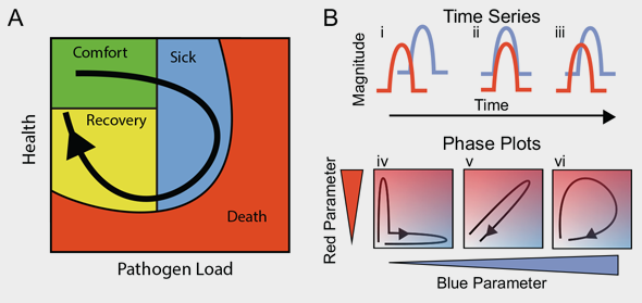
ORIGINAL CAPTION: "Fig 1. Predictions of disease space map behavior.
(A) This figure imagines a map tracing the path that a resilient infected individual might travel through disease space. The host starts at a position of comfort, but as pathogen load increases and health decreases, it enters a state of sickness. Once pathogen load decreases, the host starts to actively repair its health, resulting in an open loop in which every position along the path is unique. (B) For a system in which two parameters oscillate through a single cycle, they will trace three basic shapes through phase space. If the parameters do not overlap with each other in time, they will trace an L-shaped curve (i, iv). Complete overlap produces a line (ii, v), and partial overlap produces a loop (iii, vi). The color gradients show increasing concentrations of each parameter. See also S1 Fig." CREDIT: Torres BY, Oliveira JHM, Thomas Tate A, Rath P, Cumnock K, et al. (2016) Tracking Resilience to Infections by Mapping Disease Space. PLoS Biol 14(4): e1002436. doi:10.1371/journal.pbio.1002436
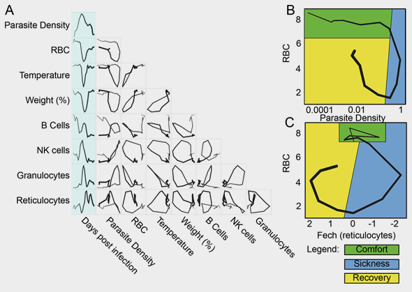
Indeed, paths through disease space for individuals inflicted with malaria are roughly circular for certain key indicators, as opposed to boomeranging back and forth along a straight line over time.

ORIGINAL CAPTION: "Fig 2. Disease space maps of malaria-infected mice. (A) Average values for eight parameters for three mice measured (and averaged) daily for 20 d are plotted in a timeline marked in blue. The paths for the three mice plotted individually are shown in S2 Fig. The transcript markers used to define B cells, NK cells, granulocytes, and reticulocytes are, respectively, Cd79b, Nkg7, Camp, and Trim 10, which are reported as log2 values. Time is indicated by the increasing thickness of the curve. (B,C) Phase plots for representative looping pairs of parameters. Note that the axes have been flipped so that all graphs start at the top, and the sick mice follow a clockwise path through phase space. The graph shows “comfortable” (days 0–6, green), “sick” (days 7–10, blue) and “recovering” (days 11–15, yellow) regions." CREDIT: Torres BY, Oliveira JHM, Thomas Tate A, Rath P, Cumnock K, et al. (2016) Tracking Resilience to Infections by Mapping Disease Space. PLoS Biol 14(4): e1002436. doi:10.1371/journal.pbio.1002436

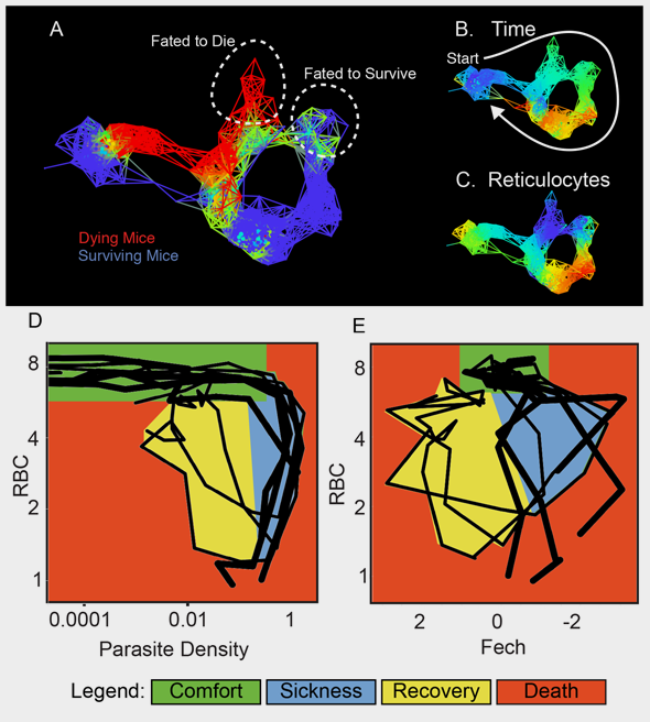
ORIGINAL CAPTION: "Fig 4. Disease maps of mice with warped disease spaces. (A) A topological network map for malaria-infected mice following the mice for a maximum of 26 d post infection. The surviving mice are marked in blue (n = 3), while those who died are marked in red (n = 4); other colors show overlap in the map. (B–C) show the same disease map as in (A), but colored according to (B) time or (C) reticulocytes (Ferrochelatase). Phase plots for parameters parasite density by RBC (D) and Fech by RBC (E) that deviate in looping systems in dying mice. Note that the axes have been arranged (D–E) so that all graphs start at the top left and the sick mice follow a clockwise path through phase space. The graph shows “comfortable” (days 0–6, green), “sick” (days 7–10, blue), and “recovering” (days 11–15, yellow) regions. Areas not encompassed by the paths followed by surviving mice are colored red and reveal the dangerous spaces traversed by dying mice. The path of dying mice is outlined in thick lines compared to the thin lines used for survivors. Ranges for (A–C) and parameters for deriving the graphs are listed in S8 Table." CREDIT: Torres BY, Oliveira JHM, Thomas Tate A, Rath P, Cumnock K, et al. (2016) Tracking Resilience to Infections by Mapping Disease Space. PLoS Biol 14(4): e1002436. doi:10.1371/journal.pbio.1002436
The Quanta chart is an idealized form that reflects information presented in the original research paper's figure 2C and figure 4E, all of which plot red blood cell concentration against immature red blood cell (reticulocyte) concentration. The result; an elegant summary figure for a non-specialist audience.