This article was published in Scientific American’s former blog network and reflects the views of the author, not necessarily those of Scientific American
The other day, while waiting at the registration desk for an event entitled “Visualizing Climate Change,” I met a data visualization developer from Bloomberg News. Upon his introduction, I immediately thought of the terrific interactive climate change infographic Bloomberg put out earlier this year. The strength of this graphic lies not only in its clear visual form and brilliantly delivered punch line, but also in the ease and seamlessness of its interactivity. My new acquaintance told me how thrilled he was at how it turned out, and said that Bloomberg was working on more graphics of this sort, specifically focused on climate change.
I was pleased to hear it. What can be more convincing, I thought, than a well researched, user-friendly visualization that lets the data speak so plainly and eloquently for itself? As I sat down for a lecture on visualizing climate change by artist Melissa Fleming, I readied myself for a presentation filled with climate-related data and innovative ways of presenting it. Indeed, Fleming began her talk with a few slides setting up the problem of climate change, featuring some ordinary charts and graphs. But then she dismissed them, saying, in essence, that charts and graphs are simply not compelling. They don’t grab our attention, and they don’t change our minds.
It is true, I thought, that data visualization lacks a sense of passion. But isn’t that what makes it so powerful in its own right? Data visualization presents facts, and—if done well—nothing more. The absence of bias or zeal lends strength and credibility to a good data graphic. On the other hand, if Fleming is correct that charts and graphs don’t convince people, or move them to change, then perhaps we need a stronger, more emotionally based approach.
On supporting science journalism
If you're enjoying this article, consider supporting our award-winning journalism by subscribing. By purchasing a subscription you are helping to ensure the future of impactful stories about the discoveries and ideas shaping our world today.
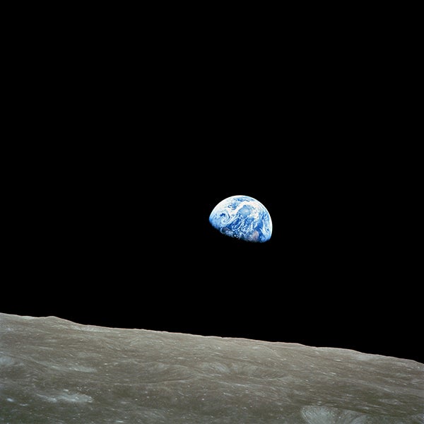
She went on to make the point that art can appeal to our emotions in a way that data visualization cannot. Fleming cited the famous “Earthrise” photo, taken in 1968 by Apollo 8 astronaut Bill Anders. Many people are convinced that this photo helped crystallize the environmental movement; just two years later, the world celebrated Earth Day for the first time. While I can hardly dispute the power of this image—especially when placed in the historical and cultural context of the late 1960s—I had trouble imagining a piece of art capable of yielding an equivalent effect in today’s visual-media-soaked world.

“Earthrise,” 1968, by Bill Anders, NASA (From Wikimedia Commons)
The bulk of Fleming’s presentation was a general survey of (mostly) contemporary fine artists whose work fits under a broad umbrella of environmental and climate-oriented themes. The majority of them were unfamiliar to me, and I enjoyed seeing their vast range of work, from photography to sculpture, installation, murals, and street art. It was heartening to see so much work focused on climate change, much of it infused with a visibly earnest devotion to the subject.
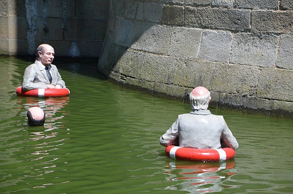
In terms of evoking an emotional response, the work of sculptor Isaac Cordal stands foremost in my mind. In photos, his 2013 installation entitled "Waiting for Climate Change" is deeply unsettling in the way it highlights the urgency of rising water levels. Cordal placed fourteen sculptures of “businessmen” in the moat of the Château des Ducs de Bretagne, in Nantes, France, and left them to float and drift throughout the summer. With their dead eyes staring ahead, their business-suit-clad bodies largely submerged in the water, they are seem disturbingly apathetic to their own plight. As a portrait of our own passivity in the face of potentially dire events, the artwork is effective.

“Waiting for Climate Change” photo: Château des Ducs - Isaac Cordal, July 2013, by Objectif Nantes (From Flickr)
Photographer Edward Burtynsky’s work underscores the impact of fossil fuels and other industrial products. Some of his photos struck me as an interesting alternative to data visualization. Take, for example, a photo in which a monstrous pile of abandoned tires stretches as far as the eye can see, obscuring the landscape almost entirely. Contrast this with a graph showing the quantity of car parts contributing to solid waste generation over a certain period of time. Which is more effective? In the photo, it is impossible to tell how many tires there are, but that is precisely the point. The number is so large as to become irrelevant, as the massive pile overwhelms and subsumes the land around it.
However, I am doubtful that this image or Cordal’s installation would have any real or lasting effect on a viewer who is indifferent to or skeptical of environmental issues. Sure, the image is striking, but it is rendered in a subjective medium by an artist who probably has an agenda. Why should people take this more seriously, either as evidence of a problem or as a call to action, than an objectively presented visualization of hard, irrefutable data?
Perhaps the answer is to fuse data with art: back the emotional punch with some quantitative substance. Some artists have tried this, with mixed results. One cited in Fleming’s talk, Paolo Grangeon, worked with the World Wildlife Foundation in 2008 to make a sort of public data installation comprising 1600 pandas made from recycled paper. The number is significant, as it matches (approximately) the number of endangered pandas left in the wild. At the same time, it grabs viewers’ attention and pulls on their heartstrings. (What could be more captivating than an adorable baby panda, let alone 1600 of them?)
However, whether the installation conveys the gravity of its subject is debatable. Not having seen it in person, I cannot say for sure whether it is effective in this respect. But given my initial reaction to photos of the sprawling installation (“wow, so many pandas!”), along with the abundance of whimsical panda selfies to be found online, I cannot help but question its value as an effective data visualization.
Nonetheless, I believe there are ways to use visual media to prompt the kind of shift inspired by the Earthrise photo, and I remain convinced that data can, and should, play a role. If the emotional and psychological pull of something like a public art installation could be combined in the right way with the weight of solid, relevant data, perhaps art could affect real and lasting change.
With artists like Golan Levin and Domestic Data Streamers beginning to inject data into public installations and street art, and offering opportunities for consumers of their art to interact with and even become part of the work, the potential is there. I look forward to seeing where this trend will lead us next, and I hope to see climate change emerge as a prominent theme in the world of data art.