This article was published in Scientific American’s former blog network and reflects the views of the author, not necessarily those of Scientific American
Last month I took my first trip to the Middle East. After an 18-hour journey from New York City I arrived, wobbly-legged and weary, in the beautiful, war-ravaged city of Beirut. As I stepped out of the airport, the temperate nighttime air carried sounds of multilingual greetings and honking car horns. I had no idea what to expect of the week ahead, and that was kind of the point.
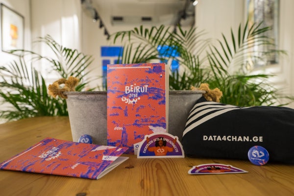
The purpose of my trip was an annual workshop called DATA4CHAN.GE. I had only heard of the event a few months earlier, when someone posted an application link on a data visualization–themed Facebook group of which I’m a member. The opportunity was intriguing to say the least: selected applicants from all over the world would convene in Beirut for five days to develop a series of data-driven projects built around human rights issues.
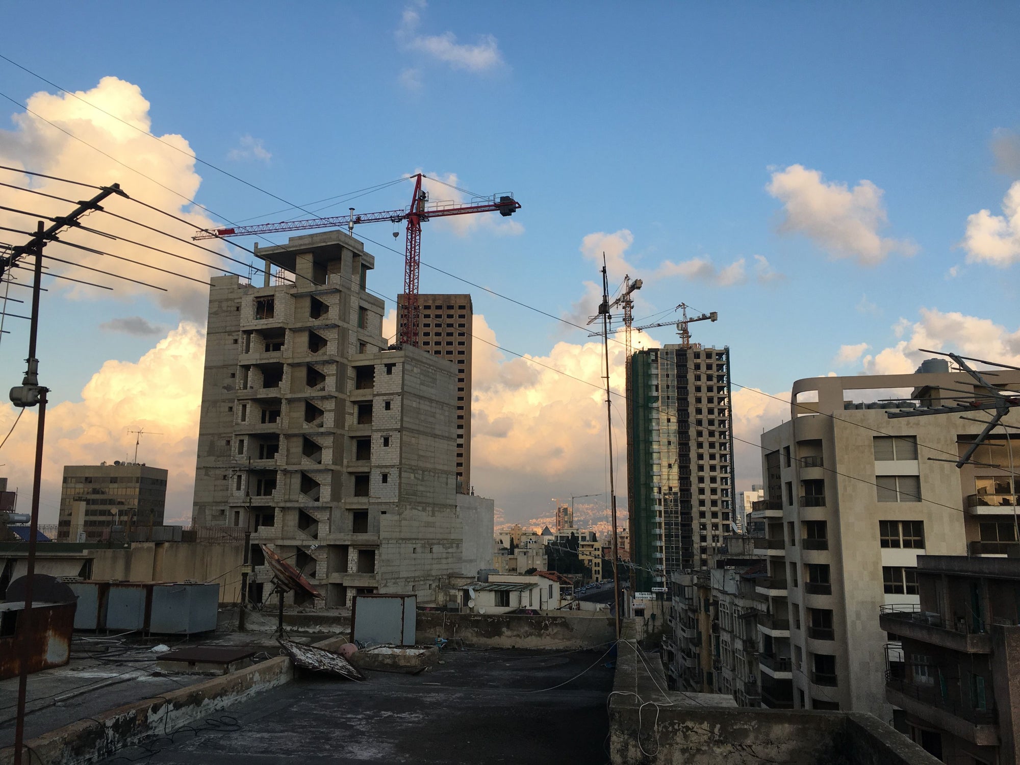
View of Beirut. Credit: Amanda Montañez
On supporting science journalism
If you're enjoying this article, consider supporting our award-winning journalism by subscribing. By purchasing a subscription you are helping to ensure the future of impactful stories about the discoveries and ideas shaping our world today.
The overlap between my work as a graphics editor for Scientific American and the theme of DATA4CHAN.GE—data visualization for human rights—may not seem immediately apparent. Indeed, I briefly wondered whether my skill set would seem sufficiently relevant (however much I care about human rights issues on a personal level). Then again, I reasoned, the challenges involved in visualizing scientific information are not necessarily unique. Fundamentally, what I do is about assessing the needs of my audience, studying my source material thoroughly, and communicating its content effectively. I guessed that human rights causes would prove an apt context for this type of problem solving. I sent off my application with fingers crossed.
Several weeks later, still giddy from having been accepted, I learned some details of how the workshop would be structured. Participants were split into four groups, each of which included four “creative team” members—experts in graphic design, Web development, journalism, data research and analysis, or some combination thereof. Together with our team leader—a fellow creative professional and DATA4CHAN.GE veteran—and two representatives from a human rights organization, each group would create some sort of visual, data-based product to be presented at the end of a whirlwind collaboration.
The organizations represented at the workshop included the Iraqi Observatory for Human Rights, the Yemen Polling Center and the Anti-Racism Movement, a Lebanese group that advocates for the rights of local migrant workers. My team worked with Maharat, a locally based outfit focused on freedom of expression. Maharat had been monitoring Lebanese media outlets in the lead-up to municipal elections and gathering data on women’s representation in news coverage. What we would do with that data remained to be seen.
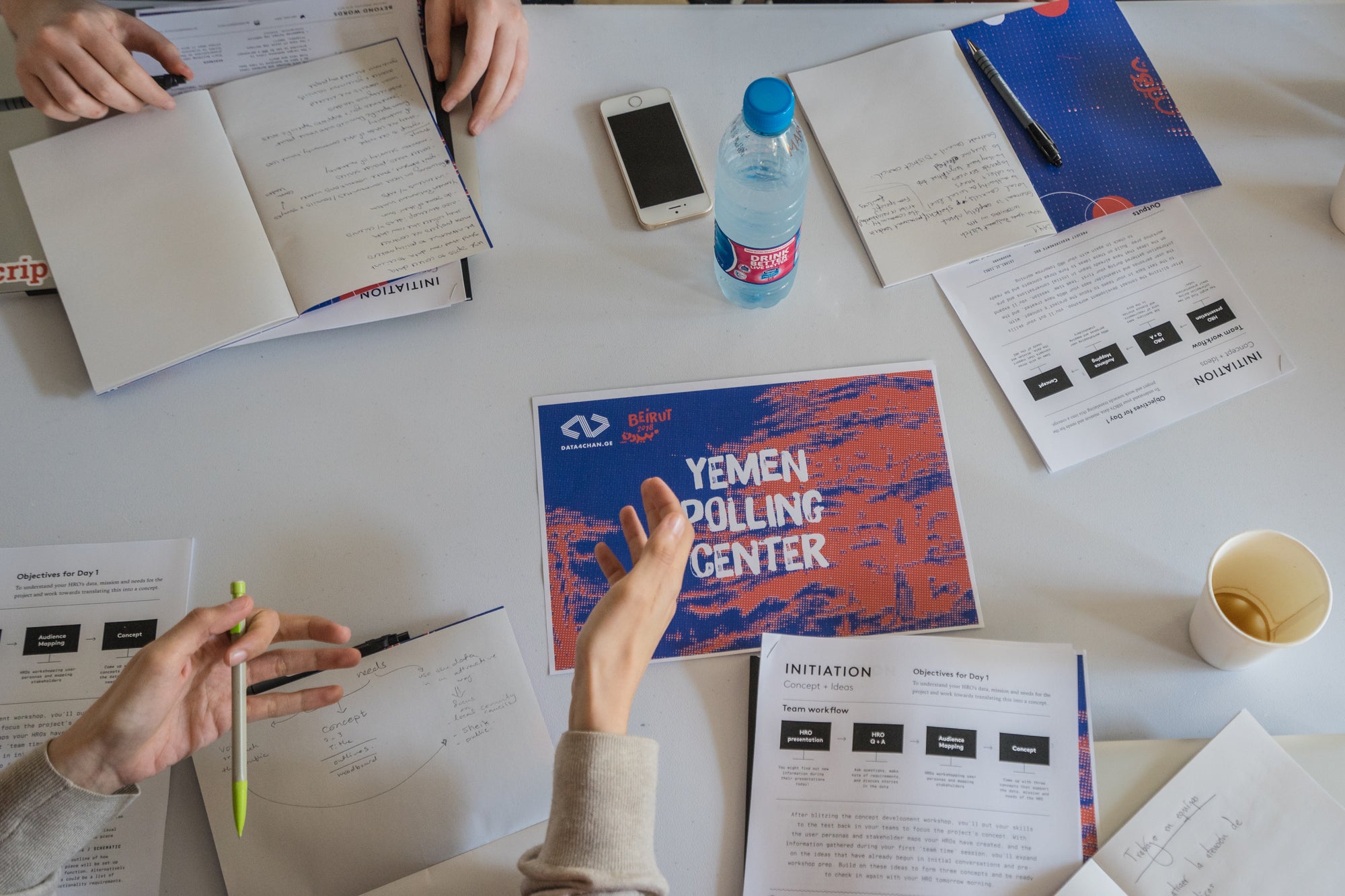
The Yemen Polling Center worktable. Credit: DATA4CHAN.GE
As a stickler for deadlines who prefers to stay ahead of schedule and bristles at the idea of working down to the wire, I began to fret over the time constraints of the workshop before it even started. The importance of the work ahead had suddenly come into focus, and I was eager to produce something smart and impactful for Maharat. But having barely skimmed the 3,000-entry-long data set (which had been roughly converted from Arabic using Google Translate), and without any directives on how to interpret or analyze, let alone visualize it, I felt lost in a way that I rarely do in my day-to-day work.
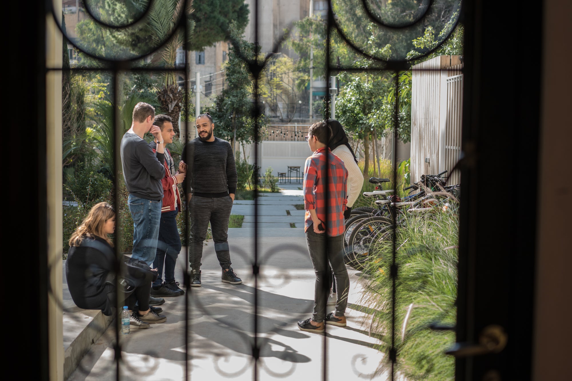
When day one of the workshop arrived, I met my teammates in the designated DATA4CHAN.GE venue, a lovely co-working space in Beirut’s bustling Hamra district. I quickly gathered that I was not alone in my apprehension about creating something meaningful in the short time allotted. And by the end of the first day, despite hours of discussion, we remained unsure of what sort of visualization we would create or whom it would target. So far, the trajectory of this project was at stark odds with my usual workflow, in which the identity of the audience is self-evident and the data source (often a scientific paper) provides a relatively clear path forward, content-wise. My anxiety rose.
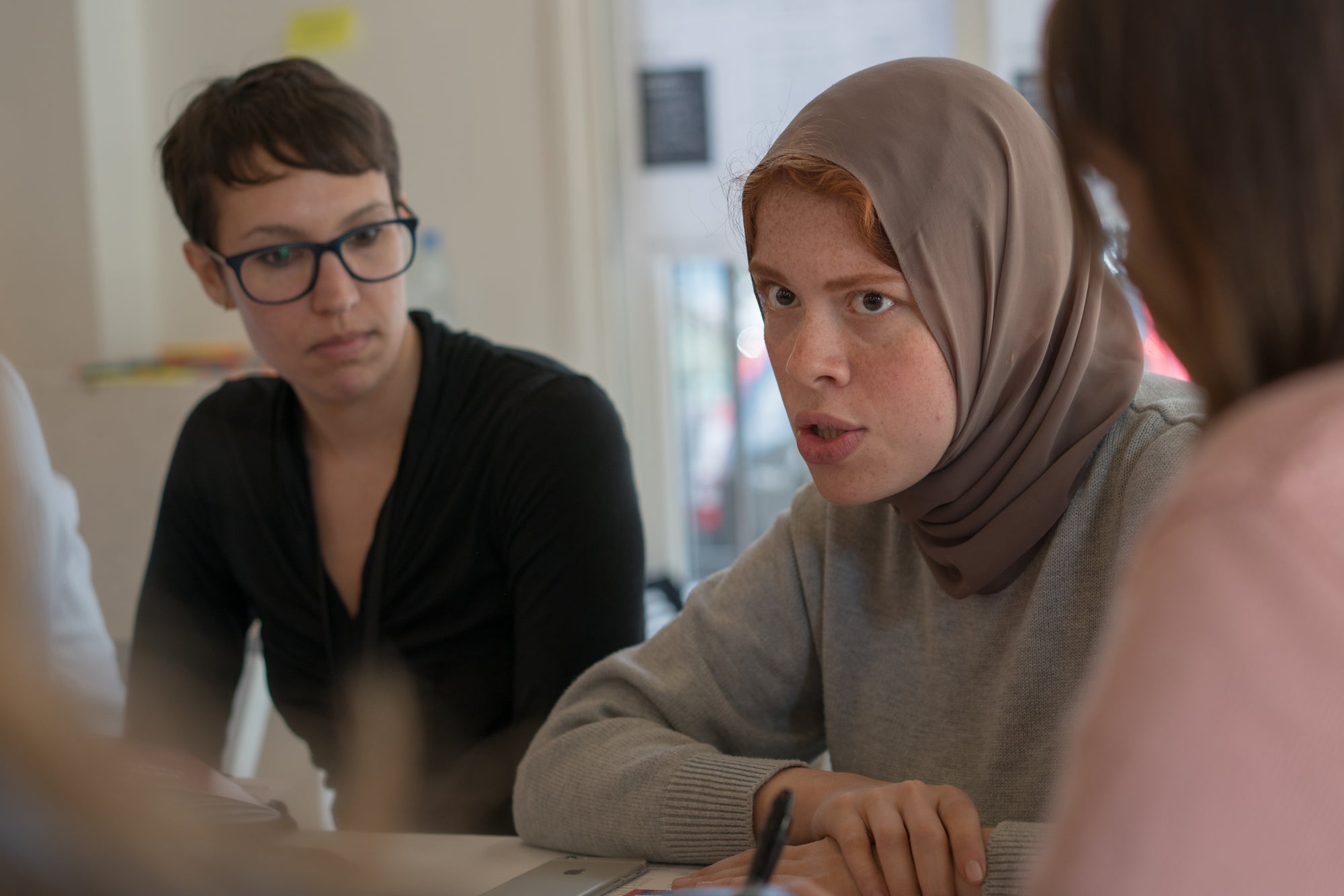
The Maharat team leader guiding discussion on day one. Credit: DATA4CHAN.GE
Yet, by the third day, we had settled firmly on a strategy, and I had come to value the strict time limit as a constructive and essential part of the experience. As I learned in developing my thesis project in graduate school, creative endeavors of a certain scale tend to defy the notion of ever being “done.” Capping this project at four days’ worth of work (the fifth day being reserved for presentations) demanded that its scope remain in check and that each team member have well-defined tasks.
This is not to say that we—or any of the groups, for that matter—emerged with a fully finished product. But over the course of the workshop, we were able to identify what was feasible given then deadline, and what would be earmarked for future work. (We were told from the start that some of the projects would receive funding to continue development following the workshop.)
Another invaluable feature of the DATA4CHAN.GE experience was working alongside people with enormously diverse backgrounds and skill sets, whom I likely never would have met otherwise. My team consisted of two men and one woman from Egypt, an Englishman, two Lebanese women (the Maharat representatives) and an American woman (me). In an aberration from my regular professional routine, I was the lone science communicator in the group. My teammates’ interests included engineering, game design, long-distance running and political activism. The age range among us spanned about 20 years.
Morning meeting on day three. Credit: DATA4CHAN.GE
Having just met one another, diving headfirst together into a fast-paced, politically charged project proved as challenging as it sounds. We occasionally encountered tension, rooted in either cultural differences or incompatible work styles. As a desperately agreeable person who typically avoids conflict at all costs, I felt the stress of these interactions keenly. But in the end I took the opportunity to step out of my comfort zone and try to help address the underlying issues. And I think I emerged a little stronger and more interpersonally agile.
Much more importantly, our collective dedication to the project ultimately prevailed, and I am immensely proud of what we achieved. For now, our work has been handed off to Maharat with hopes that it can soon develop into something polished and ready for public consumption (in both English and Arabic).
It is difficult to overstate what a positive experience the DATA4CHAN.GE workshop was (to say nothing of all the delicious Lebanese food I consumed over those five days). Science visualization is not short on challenges or rewards, and I remain convinced that my work at Scientific American represents the best use of my skills and interests (and, in its way, can even help change the world). But what a privilege this workshop offered—to travel to a new city, team up with a singularly diverse and talented group, and put my skills toward a wholly meaningful cause—learning all the while. To anyone working in data visualization or related fields and hungry for new challenges, I highly recommend seeking out and embracing opportunities like this one.