This article was published in Scientific American’s former blog network and reflects the views of the author, not necessarily those of Scientific American
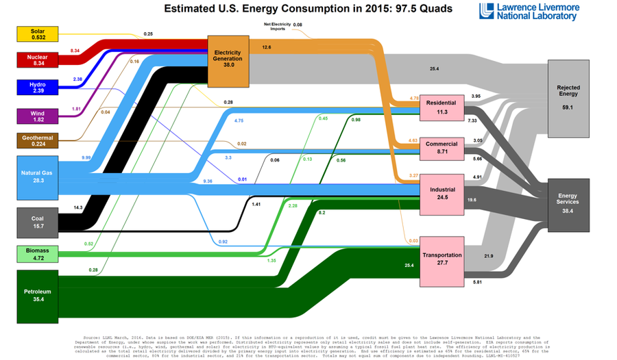
Each year, Lawrence Livermore National Laboratory (LLNL) and the U.S. Department of Energy publish a graphic displaying energy flows in the United States. In their 2015 update, the graphic shows where the 97.5 quadrillion British-thermal-units (“quads”) of energy that were consumed in the United States came from and how they were used.
All told, one can see that almost 39% (38 quads) of energy consumed in 2015 was used to generate electricity. Another 28% (27.7 quads) was used in the transportation sector - and the vast majority (92%) of fuel in the transportation sector was supplied by petroleum with biomass and natural gas playing much smaller roles.
In the electricity sector, coal use has declined compared to 2014 (see that year’s diagram here) from 16.5 to 14.3 quads. On the other hand, natural gas use for electricity production increased from 8.34 to 9.99 quads over the same period.
On supporting science journalism
If you're enjoying this article, consider supporting our award-winning journalism by subscribing. By purchasing a subscription you are helping to ensure the future of impactful stories about the discoveries and ideas shaping our world today.

By LLNL and U.S. DOE (link)
