This article was published in Scientific American’s former blog network and reflects the views of the author, not necessarily those of Scientific American
Thanksgiving is a holiday full of travel, food, and shared stories. And this Thanksgiving I will share the story of coming up with a fun, STEM-themed activity to do with my cousins – and being utterly thwarted in trying to pull it off.
From a potential-data perspective, Thanksgiving falls pretty heavily into two categories: travel and food. And with both categories having a strong geographical component, making a map seemed like an easy leap. So which to choose? The Thanksgiving holiday gets more Americans traveling long distances than almost any other holiday. Compared to the rest of the year, travel to destinations more than 50 miles away increases by 54% during the holiday’s 6-day window (Bureau of Transportation Statistics). But with my family, the focus on food is heavily correlated to the likelihood of potential participation. So, food it would be.
My initial background search turned up this awesome map compiled by the people at ESRI (Environmental Research Systems Institute). Using data from the US Department of Agriculture’s Census of Agriculture, the interactive storymap takes you behind the scenes with four common Thanksgiving menu items. Zooming in and clicking around might let you know that 1,057 acres of cranberries were farmed in Barnstable County, Massachusetts. But after playing for a while and exploring the green bean harvest in Pettis County Missouri (4 acres), I decided that I wanted to do something a bit more personal. I wanted to know where the food on my plate had come from.
On supporting science journalism
If you're enjoying this article, consider supporting our award-winning journalism by subscribing. By purchasing a subscription you are helping to ensure the future of impactful stories about the discoveries and ideas shaping our world today.
If I wanted to get my family on board with tracking down the sources of their own dishes, the best approach seemed to be trying it out on my own. That way I could provide them with some tips to make the process a bit easier. I had a few weeks to figure it out, so how hard could it be? I settled on stuffing as a test case: multiple ingredients, but nothing too exotic. Stuffing (or filling, or dressing depending on where you are from) has as many recipes as families. My family stuffing recipe has five main ingredients and some spices: bread, celery, onions, butter, chicken broth, salt, pepper, rosemary, thyme, sage, and marjoram.
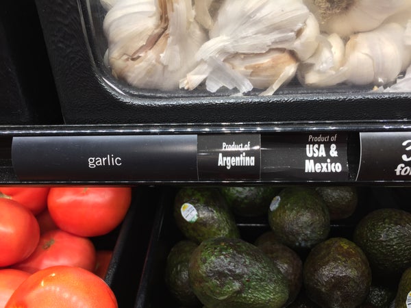
From... USA? Credit: Amanda Baker
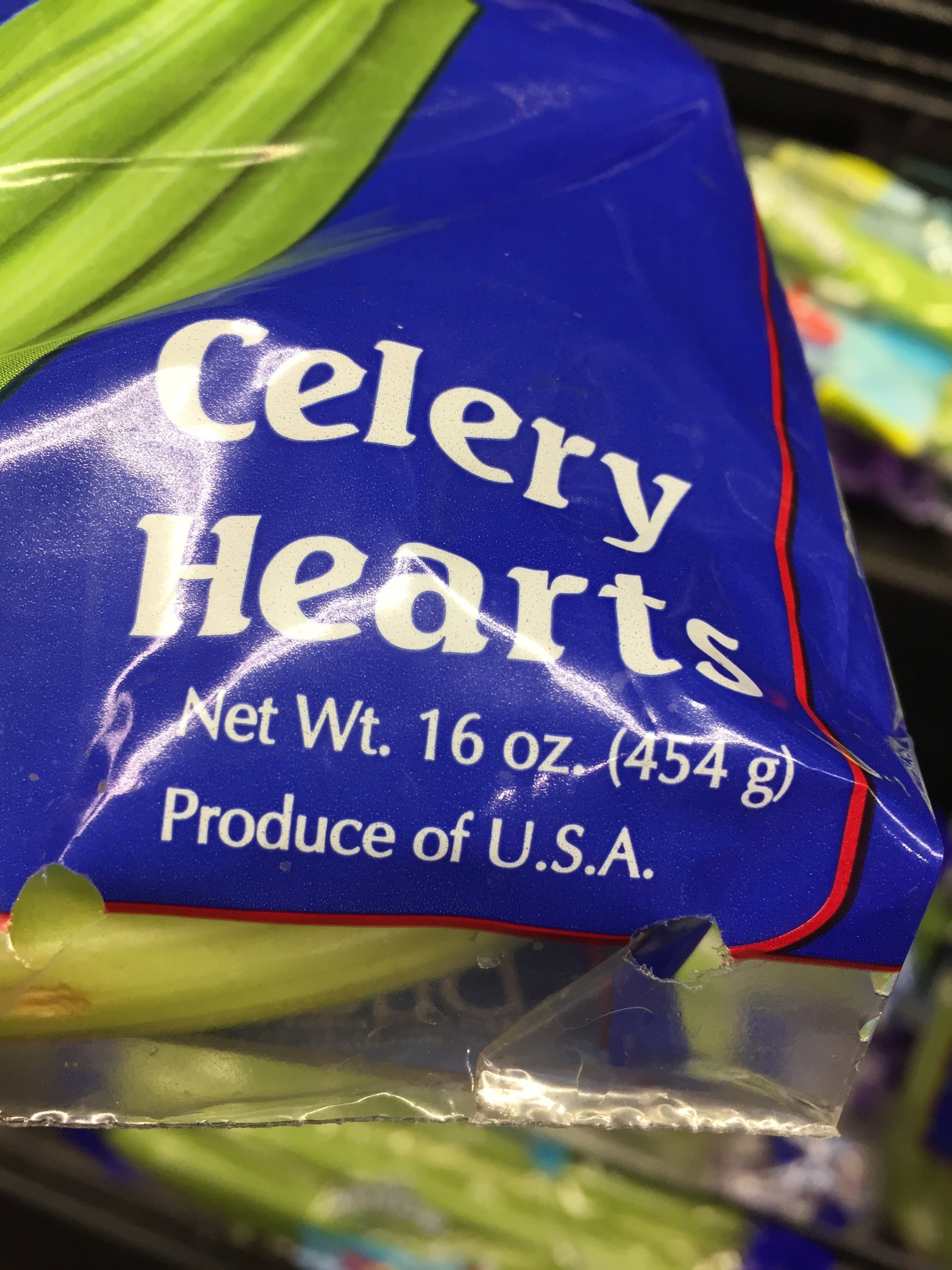
I make my own broth, so I thought I would have a better chance chasing it down than something that came in a can. The chicken came from a local farm, which made things easy. But the carrots, celery, onions, parsnips, garlic, and mushrooms that ended up in the pot all came from the grocery store. And the grocery store is where things began to fall apart. My onions: apparently from Peru. The celery and carrots? Both “USA.” How specific. The garlic bin had two labels, so the garlic was either a “Product of Argentina” or a “Product of USA & Mexico.” The pepper lacks a label of any kind. The parsley had come from my own garden, so I had at least one more non-country-sized dot on my map.
And then came the bread. Have you ever tried to ask a grocery-store clerk where they get the flour to make their bread? Just for reference, telling them that you would like to know for a piece that you are writing does not motivate them to be more forthcoming.
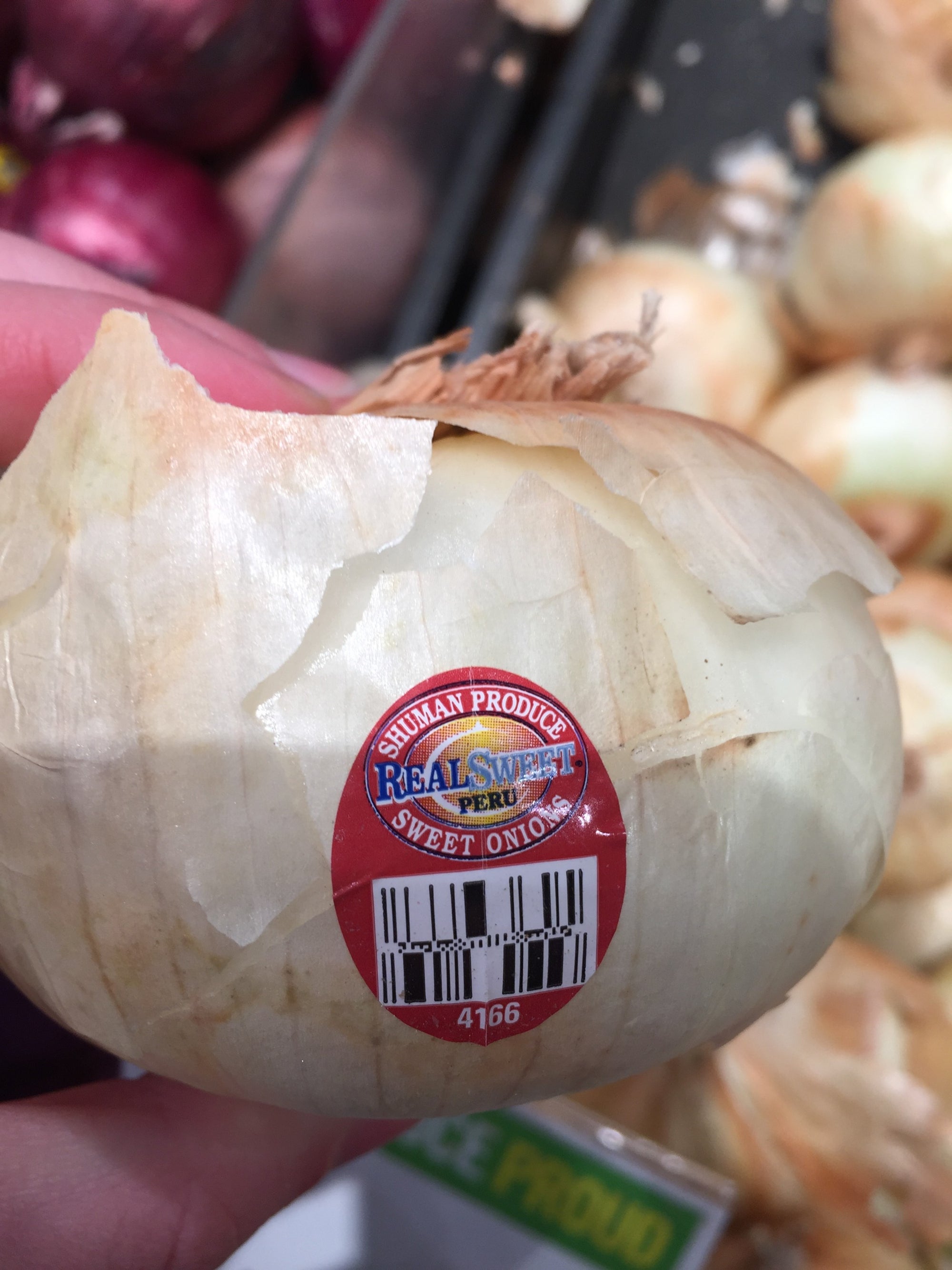
Onions from Peru. Credit: Amanda Baker
My map was a mess, and I was falling progressively deeper into the rabbit hole of trying to salvage what was clearly a non-ideal approach. In an effort to accommodate the vague labeling of most food, I contorted the style of the map to the point that the map itself was no longer meaningful. It wasn’t interesting, it wasn’t informative, and it certainly wasn’t fun. I conceded that my food map didn’t have a story to tell.
But as I started to scrap my new collection of food labels, I realized that there was a story after all. It just wasn’t the one I had set out to tell. With the increased concern Americans are showing in their food labels, for better or worse, I was surprised to find that the “Product of” label remains so vague. I had heard friends and family cite the “your food travels 1500 miles to get to you” statistic enough times to know that it is at least on people’s minds. But digging into the history of that statistic made me feel a bit better about the wall I had hit trying to find the history of my own plate.
As my extremely brief foray as an agricultural detective revealed, figuring out where any particular piece of food came from is hard. The reason it’s so hard is, in itself, complicated. First there’s the need for data. In order for someone to know where a particular egg or crop of peas came from, we would need to label and track every bean as heavily as your next Amazon delivery. But agricultural distribution is a sophisticated web of producers, distributors, and sellers that need to move perishable items around the country (and world) before they spoil. Getting food from farms to store shelves often means having to combine harvests at a central location for redistribution in the desired packaging and amounts found in your pantry. Other companies have more direct relationships with producers and handle their own distribution, which means even less data available to the public.
The researchers behind the (in)famous 1500-mile study had to find a way to identify the source of agricultural products as well as they could. Terminal markets – one form of the central distribution hub described above – is one of the few places with available data. But that data only includes the state where it was produced. The researchers had to use the geographical center of each state as the approximate location for all produce from that entire state. Combined with a few other necessary assumptions – like focusing only on the food market in one city – the researchers ended up with an approximation. Then that approximation ended up in headlines around the country, but usually without the caveats and explanations of the assumptions that had to go into coming up with the number itself.
So I may not have a map to share with my cousins, but I do have a fun thought experiment to talk through about what it would take to know where each bean in their casserole came from. And more importantly I have a chance to talk about why representing any concept with a single number is a powerful way to motivate people to care about something, but it should always act as a source for new questions rather than a definitive answer.
Happy Thanksgiving!