This article was published in Scientific American’s former blog network and reflects the views of the author, not necessarily those of Scientific American
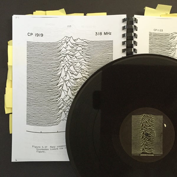
Earlier this year, I reported the punchline of my quest to uncover the story behind the story of Joy Division’s Unknown Pleasures album cover. The stacked plot featured on the record was originally created by radio astronomer Harold D. Craft, Jr. in the course working on his PhD dissertation, “Radio Observations of the Pulse Profiles and Dispersion Measures of Twelve Pulsars” (September, 1970).
When folks refer to the data visualization, they generally just say that it shows a series of radio frequency periods from the first pulsar discovered. But what does that mean? What is a pulsar, how do you read the stacked plot, and how was the data collected?
What is a Pulsar?
On supporting science journalism
If you're enjoying this article, consider supporting our award-winning journalism by subscribing. By purchasing a subscription you are helping to ensure the future of impactful stories about the discoveries and ideas shaping our world today.
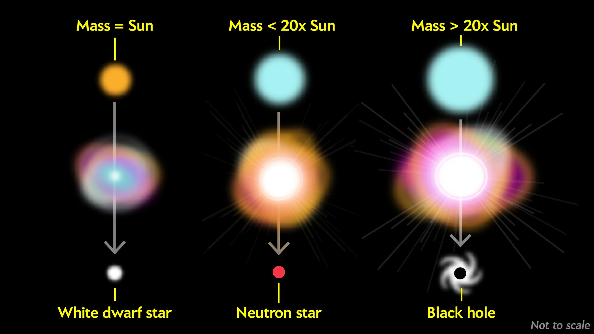
The first pulsar was identified in 1967, and the definition evolved over the next year or so as scientists tried to resolve earlier predictions against rapidly accumulating observations. Now, it’s widely accepted that a pulsar is a specific type of neutron star—one of three outcomes of a star death.
When a star the size of our sun runs out of fuel, its outer layers are ejected as a colorful nebula, and the core collapses in on itself into a white dwarf star, generally destined to cool and fade over time (left, in illustration below). When a supergiant star at least 20 times more massive than our sun runs out of fuel, it collapses abruptly, which can trigger a supernova explosion, and can result in the formation of a black hole (right). Stars lighter than about 20 solar masses but several times heavier than our sun can end their lives by creating a supernova that leaves behind a small, dense core rather than a black hole. Gravity presses the material in on itself so tightly that protons and electrons combine to make neutrons. The result is a neutron star—in which a mass about equal to that of our sun, is compressed into an incredibly dense sphere with a diameter of only about 20 kilometers (middle).
Jen Christiansen
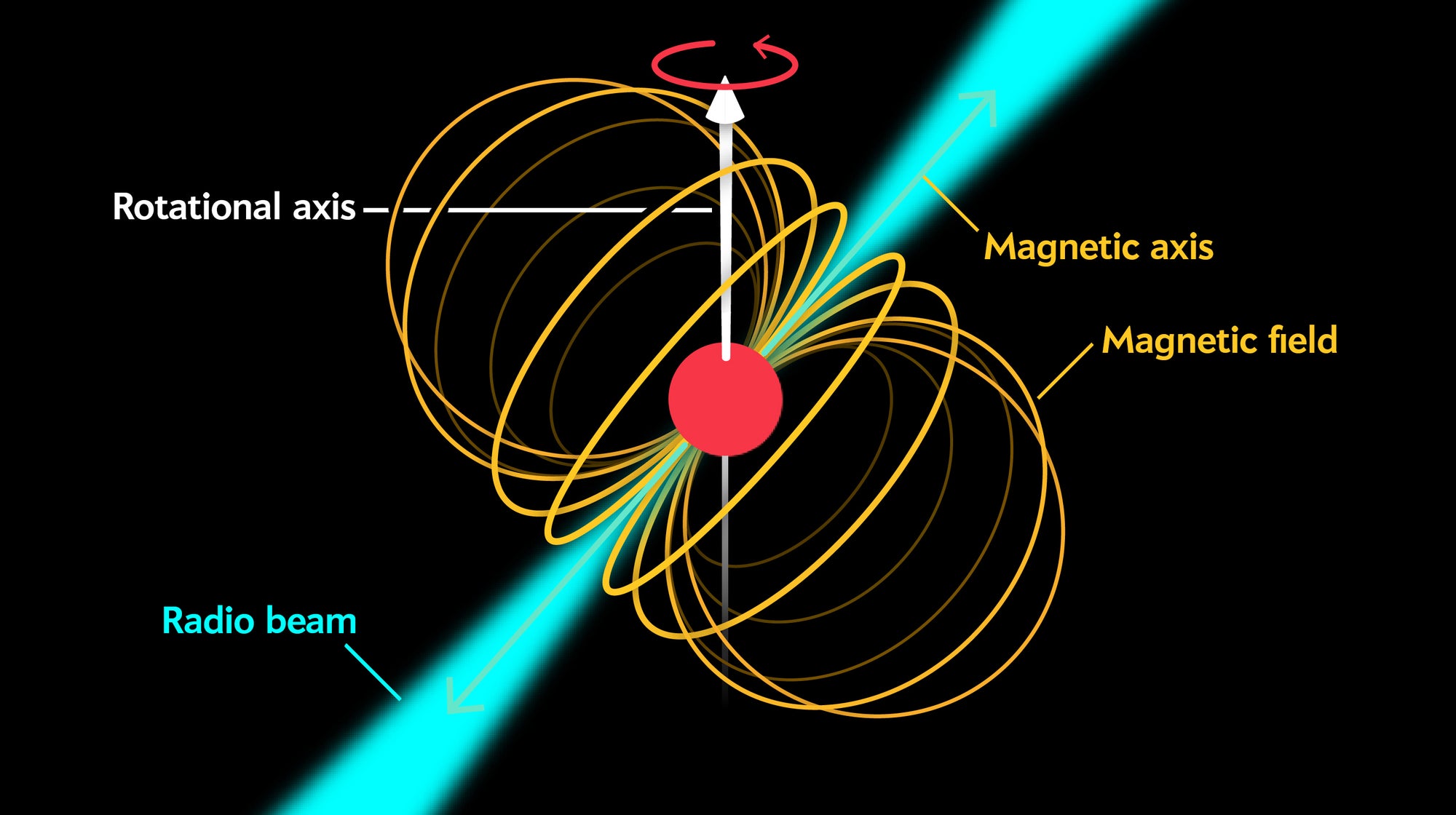
Neutron stars were proposed in 1934. But the idea of observing one was unthinkable at the time, as they’re tiny, and although very energetic—emit very little light. But as it turns out, many emit other detectable signals.
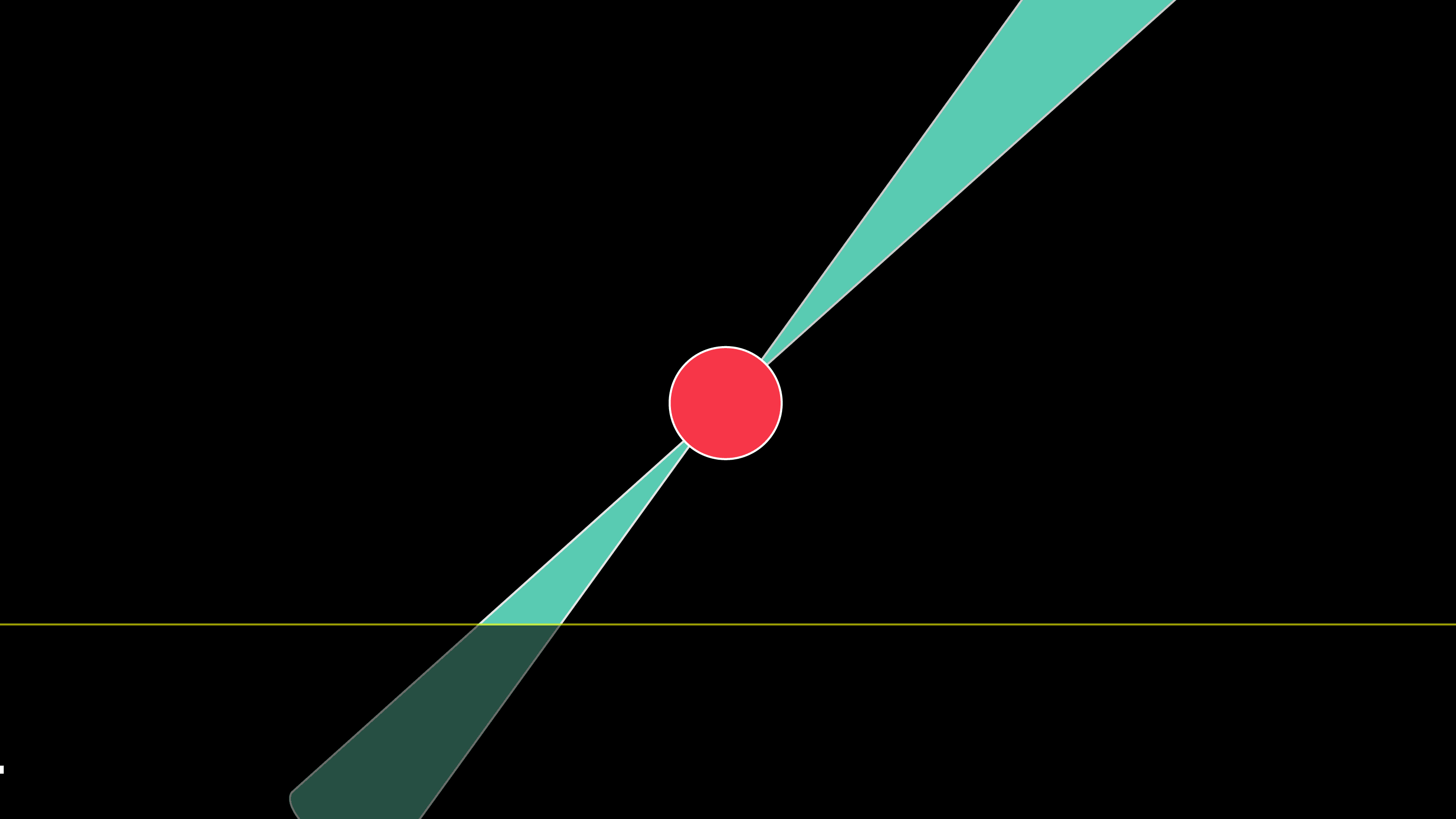
The high energy of an explosive birth and an extremely dense core can set the stage for a strong magnetic field. The magnetic axis can be dramatically misaligned with the rotational axis. As the star rotates, it emanates a radio beam, generated by the combined effect of the magnetic field and the rotation, which sweeps periodically through the surrounding space, like a lighthouse beacon.
Jen Christiansen
These strongly magnetized and rapidly rotating neutron stars are called pulsars. If oriented just so, once per revolution the beam of emission swings past the earth.
Jen Christiansen
But the stacked plot pulses below are irregular, not clean bell curves, as shown in the animation above.

Detail from Figure 5.37 in "Radio Observations of the Pulse Profiles and Dispersion Measures of Twelve Pulsars," by Harold D. Craft, Jr. September 1970. Reproduced with permission from the author.
Several researchers, including Joanna Rankin, have proposed that variation in pulse shape could be due to internal variation in the cone of emissions. Here are some idealized forms, but the pattern could be further complicated with additional hotspots and interference by solar wind.
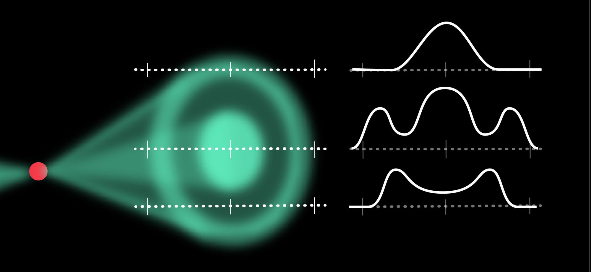
Jen Christiansen. Based on a figure in Pulsar Astronomy, by Andrew Lyne and Francis Graham-Smith, 2005
Although there’s definitely variation from pulse to pulse, the average shape over about a minute results in a characteristic form that is different for each individual pulsar.
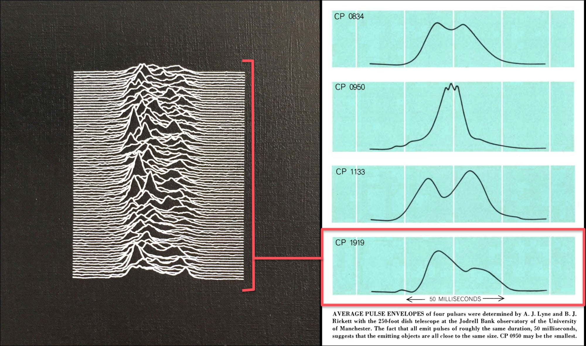
Joy Division’s Unknown Pleasures album cover detail (left); Allen Beechel, in “Pulsars,” by Anthony Hewish, Scientific American, October 1968 (right).
Although the idea of neutron stars as the origin of these radio signals was embraced early on, the lighthouse beam mechanism was only one of several early ideas on what might be responsible for the regular signal pattern. In another competing idea described by Anthony Hewish in his 1968 article in Scientific American, the pulsating surface of the star generates atmospheric shock waves, triggering radio wave bursts that could be detected by radio telescopes on Earth. This—and several other hypotheses—were eventually dismissed.
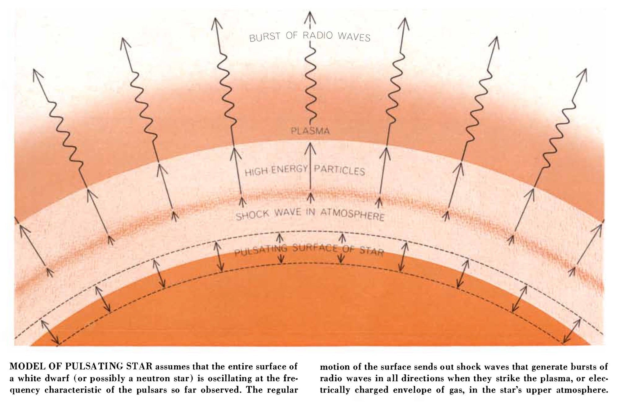
Allen Beechel, from “Pulsars,” by Anthony Hewish, in Scientific American, October 1968
How do you Read the Stacked Plot?
Let’s look at the full plot (below). Time for each line reads from left to right, and successive pulses are stacked from bottom to top. Peaks represent relatively strong radio signals. This particular plot shows data collected at a frequency of 318 Megahertz.
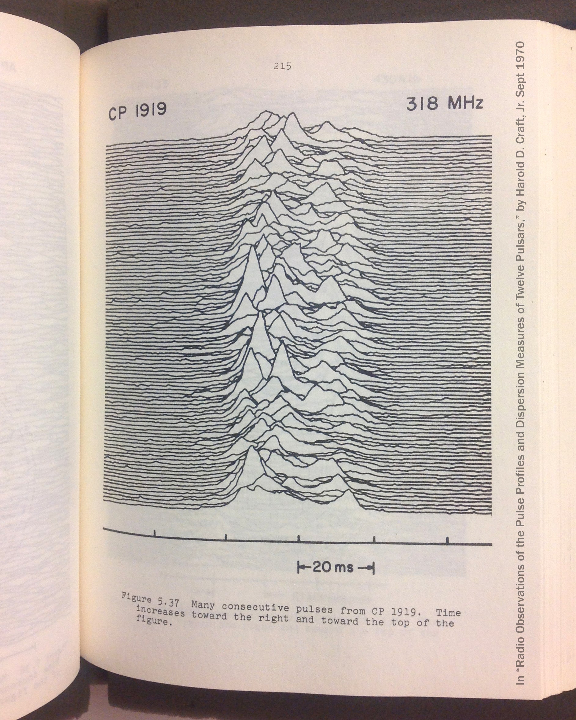
Figure 5.37 in "Radio Observations of the Pulse Profiles and Dispersion Measures of Twelve Pulsars," by Harold D. Craft, Jr. September 1970. Reproduced with permission from the author.
The animation below demonstrates the concept, but not the correct timing. The pulses occur every 1.337 seconds, but only last for about four one hundredths of a second. The pulse shapes shown here are stretched horizontally quite a bit.

Jen Christiansen
How was Pulsar Data Collected during the Early Days of Discovery?
The first pulsar—identified as such—was detected in 1967 by the 4.5-acre Array built at the Mullard Radio Astronomy Observatory in Cambridgeshire, England. The telescope was designed by project lead Anthony Hewish to detect interplanetary scintillation in an effort to learn more about quasars. Interplanetary scintillation is similar in concept to the twinkling of stars that you see when looking at the night sky, but refers to the twinkling of radio waves (rather than visible light), as they travel through the solar wind. The array is comprised of over 2,000 dipole antennae connected with transmission lines. The dipoles are fixed. Rotation of the earth causes the full array to sweep the sky from west to east.

The 4.5 Acre Array. Reproduced with permission from 40 Years of Pulsars—Millisecond Pulsars, Magnetars, and More, edited by C. G. Bassa, Z. Wang, A. Gumming, and V. M. Kaspi. Copyright 2008, AIP Publishing LLC
PhD student Jocelyn Bell operated the telescope and analyzed the data—about 96 feet of chart paper was produced every day—recorded on four three-track "Rapidgraph" pen recorders. This was the type of pattern that caught her attention (below). It was unlike any of the scintillation patterns that she was searching for in the course of the team’s quasar research.

Detail from Figure 1 of “Observation of a Rapidly Pulsating Radio Source,” by Hewish et al. in Nature, February 24, 1968. Reproduced with permission from Macmillan Publishers Ltd (copyright 1968).
The regular blips are not calibration marks. Those are upticks in the signal about every second, over an interval of about a minute, which appeared at about the same time on successive days. Localized interference was investigated and dismissed (by confirmation from another telescope and other means), and it became increasingly evident that the signal, indeed, originated from space. The research team briefly entertained the idea that the signal could be from an alien civilization, but that explanation was dismissed when 3 other sources of similar signals were found in other parts of the sky.
Radio astronomy was not new, so why had pulsar signals not been identified earlier? Field-sized dipole arrays—like the one at Mullard—were optimized for long wavelengths, and broad sky surveys at regular intervals. They were more likely to pick up the signal and identify it as a regular and persistent one, rather than an anomaly, or dismissed as noise.
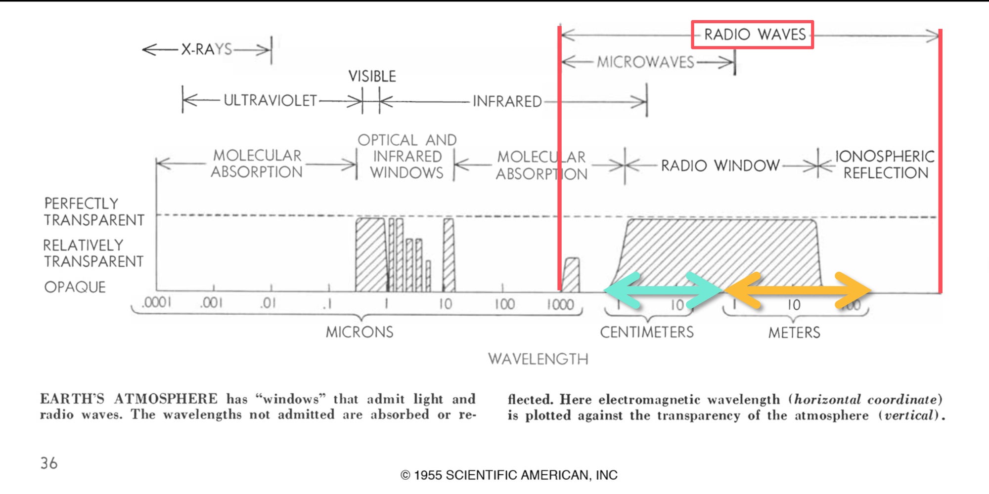
Bunji Tagawa, from “Radio Telescopes,” by John D. Kraus, in Scientific American, March 1955. Red, cyan, and orange marks added by Jen Christiansen.
Once the discovery announcement was made and the initial results were published, radio telescopes around the world—including Arecibo Observatory in Puerto Rico—focused on the locations of the previously identified pulsar coordinates, and began to search for more.
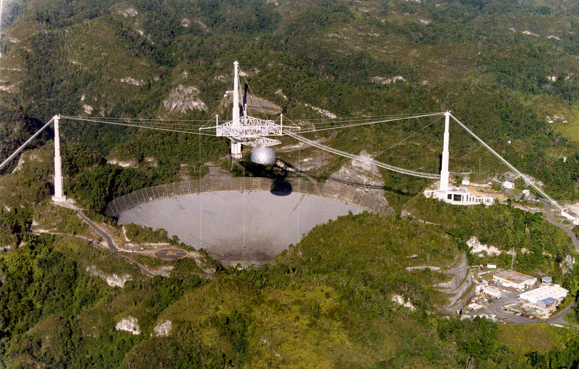
Arecibo Observatory. Reproduced with permission from the NAIC—Arecibo Observatory, a facility of the NSF.
Frank Drake (director of the Arecibo Observatory 1966-1968, and chairman of the astronomy department at Cornell University through 1971), advised several doctoral students working at Arecibo to turn their attention, using the powerful tool at their disposal, to the newly identified objects. Craft focused on pulse shapes, in an effort to shed light on emission mechanisms; and dispersion, to learn more about how those emissions might shift between the pulsar and Earth. (You can hear Craft speak about Arecibo and his dissertation in my earlier post on this blog, "Pop Culture Pulsar, Origin Story of Joy Division’s Unknown Pleasures Album Cover"). Craft went on to become director of the observatory (1973-1982), and Vice President Emeritus at Cornell University.
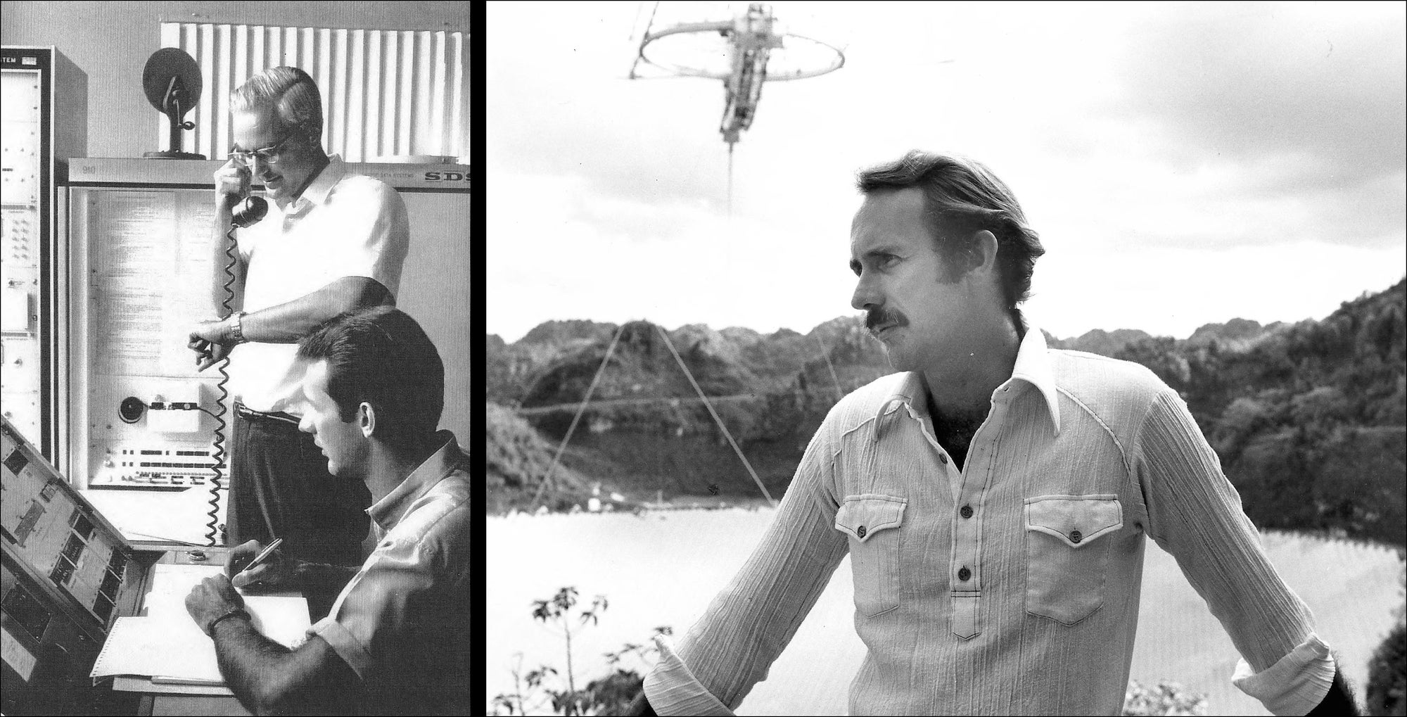
Frank Drake (standing) and Hal Craft at Arecibo, circa 1968 (left). Hal Craft at Arecibo in the 1970s (right). Office of Public Information, Visual Services, Cornell University. Reproduced with permission of the Division of Rare and Manuscript Collections, Cornell University.
Pouring through dissertations from Cornell’s Division of Rare Manuscript Collections, I was struck by the variety of visualizations of pulsar data from Arecibo at that time, including these heat maps from Donald Charles Backer (below). Each row is a successive pulse, grading from faint radio signal strengths in light gray, to stronger signals in black.
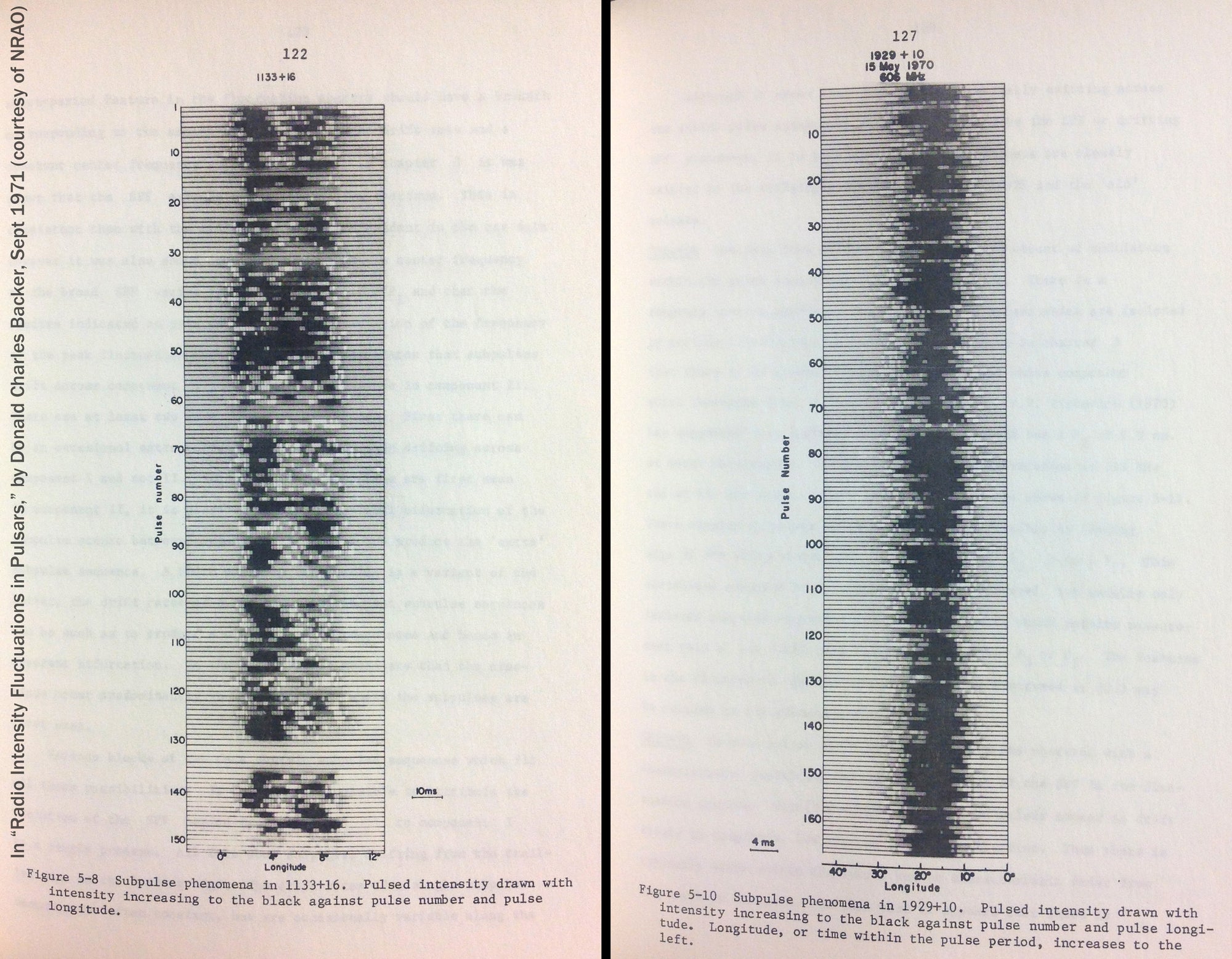
From "Radio Intensity Fluctuations in Pulsars," by Donald Charles Backer. September 1971. Reproduced with permission from the National Radio Astronomy Observatory.
Postscript
I should note that pulsar research is still an active field. You may have heard in the news earlier this year that a pulsar in a tight orbit around another dense star is helping scientists test Einstein’s ideas on the relationships between gravity, space and time. And pulse arrival times are being used to learn more about gravitational waves.
Although radio telescopes still play a large role in collecting pulsar data, efforts to combine information from different parts of the spectrum are resulting in images like this (below). Here, X-rays detected by NASA's NuSTAR mission reveal a pulsar (pink) in the center of galaxy Messier 82. (M82 is associated with the constellation Ursa Major, 12 million light-years away.)
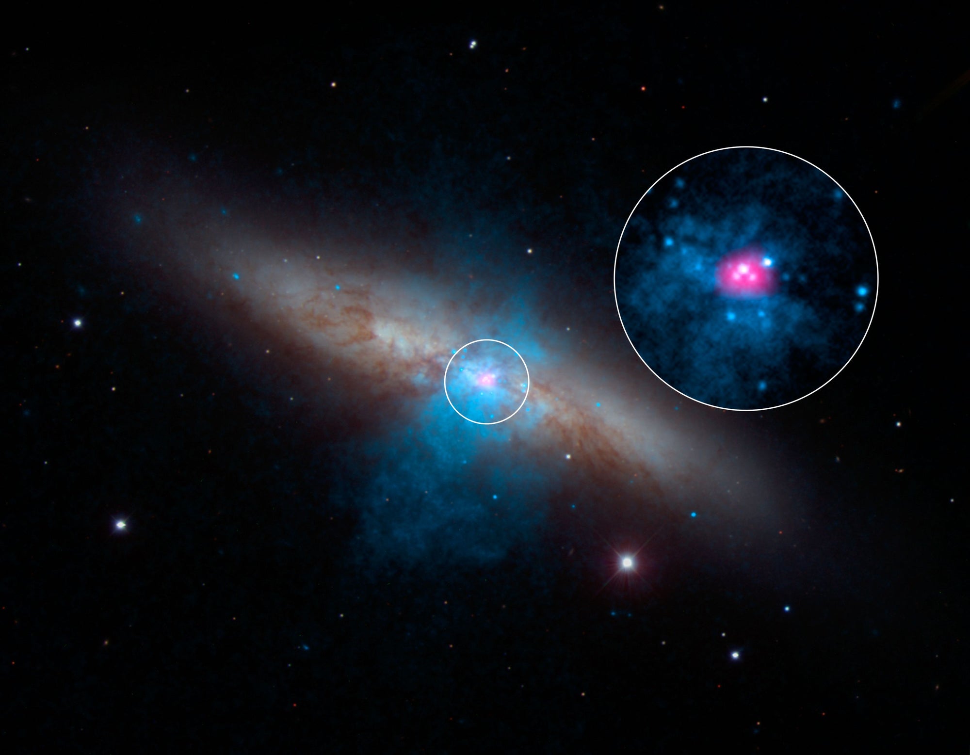
Visible light image of galaxy M82, with X-ray data from NASA’s Chandra Observatory in blue, and higher-energy X-ray data detected with NuSTAR in pink, revealing the central pulsar. NASA/JPL-Caltech/SAO/NOAO
And visualizations, such as this simulation of a supernova with its central proto-neutron star (pink sphere, below), are helping scientists learn more about how pulsars are formed.
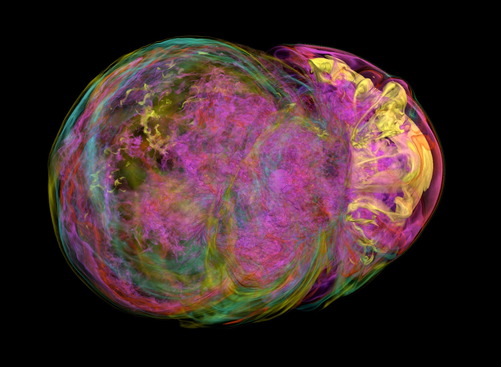
Supplemental figure from “Pulsar spins from an instability in the accretion shock of supernovae” By John M. Blondin & Anthony Mezzacappa, in Nature, January 4, 2007. Reproduced with permission from Macmillan Publishers Ltd (copyright 2007).
Evocative, for sure. But album cover worthy? That remains to be seen.
* * * * * * * * * * *
For more on pulsars, check out “The Nature of Pulsars,” by Jeremiah P. Ostriker, in Scientific American, January 1971; Clocks in the Sky: The Story of Pulsars by Geoff McNamara; and an interview with Jocelyn Bell Burnell on the BBC. For more from Hal Craft and Frank Drake, listen to Cornell University’s series “An Oral History of the Arecibo Observatory.”
A variation on this post was first presented at VISUALIZED on October 8, 2015.