This article was published in Scientific American’s former blog network and reflects the views of the author, not necessarily those of Scientific American
In a memorable talk at OpenVisConf earlier this year, data journalist Mona Chalabi posited that there is no such thing as an emotionless data visualization. There is a person behind each visualization, she reasoned, and that person has feelings about the information she is representing. Whether consciously or not, those feelings are often revealed in the visual design decisions that characterize the resulting image.
In science visualization, however, the goal is often to be as detached as possible. When representing scientific data, we are generally not trying to evoke an emotional response from our readers, but rather to allow them to explore the data and draw empirical conclusions themselves. While those conclusions may carry emotional weight, it is not the job of the visualization to arouse those feelings directly.
A recent project called Atlas of Emotions takes the idea of detachment in data visualization and turns it on its head. This series of interactive, annotated graphs is infused with the visual manifestations of five universal emotions: sadness, fear, enjoyment, anger, and disgust.
On supporting science journalism
If you're enjoying this article, consider supporting our award-winning journalism by subscribing. By purchasing a subscription you are helping to ensure the future of impactful stories about the discoveries and ideas shaping our world today.

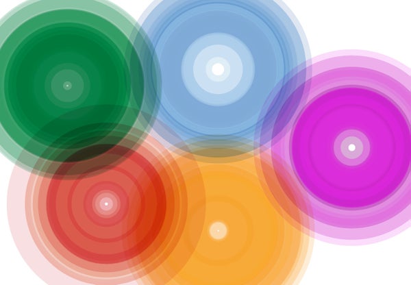
Image from Atlas of Emotions homepage
Credit: Paul Ekman
Click the image to launch the interactive
The concept for Atlas of Emotions emerged from conversations between the Dalai Lama, who funded the project, and Paul Ekman, a prominent psychologist best known for his seminal work in so-called microexpressions. Psychologist Eve Ekman, Paul’s daughter, was a fellow principal investigator on the project. While some of Paul Ekman’s research methods have been criticized in the past, the scientific basis for Atlas of Emotions is outlined on the website, and the associated research paper demonstrates a scientific consensus on the nature of emotions, among those who study the topic.
However, what interests me most about the project is not the underlying science but the visualizations themselves. Created in collaboration with Stamen, a San Francisco-based design firm specializing in maps and data visualization, the interactive consists of five colorful area-chart-style graphics.
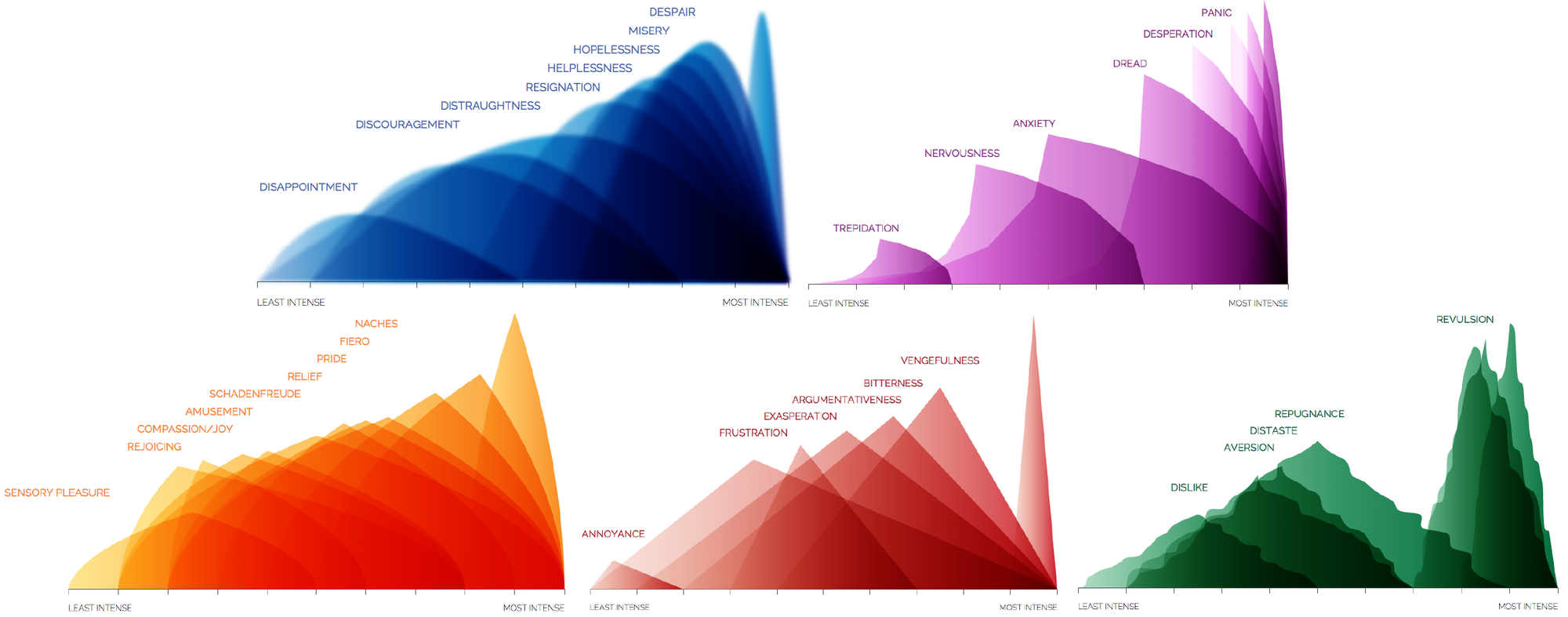
Five visualizations from Atlas of Emotions
Credit: Paul Ekman
The use of color is clearly purposeful, and if you have seen Pixar’s excellent 2015 film Inside Out, the hues may remind you of the characters representing these same five emotions. (The parallel is no wonder, as Dr. Ekman served as a psychology consultant for the film.) For each visualization, the roughly triangular peaks represent specific psychological states. Together, they give an intuitive picture of the relative intensities of each state. For example, on one end of the “sadness” graph disappointment is a shallow but persistent hump, while at the other end anguish looms tall and abrupt.
Meanwhile, the contours of each shape attempt to embody the emotion itself. In some cases it is difficult to articulate exactly why the visualizations are so successful in this regard. In other instances, the design elements are so suggestive as to seem obvious. The edges of the “sadness” visualization are blurred, evoking the oppressive haze of depression or the welling of tears in one’s eyes. The shapes in the “fear” graph rear backwards as if startled, and the irregularly wavy peaks of “disgust” conjure images of toxic ooze.
More than just a set of images, Atlas of Emotions is an interactive learning tool, guiding the user through each emotion, inviting him to explore and contemplate the nuances of each specific feeling. From the triggers that can spur an emotion to the actions with which we respond, Ekman is thorough is his investigation of what makes us human.
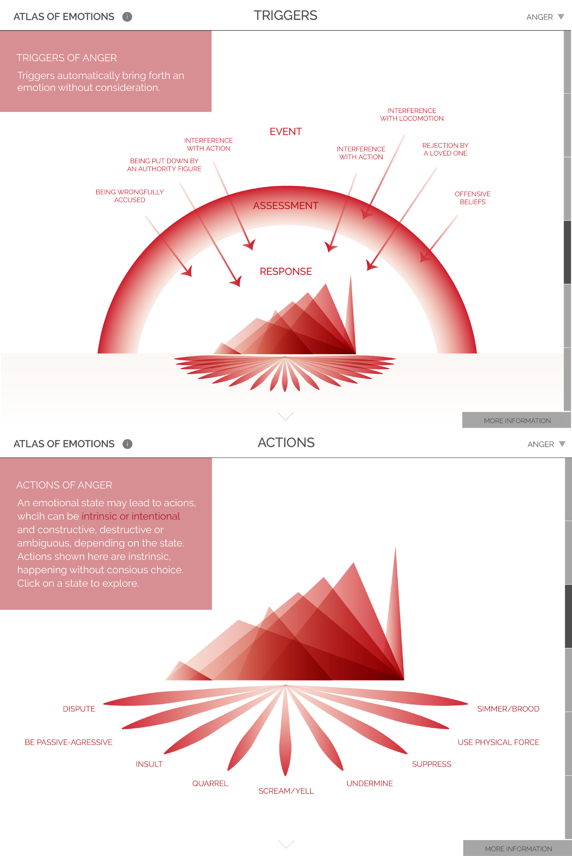
Visualizations showing triggers and actions associated with anger
Credit: Paul Ekman
For me, Atlas of Emotions is above all a fascinating examination of the inherently emotional qualities of the visual language used in information graphics. Basic elements like line and color, however innocent or neutral they may seem, cannot be stripped of their psychological baggage. So perhaps Mona Chalabi is right, after all: though the effects may be subtle, no visualization is completely devoid of emotion.
For more on the design process behind Atlas of Emotions, read a blog post by data visualizer and Stamen collaborator Zan Armstrong.