This article was published in Scientific American’s former blog network and reflects the views of the author, not necessarily those of Scientific American
In the July issue of Scientific American, our Graphic Science section features a data visualization on the consumption of food crops around the world from 1961 to 2009. The data comes from a study published in Proceedings of the National Academy of Sciences on trends in global food supplies. The two main takeaways of the study—that diets are becoming more homogenous and calorie-rich overall—are immediately apparent in the graphic, shown below.

Source: “Increasing Homogeneity in Global Food Supplies and the Implications for Food Security,” by Colin K. Khoury et al., in Proceedings of the National Academy of Sciences USA, Vol. 111, No. 11; March 18, 2014
Graphic by Jen Christiansen
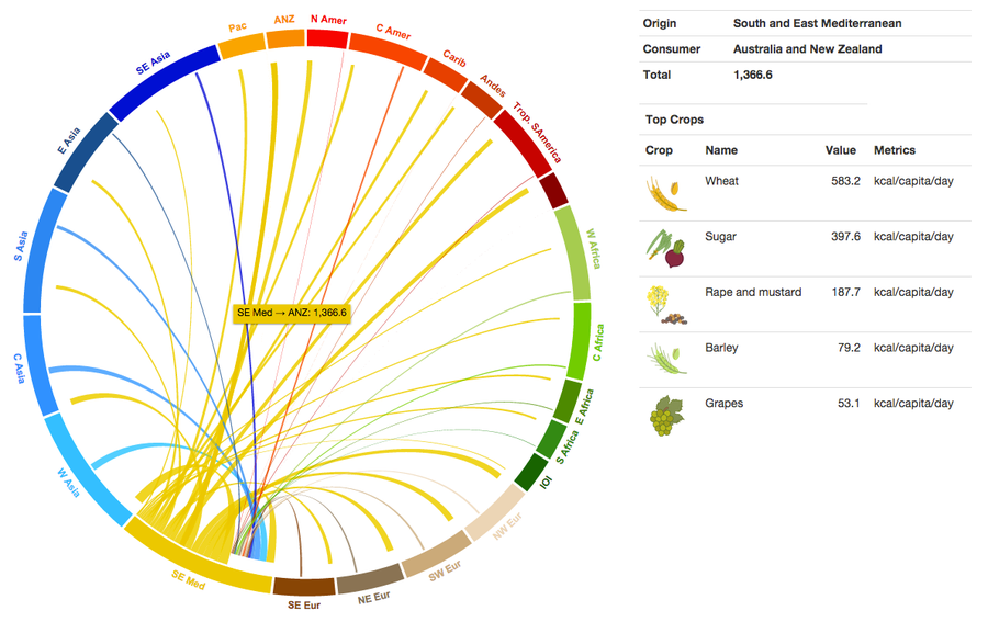
Also recently, the same group of researchers published an in-depth look at where different food crops originate and where they are consumed. Here, the primary message is that countries are highly interconnected when it comes to food supply; increasingly, the crops we eat come to us from distant countries. Since the dataset associated with this study is so large and complex, the researchers published a set of interactive graphics to help viewers understand and navigate the many global links underlying the production and consumption of various food crops.
On supporting science journalism
If you're enjoying this article, consider supporting our award-winning journalism by subscribing. By purchasing a subscription you are helping to ensure the future of impactful stories about the discoveries and ideas shaping our world today.

Visualizations by Colin K. Khoury, Harold A. Achicanoy, Carlos Navarro-Racines, Steven Sotelo, and Andy Jarvis at the International Center for Tropical Agriculture (CIAT)
Click the image above to launch the interactive
At first, it may seem as if the main idea of the first study—increased homogeneity of diets—conflicts with that of the second—ample global exchange of food supplies. Intuitively, if each country is consuming crops from diverse regions, we should all have plenty of variety in our diets. However, given a closer look at the interactive graphs, it becomes clear that many of the top crops consumed in each region are the same, even if they come from different sources. For example, hover over some of the connection lines in the interactive food consumption graph, and notice how often wheat, rice, and sugar emerge at the top of the list.

Image from interactive visualization showing food consumption links from South and East Mediterranean to Australia and New Zealand
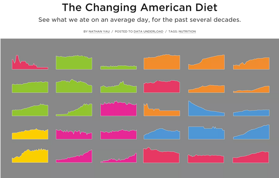
Each of the above graphics offers a global, big-picture view of food consumption. Meanwhile, Nathan Yau of Flowing Data has taken a different approach to visualizing changing diets. His recently published interactive graphic, The Changing American Diet, focuses on specific food products consumed in the United States from 1970 to 2013.

Graphic by Nathan Yau
Click the image above to launch the interactive
This interactive is a great example of a type known in the data visualization world as “small multiples:” a series of visualizations juxtaposed to emphasize variations from one to the next, as well as outliers from the group. Yau has created a wonderfully multi-dimensional version of this classic brand of information graphic; the user can look at the data in various ways in order to glean different bits of information.

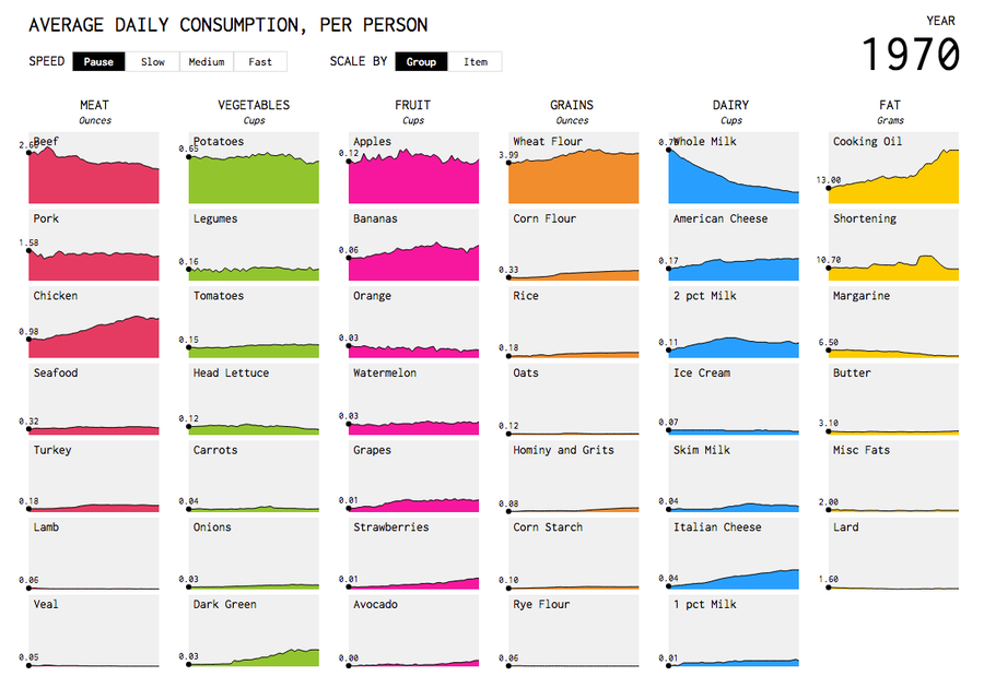
Image from The Changing American Diet
Visualization by Nathan Yau
For example, each area chart in the series can be viewed either on its own scale (to show fluctuations within each graph), or on a universal scale (to emphasize the overall hierarchy of products within each category). Moreover, the major changes in diets over time are highlighted in two different ways. A simple, static shot of the graphic shows some clear trends, such as the steady rise of chicken over the years, or the decline of whole milk. But let the visualization “play,” and as the year advances, the graphs in each category switch places as one overtakes another in popularity. The movement holds our attention as the visualization becomes a fascinating sort of race among the foods.
As all of these visualizations demonstrate, there are many graphical ways to examine different aspects of what we eat. And given the dangerous trends in obesity both here in the U.S. and globally, it is a topic certainly worth our attention.