This article was published in Scientific American’s former blog network and reflects the views of the author, not necessarily those of Scientific American
Data visualization. Infographics. Ooh, better yet, make that interactive infographics. The recent buzz around the visual display of information makes it seem like everyone should be rushing to whip up some multi-colored cartogram, bubble chart or word cloud. Never before have we had both the tools and the vast amounts of raw data to play around with, and scientists and journalists alike are making fabulous use of this opportunity. From unemployment rates to air traffic patterns to the wealth and health of nations to blood test results, information has never been so fun to look at.
But before we get too carried away with swirling globes and animated charts, it’s worth going back to the basics – taking note of some simple methods for visually presenting data. This endeavor is particularly relevant to science and health, where visual information appears anywhere from diagrams in scientific research papers to public health campaigns. The field of information design is vast, but I’ll concentrate on just a few simple ways to approach the combination of words and pictures. Many examples come straight from Edward Tufte, the information design guru who put the serious study of infographics on the map, so to speak (the New York Times has called him the Leonardo da Vinci of Data). Since the publication of his first book The Visual Display of Quantitative Information in 1983, Tufte has demonstrated over and over how the right approach to visual displays can dramatically improve the clarity and effectiveness of data. And in fact, many of the classic principles of good information design can be found throughout the history of science.
Put words into pictures
On supporting science journalism
If you're enjoying this article, consider supporting our award-winning journalism by subscribing. By purchasing a subscription you are helping to ensure the future of impactful stories about the discoveries and ideas shaping our world today.
If I handed you an anatomical drawing and told you to label different body parts, what would you do? Probably, you’d start drawing lines to the liver, the heart, etc, perhaps matching each line up with a letter and listing all the different names below. You may very well end up with something like this (it’s a pigeon):
[Left - Viscera of a Pigeon, Zoology: an elementary text-book, 1901. Credit: Wikimedia Commons - click on link to see large]
However, you could also integrate the labels into the image itself. These beautiful illustrations from Gray's Anatomy embed labels right into the muscle and bone, rather than relying on pointer-lines and letter codes.
[Right - Muscles of the pharynx and cheek, Gray’s Anatomy, 1918. Credit: Wikimedia Commons - click on link to see large]
Of course, lines can be useful when space is limited, but they can also make anatomical drawings look more like this unfortunate fellow (the Wound Man, an example from Tufte’s book Visual Explanations).
[Left - Wound Man, Hans von Gersdorff, 1517. Credit: Wikimedia Commons - click on link to see large]
In other cases, symbols can be a source of information (rather than references to a legend or glossary). In this map of the constellation Orion, from Johann Bayer’s Uranometria, the stars vary in size to indicate brightness level. They are also paired with the Greek letters of the alphabet in order of brightness, a common convention in star maps.
[Right - Orion, Uranometria, 1661. Credit: Wikimedia Commons - click on link to see large]
In both of these cases, the information (name or brightness level) is located precisely where we need it. Words, pictures and symbols and combined in whatever way most effectively conveys knowledge. As data visualization and infographics become more popular, the arbitrary division between word and image will start to disappear.
Put pictures into words
If we can embed labels into muscles or letters into a map, the reverse is also true. Oliver Byrne’s visual rendition of Euclid’s Elements beautifully explains mathematical proofs and theorems by cleverly embedding pictures into words.
[Left - Proposition 47, or the Pythagorean theorem, Byrne’s Euclid, 1847. Credit: Wikimedia Commons - click on link to see large]
A typical geometry proof would indicate angles and lines by letters (angle ABC, line CB), forcing the reader to jump back and forth from text to diagram. Byrne eliminates the letter coding and eye jerking and shows us the angle within the text – in primary colors and simple shapes. We can easily differentiate the highly contrasting colors of red, yellow, blue and black, and easily read the generously spaced words and letters.
Galileo also successfully combines words and pictures in a straightforward, intuitive way. In his first observations of Saturn, he squeezes tiny little drawings of the planet in the middle of a sentence. Pictures and letters, both just a series of lines, are used interchangeably.
Finally, we take an example straight from Tufte – the sparkline. A word sized image used to track changes over time, the sparkline is a condensed piece of graphical data packaged right into a sentence or chart, much like Galileo’s mini Saturns. A sparkline can present average yearly temperatures, the last 20 readings of blood glucose, or daily changes in the euro exchange rate. By packing a graphic full of data, we can easily grasp and compare trends and variations of thousands of individual data measurements.
Treat words as pictures
The treatment of letters as images is nothing new; it’s what typography is all about. In the previous Gray’s Anatomy illustrations, slight variations to the typeface tell us which tissue is a muscle, a tendon, etc. The graphical elements of a letterform can make a huge difference to information display – particularly at 65 miles per hour. Clearview is a typeface designed specifically for highway signs, where readability is not just an aesthetic preference, but has serious public health consequences.
[Right - Comparison of two road signs, Highway Gothic on the left, Clearview on the right, 2007. Credit: Wikimedia Commons - click on link to see large]
The previous road sign font, Highway Gothic, was hard to read because of very small counter spaces, or the enclosed shapes of a letterform (the inside of an "O" or "P"). Clearview, with larger enclosed shapes, taller lowercase letters and better letterspacing, is easier to read from a distance and at night.
[Left - Clearview letterforms. Credit: Wikimedia Commons - click on link to see large]
Clearview improved drivers’ reading accuracy, reaction time, and recognition distance – all with a few small tweaks to the design. In this case, proper type is crucial for public health and safety.
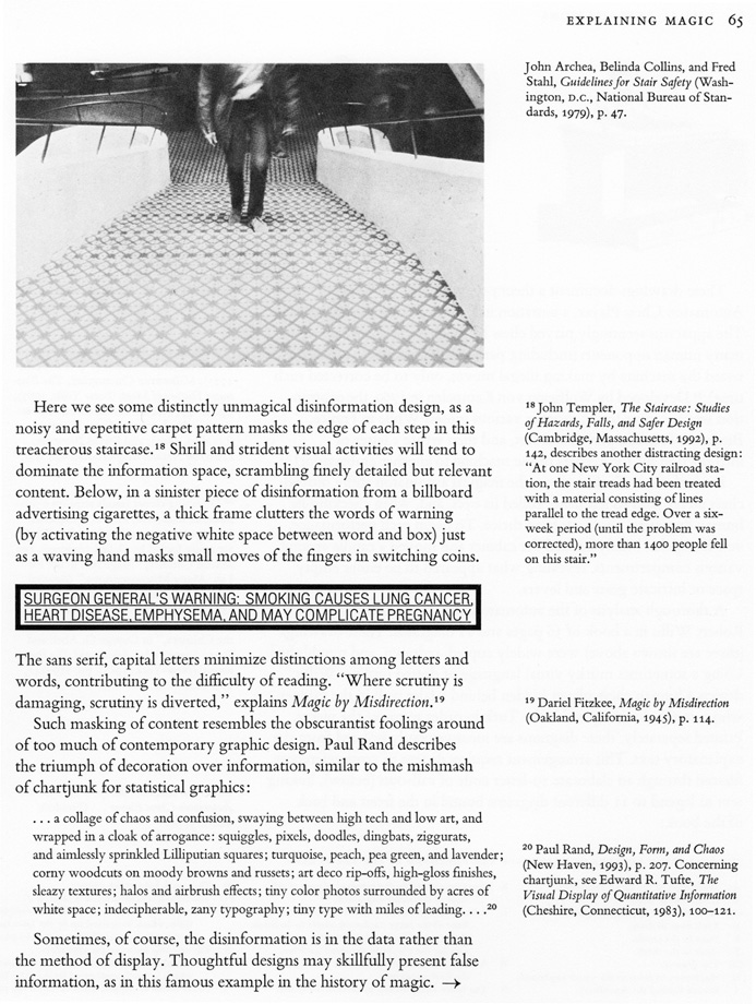
Type can also get in the way of effective communication, as this Surgeon General’s warning clearly shows (well actually, it doesn’t clearly show anything at all). The combination of ALL CAPS, thin line weight, tightly cramped letters and the thick bold border renders the text almost illegible. For a health warning meant to convey life-or-death information, this is a pretty terrible typographic example.
Now, go make some!
From anatomical labels to geometric proofs, clear and effective displays of data come in all shapes and sizes. Some may look fancy, but all depend on a combination of words and pictures – the building blocks of good information design. The previous maps, drawings, manuscripts, labels and signs are just a few examples from the world of science and health, but I think they demonstrate how good design can also be pretty simple. There are dozens of other principles to talk about (like eliminating unnecessary distractions and chartjunk, or using visualizations to explore and discover new patterns) which is probably why Tufte has four whole books on the subject. But I hope these few examples are helpful as you think about visual information – and create some of your own.
About the Author: Lena Groeger is a graduate student in New York University's Science Health and Environmental Reporting Program. Before moving to New York she worked as a graphic designer for Brown University Health Education, and before that studied philosophy (the obvious choice for a science journalist). You can check out her website, follow her on Twitter, and find more of her writing on Scienceline.
The views expressed are those of the author and are not necessarily those of Scientific American.